Annotated timeline
time series line chart
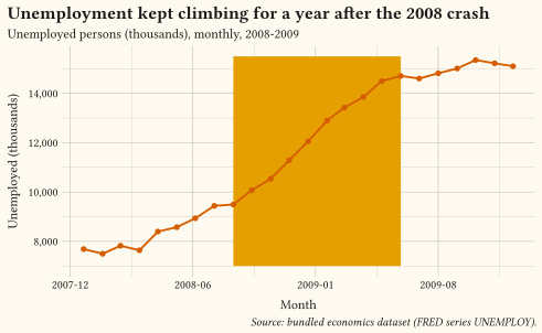
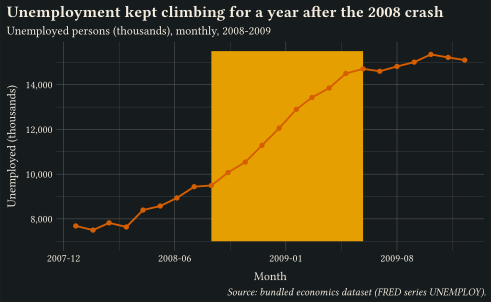
Unemployment over the 2008-2009 recession with a shaded context period and an in-plot label placed by annotate; the title states the finding.
Development - This documentation is for the development version of Gribouille. For the stable version, please visit the main documentation.
Show how values change over time or along an ordered sequence.
These charts answer “how did it change?”: trends, seasonality, turning points, and rank shifts along an ordered axis. Lines are the default; areas add a sense of cumulative magnitude but need a zero baseline; steps suit values that hold between events. Label series directly at the line ends instead of relying on a legend, annotate the context that explains a shift, and split tangled series into small multiples rather than letting spaghetti build up. Every example ships its full source: click View source to copy it.
time series line chart
Unemployment over the 2008-2009 recession with a shaded context period and an in-plot label placed by annotate; the title states the finding.
time series small multiples
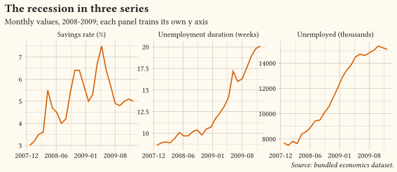
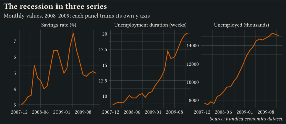
Three recession series reshaped with pivot-longer into facet-wrap panels with free y scales; separate panels beat overlaid lines when units differ.
time series area chart
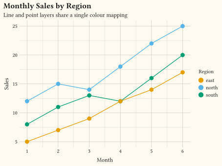
time series line chart
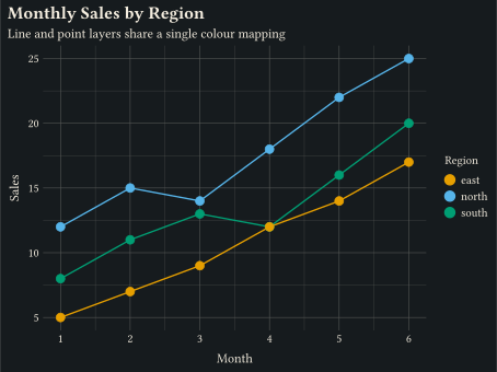
Lines and points share a discrete colour mapping. geom-line + geom-point.
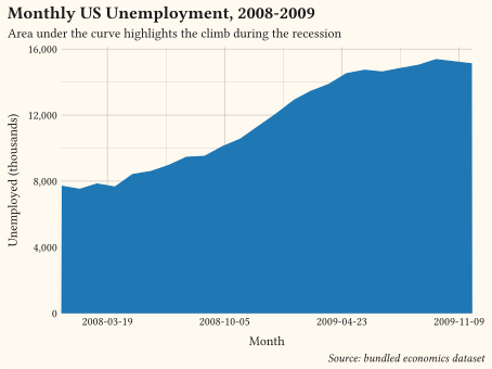
time series
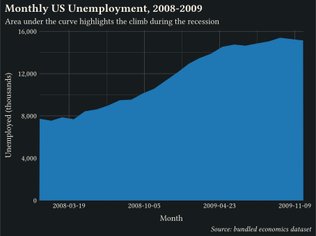
Filled polygon from y = 0 to y, drawn by geom-area.
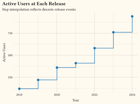
time series step chart
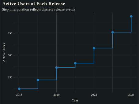
Discrete jumps between consecutive points via geom-step.
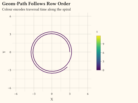
coordinates trajectory
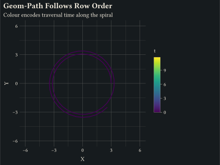
geom-path connects rows in input order, useful for trajectories.
time series
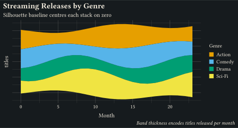
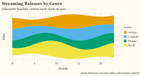
geom-area on a position-stack(offset: "silhouette") baseline centres each stack on zero for the classic ThemeRiver flow.
time series
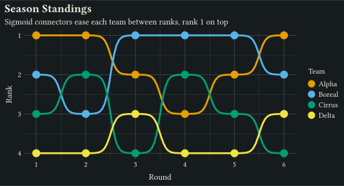
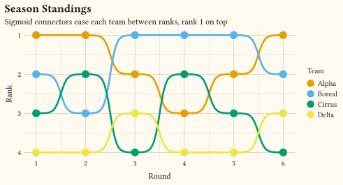
stat-connect(connection: "sigmoid") eases geom-line between ranks with logistic connectors; a reversed y scale puts rank 1 on top.
time series difference chart
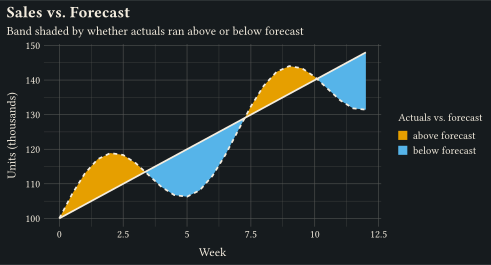
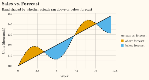
stat-difference shades the geom-ribbon between forecast and actuals by which series leads, splitting the band cleanly at every crossing via fill: after-stat("_sign").
time series step chart
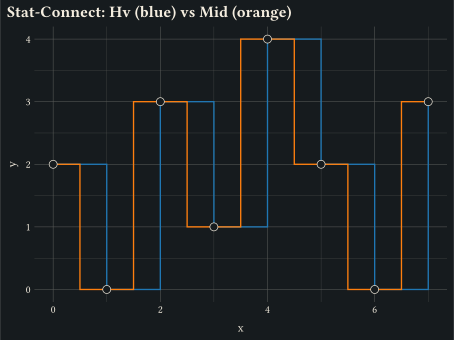
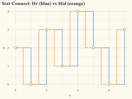
Insert intermediate vertices between consecutive points via stat-connect; two paths overlay the same data with connection: "hv" (step) and connection: "mid" (midpoint corner).
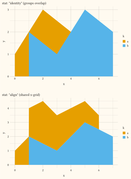
time series stacked area chart
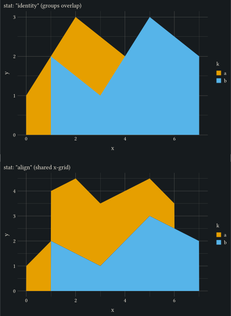
Resample groups onto a shared x-grid via stat-align so stacked geom-area layers join cleanly even when the per-group x values are mismatched.
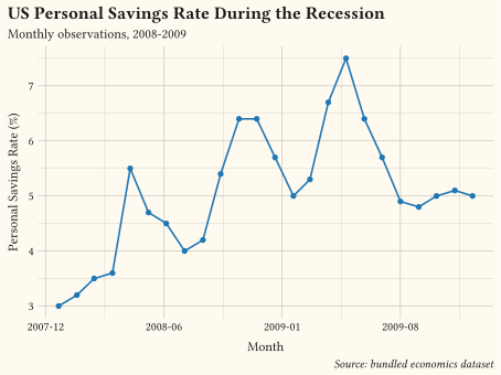
time series line chart
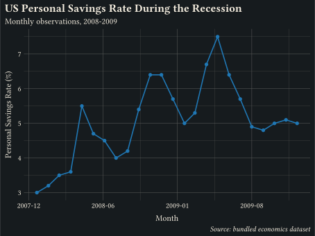
ISO date strings on x parsed and laid out by scale-date with year-month tick labels.
// Showcase: unemployment time series with an annotated context period and a
// finding stated in the title; annotation does the pointing, not a legend.
#import "@preview/gribouille:dev": *
#set page(width: auto, height: auto, margin: 0cm)
#let accent = okabe-ito.at(5)
#let shade = okabe-ito.at(0)
#plot(
data: economics,
mapping: aes(x: "date", y: "unemploy"),
layers: (
annotate(
"rect",
xmin: "2008-09-01",
xmax: "2009-06-01",
ymin: 7000,
ymax: 15500,
fill: shade.transparentize(80%),
stroke: none,
),
geom-line(stroke: 1.4pt, colour: accent),
geom-point(size: 2pt, fill: accent),
annotate(
"text",
x: "2009-01-01",
y: 14500,
label: "post-crash surge",
size: 9pt,
colour: shade,
),
),
scales: scales(
x: scale-date(date-format: "[year]-[month repr:numerical]"),
y: scale-continuous(labels: format-comma()),
),
labels: labels(
title: "Unemployment kept climbing for a year after the 2008 crash",
subtitle: "Unemployed persons (thousands), monthly, 2008-2009",
x: "Month",
y: "Unemployed (thousands)",
caption: "Source: bundled economics dataset (FRED series UNEMPLOY).",
),
theme: theme-minimal(),
width: 13cm,
height: 8cm,
)// Showcase: three economic series as small multiples with free y scales;
// separate panels beat spaghetti when units and ranges differ.
#import "@preview/gribouille:dev": *
#set page(width: auto, height: auto, margin: 0cm)
#let accent = okabe-ito.at(5)
#let series-names = (
psavert: "Savings rate (%)",
uempmed: "Unemployment duration (weeks)",
unemploy: "Unemployed (thousands)",
)
#let long = pivot-longer(
economics,
("psavert", "uempmed", "unemploy"),
names-to: "series",
values-to: "value",
).map(row => (..row, series: series-names.at(row.series)))
#plot(
data: long,
mapping: aes(x: "date", y: "value"),
layers: (geom-line(stroke: 1.2pt, colour: accent),),
scales: scales(x: scale-date(date-format: "[year]-[month repr:numerical]")),
facet: facet-wrap("series", ncolumn: 3, scales: "free_y"),
labels: labels(
title: "The recession in three series",
subtitle: "Monthly values, 2008-2009; each panel trains its own y axis",
x: none,
y: none,
caption: "Source: bundled economics dataset.",
),
theme: theme-minimal(),
width: 15cm,
height: 6.5cm,
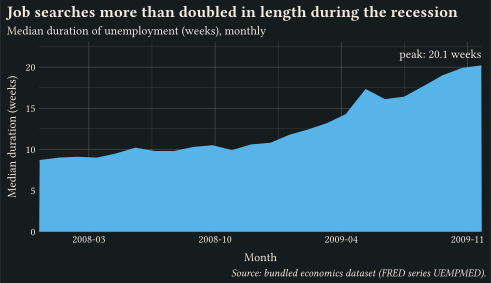
)// Showcase: area chart of unemployment duration with the peak annotated;
// areas keep their zero baseline and the extremum gets named.
#import "@preview/gribouille:dev": *
#set page(width: auto, height: auto, margin: 0cm)
#let accent = okabe-ito.at(1)
#let peak = slice-max(economics, "uempmed").first()
#plot(
data: economics,
mapping: aes(x: "date", y: "uempmed"),
layers: (
geom-area(fill: accent, alpha: 0.35),
geom-line(stroke: 1.4pt, colour: accent),
annotate(
"text",
x: peak.date,
y: peak.uempmed,
label: "peak: " + str(peak.uempmed) + " weeks",
anchor: "south-east",
nudge-y: 0.15cm,
size: 9pt,
),
),
scales: scales(
x: scale-date(date-format: "[year]-[month repr:numerical]", expand: (0, 0)),
y: scale-continuous(limits: (0, 22)),
),
labels: labels(
title: "Job searches more than doubled in length during the recession",
subtitle: "Median duration of unemployment (weeks), monthly",
x: "Month",
y: "Median duration (weeks)",
caption: "Source: bundled economics dataset (FRED series UEMPMED).",
),
theme: theme-minimal(),
width: 13cm,
height: 7.5cm,
)// Line plus point layers sharing discrete colour and fill mappings.
#import "@preview/gribouille:dev": *
#set page(width: auto, height: auto, margin: 0cm)
#let trend = (
(month: 1, sales: 12, region: "north"),
(month: 2, sales: 15, region: "north"),
(month: 3, sales: 14, region: "north"),
(month: 4, sales: 18, region: "north"),
(month: 5, sales: 22, region: "north"),
(month: 6, sales: 25, region: "north"),
(month: 1, sales: 8, region: "south"),
(month: 2, sales: 11, region: "south"),
(month: 3, sales: 13, region: "south"),
(month: 4, sales: 12, region: "south"),
(month: 5, sales: 16, region: "south"),
(month: 6, sales: 20, region: "south"),
(month: 1, sales: 5, region: "east"),
(month: 2, sales: 7, region: "east"),
(month: 3, sales: 9, region: "east"),
(month: 4, sales: 12, region: "east"),
(month: 5, sales: 14, region: "east"),
(month: 6, sales: 17, region: "east"),
)
#plot(
data: trend,
mapping: aes(x: "month", y: "sales", colour: "region", fill: "region"),
layers: (
geom-line(stroke: 1pt),
geom-point(size: 3pt),
),
scales: scales(x: scale-continuous(breaks: (1, 2, 3, 4, 5, 6))),
labels: labels(
title: "Monthly Sales by Region",
subtitle: "Line and point layers share a single colour mapping",
x: "Month",
y: "Sales",
colour: "Region",
fill: "Region",
),
theme: theme-minimal(),
width: 12cm,
height: 9cm,
)// geom-area: filled polygon from y = 0 up to y along x.
#import "@preview/gribouille:dev": *
#set page(width: auto, height: auto, margin: 0cm)
#plot(
data: economics,
mapping: aes(x: "date", y: "unemploy"),
layers: (
geom-area(alpha: 0.35, fill: rgb("#1f77b4")),
geom-line(stroke: 1pt, colour: rgb("#1f77b4")),
),
scales: scales(x: scale-date(expand: (0, 0)), y: scale-continuous(labels: format-comma())),
labels: labels(
title: "Monthly US Unemployment, 2008-2009",
subtitle: "Area under the curve highlights the climb during the recession",
x: "Month",
y: "Unemployed (thousands)",
caption: "Source: bundled economics dataset",
),
theme: theme-minimal(),
width: 12cm,
height: 9cm,
)// geom-step: stair-step interpolation between consecutive points.
#import "@preview/gribouille:dev": *
#set page(width: auto, height: auto, margin: 0cm)
#let releases = (
(version: 1, year: 2018, users: 120),
(version: 2, year: 2019, users: 220),
(version: 3, year: 2020, users: 360),
(version: 4, year: 2021, users: 410),
(version: 5, year: 2022, users: 580),
(version: 6, year: 2023, users: 760),
(version: 7, year: 2024, users: 940),
)
#plot(
data: releases,
mapping: aes(x: "year", y: "users"),
layers: (
geom-step(stroke: 1.2pt, direction: "hv", colour: rgb("#1f77b4")),
geom-point(size: 3pt, fill: rgb("#1f77b4")),
),
scales: scales(x: scale-continuous(breaks: (2018, 2020, 2022, 2024)), y: scale-continuous(labels: format-comma())),
labels: labels(
title: "Active Users at Each Release",
subtitle: "Step interpolation reflects discrete release events",
x: "Year",
y: "Active Users",
),
theme: theme-minimal(),
width: 12cm,
height: 9cm,
)// geom-path: connects rows in input order, not sorted by x.
#import "@preview/gribouille:dev": *
#set page(width: auto, height: auto, margin: 0cm)
#let spiral = ()
#for i in range(0, 60) {
let t = i * 0.2
let r = 3 + t * 0.05
spiral.push((x: calc.cos(t) * r, y: calc.sin(t) * r, t: t))
}
#plot(
data: spiral,
mapping: aes(x: "x", y: "y", colour: "t"),
layers: (geom-path(stroke: 1.2pt),),
scales: scales(colour: scale-viridis-c(), x: scale-continuous(breaks: (-6, -3, 0, 3, 6)), y: scale-continuous(breaks: (-6, -3, 0, 3, 6))),
coord: coord-fixed(),
labels: labels(
title: "Geom-Path Follows Row Order",
subtitle: "Colour encodes traversal time along the spiral",
x: "X",
y: "Y",
colour: "t",
),
theme: theme-minimal(),
width: 12cm,
height: 9cm,
)// streamgraph: stacked geom-area on a silhouette baseline (ThemeRiver).
#import "@preview/gribouille:dev": *
#set page(width: auto, height: auto, margin: 0cm)
#let genres = ("Drama", "Comedy", "Action", "Sci-Fi")
#let releases = ()
#for (gi, genre) in genres.enumerate() {
for month in range(0, 24) {
let wave = calc.sin(month * 0.4 + gi * 1.3) * (1.2 + gi * 0.4)
let base = 4 + gi * 0.6 + month * 0.05
releases.push((month: month, titles: base + wave, genre: genre))
}
}
#plot(
data: releases,
mapping: aes(x: "month", y: "titles", fill: "genre"),
layers: (
geom-area(position: position-stack(offset: "silhouette"), alpha: 0.85),
),
scales: scales(fill: scale-okabe-ito(name: "Genre")),
labels: labels(
title: "Streaming Releases by Genre",
subtitle: "Silhouette baseline centres each stack on zero",
x: "Month",
caption: "Band thickness encodes titles released per month",
),
guides: guides(y: none),
theme: theme-minimal(),
width: 13cm,
height: 7cm,
)// bump-chart: rank trajectories eased through sigmoid connectors.
#import "@preview/gribouille:dev": *
#set page(width: auto, height: auto, margin: 0cm)
#let ranks = (
Alpha: (1, 1, 2, 3, 2, 1),
Boreal: (2, 3, 1, 1, 1, 2),
Cirrus: (3, 2, 4, 2, 3, 4),
Delta: (4, 4, 3, 4, 4, 3),
)
#let standings = ()
#for (team, rs) in ranks {
for (i, r) in rs.enumerate() {
standings.push((round: i + 1, rank: r, team: team))
}
}
#plot(
data: standings,
mapping: aes(x: "round", y: "rank", colour: "team", fill: "team"),
layers: (
geom-line(stat: stat-connect(connection: "sigmoid"), stroke: 2pt),
geom-point(size: 4pt,),
),
scales: scales(
x: scale-continuous(breaks: (1, 2, 3, 4, 5, 6)),
y: scale-continuous(transform: "reverse", breaks: (1, 2, 3, 4)),
colour: scale-okabe-ito(name: "Team"),
fill: scale-okabe-ito(name: "Team"),
),
labels: labels(
title: "Season Standings",
subtitle: "Sigmoid connectors ease each team between ranks, rank 1 on top",
x: "Round",
y: "Rank",
),
theme: theme-minimal(),
width: 13cm,
height: 7cm,
)// diff-forecast: shade the band between forecast and actuals by which leads.
#import "@preview/gribouille:dev": *
#set page(width: auto, height: auto, margin: 0cm)
#let series = range(0, 25).map(i => {
let x = i * 0.5
(
week: x,
forecast: 100 + x * 4,
actual: 100 + x * 3.6 + calc.sin(x * 0.9) * 12,
)
})
#plot(
data: series,
mapping: aes(x: "week"),
layers: (
geom-ribbon(
mapping: aes(ymin: "forecast", ymax: "actual", fill: after-stat("_sign")),
stat: stat-difference(levels: ("above forecast", "below forecast")),
alpha: 0.55,
),
geom-line(mapping: aes(y: "forecast"), stroke: 1.3pt),
geom-line(mapping: aes(y: "actual"), stroke: 1.3pt, linetype: "dashed"),
),
scales: scales(fill: scale-okabe-ito()),
labels: labels(
title: "Sales vs. Forecast",
subtitle: "Band shaded by whether actuals ran above or below forecast",
x: "Week",
y: "Units (thousands)",
fill: "Actuals vs. forecast",
),
theme: theme-minimal(),
width: 13cm,
height: 7cm,
)// stat-connect inserts intermediate vertices between consecutive points.
// Two layers compare "hv" (default, step) and "mid" (midpoint corner)
// connection modes against the same dataset.
#import "@preview/gribouille:dev": *
#set page(width: auto, height: auto, margin: 0cm)
#let d = range(0, 8).map(i => (x: i, y: calc.rem(i * 3 + 2, 5)))
#plot(
data: d,
mapping: aes(x: "x", y: "y"),
layers: (
geom-path(
stat: stat-connect(connection: "hv"),
stroke: 1pt,
colour: rgb("#1f77b4"),
),
geom-path(
stat: stat-connect(connection: "mid"),
stroke: 1pt,
colour: rgb("#ff7f0e"),
),
geom-point(size: 3pt),
),
labels: labels(title: "Stat-Connect: Hv (blue) vs Mid (orange)"),
theme: theme-minimal(),
width: 12cm,
height: 9cm,
)// stat-align resamples each group onto a shared x-grid so stacked areas
// share clean vertices even when the inputs use mismatched x values.
// Side by side: the raw `stat: "identity"` overlap versus the aligned stack.
#import "@preview/gribouille:dev": *
#set page(width: auto, height: auto, margin: 0cm)
#let d = (
(x: 0, y: 1, k: "a"),
(x: 2, y: 3, k: "a"),
(x: 4, y: 2, k: "a"),
(x: 6, y: 1, k: "a"),
(x: 1, y: 2, k: "b"),
(x: 3, y: 1, k: "b"),
(x: 5, y: 3, k: "b"),
(x: 7, y: 2, k: "b"),
)
#let panel(stat, subtitle) = plot(
data: d,
mapping: aes(x: "x", y: "y", fill: "k"),
layers: (geom-area(stat: stat, alpha: 0.7),),
labels: labels(subtitle: subtitle),
theme: theme-minimal(),
width: 12cm,
height: 8cm,
)
#grid(
columns: 1,
row-gutter: 1em,
panel("identity", "stat: \"identity\" (groups overlap)"),
panel("align", "stat: \"align\" (shared x-grid)"),
)// scale-date parses ISO date strings on x and renders year-month tick labels.
#import "@preview/gribouille:dev": *
#set page(width: auto, height: auto, margin: 0cm)
#plot(
data: economics,
mapping: aes(x: "date", y: "psavert"),
layers: (
geom-line(stroke: 1.2pt, colour: rgb("#1f77b4")),
geom-point(size: 2pt, fill: rgb("#1f77b4")),
),
scales: scales(x: scale-date(date-format: "[year]-[month repr:numerical]")),
labels: labels(
title: "US Personal Savings Rate During the Recession",
subtitle: "Monthly observations, 2008-2009",
x: "Month",
y: "Personal Savings Rate (%)",
caption: "Source: bundled economics dataset",
),
theme: theme-minimal(),
width: 12cm,
height: 9cm,
)