Examples
Set project.type: atelier in your _quarto.yml, provide a _brand.yml, then author pages as usual. The sections below exercise the elements the project type styles for dark mode and accessibility; toggle the colour scheme while scrolling to see each one hold up.
Code
Inline code, a highlighted block:
quarto add mcanouil/quarto-atelier@0.10.5and a plain block with no language:
no language, still framed and styledHover a block: the copy button takes the palette accent instead of Quarto’s fixed grey, in both schemes.
Tabset
Content of the first tab.
Content of the second tab.
Typography
Headings carry a slight positive tracking from --atelier-heading-letter-spacing. Override it in a project stylesheet, for example with a small negative value for a tight serif.
Add that stylesheet under format.atelier-html.theme, not format.html, which would replace the project type’s format and drop the theme along with the bundled scripts.
A nested heading
Lorem ipsum dolor sit amet, consectetur adipiscing elit. Duis sagittis posuere ligula sit amet lacinia. Duis dignissim pellentesque magna, rhoncus congue sapien finibus mollis. Ut eu sem laoreet, vehicula ipsum in, convallis erat. Vestibulum magna sem, blandit pulvinar augue sit amet, auctor malesuada sapien. Nullam faucibus leo eget eros hendrerit, non laoreet ipsum lacinia. Curabitur cursus diam elit, non tempus ante volutpat a. Quisque hendrerit blandit purus non fringilla. Integer sit amet elit viverra ante dapibus semper. Vestibulum viverra rutrum enim, at luctus enim posuere eu. Orci varius natoque penatibus et magnis dis parturient montes, nascetur ridiculus mus.
Framed embeds
.embed-art frames an embedded document or an image as a tilted card, centred on its own.
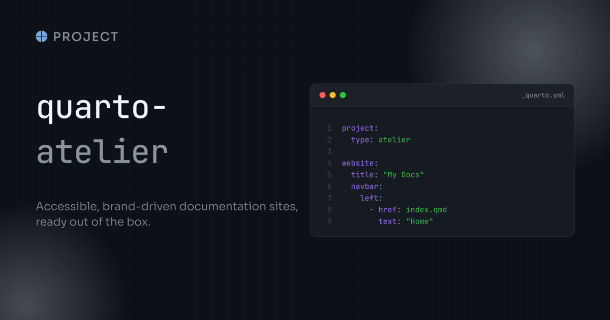
The card here is the site’s own social card, framed at its own dimensions: the frame carries no shape of its own, so the padding is the same on all four sides whatever it holds. Give an <embed> a width and a height to size it, and override the --atelier-embed-art-* properties in a project stylesheet to change the fallback or the tilt.
Table of contents
Scroll this page and watch the table of contents on the right: the active entry and its left border take the palette accent.
Tooltips
Hover the colour-scheme toggle, or the site title, for a themed tooltip on the palette surface rather than the browser default. The named links beside them show no tooltip on purpose: an item with visible text is given an aria-label instead, because repeating the label would announce it twice to a screen reader.
Dates
This page is dated with an ordinal suffix rendered by the bundled script.
Everything above, in both schemes
| Feature | Light | Dark |
|---|---|---|
| Code surface | ✓ | ✓ |
| Copy button | ✓ | ✓ |
| Tabsets | ✓ | ✓ |
| Scrollbars | ✓ | ✓ |
| Sidebar and TOC | ✓ | ✓ |
| Footer | ✓ | ✓ |
| Announcement banner | ✓ | ✓ |