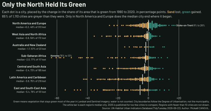
// Gribouille comes from the typst-render preamble (assets/typst/_preamble.typ),
// so this file does not import it.

// One row per city and year: the share of the city's area that stays green
// most of the year, read from satellite imagery. Rows without a city code are
// UN-Habitat's regional and global averages, not cities.
// Source: data/urban.csv (TidyTuesday 2026-09-22).
#let records = csv("data/urban.csv", row-type: dictionary)

// 2025 is published for too few cities to compare, so the span is the last
// year every city has.
#let first-year = "1990"
#let last-year = "2020"

#let cities = {
  let found = (:)
  for row in records {
    if row.cityCode == "NA" or row.year not in (first-year, last-year) { continue }
    let city = found.at(row.cityCode, default: (
      city: row.cityName,
      region: row.sdgRegion,
    ))
    city.insert("y" + row.year, float(row.averageShareOfGreenAreaInCityUrbanAreaPct))
    found.insert(row.cityCode, city)
  }
  found
    .values()
    .map(c => (..c, change: c.at("y" + last-year) - c.at("y" + first-year)))
}

// A region with a handful of cities has no swarm to draw, so it is left out
// and the caption says so.
#let min-cities = 10

// The catalogue's region names, shortened where they do not fit a row label.
#let display = (
  "Northern America and Europe": "North America and Europe",
  "Western Asia and Northern Africa": "West Asia and North Africa",
  "Central Asia and Southern Asia": "Central and South Asia",
  "Latin America and the Caribbean": "Latin America and Caribbean",
  "Eastern Asia and South-eastern Asia": "East and South-East Asia",
)

#let regions = {
  cities
    .map(c => c.region)
    .dedup()
    .map(name => {
      let mine = cities.filter(c => c.region == name)
      (
        region: name,
        n: mine.len(),
        median: median(mine.map(c => c.change)).y,
        lost: mine.filter(c => c.change < 0).len() / mine.len(),
      )
    })
    .filter(r => r.n >= min-cities)
    .sorted(key: r => r.median)
}
#let kept = regions.map(r => r.region)

#let drawn = cities.filter(c => c.region in kept)
#let lost-overall = drawn.filter(c => c.change < 0).len() / drawn.len()

// The claim the title makes: one region's typical city ends where it began,
// and every other region's typical city ends greyer.
#let north = regions.last()
#assert(
  north.region == "Northern America and Europe" and north.median > 0,
  message: "North America and Europe is no longer the only region whose median city gained",
)
#assert(
  regions.slice(0, -1).all(r => r.median < 0),
  message: "another region's median city now gains green area",
)

// Night from orbit: a near-black ground, with vegetation and bare soil in the
// colours a false-colour satellite image gives them. The figure keeps its
// colours on the light and the dark site theme alike.
#let night = rgb("#101613")
#let ink = rgb("#e6e9e2")
#let soil = rgb("#e3b061")
#let canopy = rgb("#3a9a8a")

// Barlow was drawn from the lettering of road signs and number plates, the
// type a city is read in. It is vendored in assets/fonts.
#let body-font = "Barlow"

// A change always carries its sign, with a true minus.
#let signed(v, digits: auto) = {
  let sign = if v > 0 { "+" } else if v < 0 { "\u{2212}" } else { "" }
  sign + format-number(digits: digits)(calc.abs(v))
}
#let share-label = format-number(digits: 0, suffix: "%")

// Rows are numbered from the bottom, so the region that lost most sits at the
// foot and North America and Europe at the top.
#let row-of = (:)
#for (i, r) in regions.enumerate() { row-of.insert(r.region, i + 1) }

// Each region is a swarm along its row, stacked here rather than with
// geom-beeswarm, which on a flipped or discrete axis draws each swarm under the
// wrong row label in this version of gribouille. Cities are binned by change, one
// percentage point to a bin, and the cities in a bin stack outwards from the
// row's centre line, alternately above and below, at the bin's centre. One step
// is shared by every row, so a taller stack means more cities, whichever region
// it is in.
#let bin-of(c) = calc.floor(c.change)

#let stacks = {
  let found = (:)
  for c in drawn {
    let key = c.region + "|" + str(bin-of(c))
    found.insert(key, found.at(key, default: ()) + (c,))
  }
  found
}
#let step = 0.8 / calc.max(..stacks.values().map(s => s.len()))

// A city is sand when it lost green area and green when it gained, in the same
// two colours the subtitle names. How much it changed is already its position.
#let points = {
  stacks
    .values()
    .map(stack => {
      stack
        .sorted(key: c => c.change)
        .enumerate()
        .map(((k, c)) => {
          let side = if calc.even(k) { 1 } else { -1 }
          (
            ..c,
            x: bin-of(c) + 0.5,
            y: row-of.at(c.region) + side * calc.quo(k + 1, 2) * step,
            paint: if c.change < 0 { soil } else { canopy },
          )
        })
    })
    .flatten()
}

// The median city of each region, as a bar across its row. The bar sits at the
// exact median, while each dot sits at the centre of its one-point bin.
#let bar-half = 0.46
#let medians = regions.map(r => (
  x: r.median,
  xend: r.median,
  y: row-of.at(r.region) - bar-half,
  yend: row-of.at(r.region) + bar-half,
))

// The panel reaches past the data on both sides: on the left for the row
// labels and on the right for the callout on the city that gained most. Both
// margins are a share of the data's span, so they keep their width in the
// figure if the data changes.
#let changes = drawn.map(c => c.change)
#let lo = calc.min(..changes)
#let hi = calc.max(..changes)
#let span = hi - lo
#let breaks = range(int(calc.ceil(lo / 20)) * 20, int(calc.ceil(hi)) + 20, step: 20)

// Each region is named on the left with its median and the share of its cities
// that lost ground, so the row reads without the axis.
#let names = regions.map(r => (
  x: lo - 0.045 * span,
  y: row-of.at(r.region),
  content: align(right, text(font: body-font, size: 7pt, fill: ink)[
    #text(weight: "semibold")[#display.at(r.region, default: r.region)] \
    #text(size: 6pt, fill: ink.transparentize(30%))[median #signed(r.median, digits: 1), #format-percent()(r.lost) of #r.n lost]
  ]),
))

// The two cities at either end of the range, named where they sit.
#let by-change = points.sorted(key: c => c.change)
#let callout(c, dx, dy) = (
  x: c.x + dx,
  y: c.y + dy,
  content: text(font: body-font, size: 6pt, fill: ink.transparentize(15%))[
    #text(weight: "semibold")[#c.city.split(" (").first()]
    #share-label(c.at("y" + first-year)) to #share-label(c.at("y" + last-year))
  ],
)

#plot(
  data: points,
  mapping: aes(x: "x", y: "y"),
  layers: (
    geom-vline(
      data: breaks.filter(b => b != 0).map(b => (b: b)),
      mapping: aes(xintercept: "b"),
      inherit-aes: false,
      colour: ink,
      alpha: 0.1,
      stroke: 0.4pt,
    ),
    geom-vline(xintercept: 0, colour: ink, alpha: 0.4, stroke: 0.6pt),
    geom-point(
      mapping: aes(colour: "paint", fill: "paint"),
      shape: "circle",
      size: 1.3pt,
      stroke: 0pt,
    ),
    geom-segment(
      data: medians,
      mapping: aes(xend: "xend", yend: "yend"),
      colour: ink,
      stroke: 1.4pt,
    ),
    geom-typst(
      data: names,
      mapping: aes(label: "content"),
      anchor: "east",
    ),
    geom-typst(
      data: (callout(by-change.first(), -0.6, 0.1),),
      mapping: aes(label: "content"),
      anchor: "south-west",
    ),
    geom-typst(
      data: (callout(by-change.last(), 0.8, 0),),
      mapping: aes(label: "content"),
      anchor: "west",
    ),
  ),
  scales: scales(
    x: scale-continuous(
      limits: (lo - 0.4 * span, hi + 0.27 * span),
      breaks: breaks,
      labels: signed,
      expand: (0%, 0%),
    ),
    y: scale-continuous(limits: (0.45, regions.len() + 0.55), breaks: (), expand: (0%, 0%)),
    colour: scale-identity(),
    fill: scale-identity(),
  ),
  guides: guides(default: none),
  labels: labels(
    title: "Only the North Held Its Green",
    subtitle: [
      Each dot is a city, placed by the change in the share of its area that is green from #first-year to #last-year, in percentage points. #text(fill: soil, weight: "semibold")[Sand] lost, #text(fill: canopy, weight: "semibold")[green] gained. \
      #format-percent()(lost-overall) of #format-comma()(drawn.len()) cities are greyer than they were. Only in North America and Europe does the median city end where it began.
    ],
    caption: [
      Green means vegetation that stays green most of the year in Landsat and Sentinel imagery; water is not counted. City boundaries follow the Degree of Urbanisation, not the municipality. \
      The white bar is each region's median city. 2025 is published for too few cities to compare. Regions with fewer than #min-cities cities are not drawn. \
      Source: UN-Habitat Urban Indicators Database (TidyTuesday 2026-09-22). Author: #link("https://mickael.canouil.fr")[Mickaël CANOUIL].
    ],
    x: none,
    y: none,
  ),
  theme: theme-minimal(
    ink: ink,
    paper: night,
    plot-title: element-text(font: body-font, size: 16pt, weight: "bold", colour: ink),
    plot-subtitle: element-text(font: body-font, size: 8pt, colour: ink),
    plot-caption: element-text(font: body-font, size: 6pt, colour: ink.transparentize(30%)),
    axis-text: element-text(font: body-font, size: 7pt, colour: ink.transparentize(20%)),
    panel-grid: element-blank(),
  ),
  width: auto,
  height: auto,
)