Show a trend inside a cell
Sparklines and bars sharing one scale down the column.
A column of series is a column of shapes, and a reader compares them by eye. format-nanoplot draws each cell through whichever renderer is passed, and the domain is shared down the column so the comparison means something.
// In-cell nanoplots drawn with native primitives, sharing one domain down the
// column so the sparklines can be compared. Cash must read as flat: scaled per
// cell, its small wobble would draw exactly like real movement.
//
// A plot is taller than the figures beside it. The theme's
// `cell-vertical-align` places the shorter cells in each row.

#import "@preview/keisen:0.0.1": *

#set page(width: auto, height: auto, margin: 0.5cm)
#set text(font: "Libertinus Serif", size: 10pt)

#let trends = (
  (1.0, 1.2, 1.1, 1.4, 1.8, 2.1),
  (2.0, 1.8, 1.6, 1.5, 1.2, 0.9),
  (1.5, 1.5, 1.6, 1.5, 1.7, 1.6),
)

#display-table(
  (
    asset: ("Equities", "Bonds", "Cash"),
    trend: trends,
    volume: trends,
    weight: (0.62, 0.31, 0.07),
  ),
  table-header(title: [Portfolio], subtitle: [Twelve-month trends]),
  table-stub(rowname: "asset", label: [Asset]),
  columns-label(trend: [Trend], volume: [Volume], weight: [Weight]),
  format-nanoplot("trend", plot: nanoplot-line, width: 6em, height: 1em, baseline: 25%),
  format-nanoplot("volume", plot: nanoplot-bar, width: 6em, height: 1em, baseline: 25%),
  format-percent("weight", decimals: 1),
  table-options(cell-vertical-align: horizon),
  table-source-note([Source: portfolio ledger.]),
)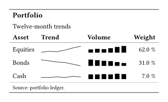
Cash reads as flat because all three rows share one scale, taken from the column itself rather than passed in. Scaled per cell, its small wobble would draw exactly like the others’ real movement, which is how a nanoplot lies.
A plot is taller than the figures beside it, so cell-vertical-align decides where the short cells sit. Typst puts a table cell at the top of its row, and horizon centres each one against the tallest cell beside it.
The two renderers differ on where they measure from. nanoplot-bar measures from zero, since a bar drawn from 5 to 10 makes a small difference look like the whole quantity. nanoplot-line scales to the domain, since a trend is about shape rather than magnitude.
format-nanoplot takes any (numbers, domain: none, width: .., height: ..) => content, so a renderer written in the document works exactly as well as the three that ship. A nanoplot column holds readings rather than quantities, so it cannot be summarised, and columns: auto leaves it out.