Recipes
Common chart types and effects built by composing layers and native Typst, no dedicated geom required.
Gribouille is pure Typst, so a plot is ordinary content: you can filter, layer, place, and arrange it with the language you already have. Many chart types that ship as dedicated geoms in R extension packages are, underneath, a two-layer composition or a place() call. This page collects those compositions as ready-to-adapt recipes. Each one uses only the bundled datasets (mpg, penguins) and stable API.
Lollipop
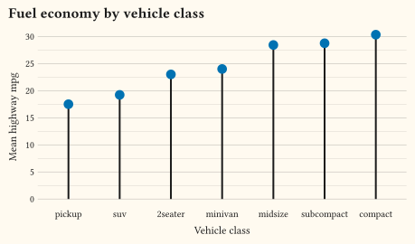
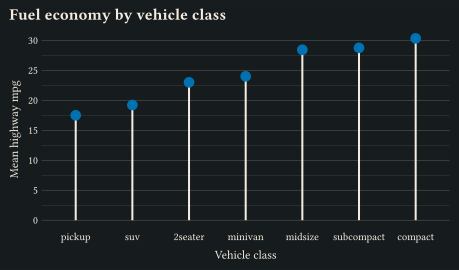
A lollipop chart is a bar chart with the ink budget of a point: one geom-segment stem from zero plus one geom-point head. Summarise the data first with plain Typst array methods. Add a zero column so the stem has a start row to map. Because the segment layer maps y: "zero", the value 0 trains the y scale and the plot includes the baseline automatically. Discrete scales sort their levels alphabetically. Pass the sorted classes as limits: to put the categories in value order.
#let mean-hwy = {
  let classes = mpg.map(r => r.class).dedup()
  let means = classes.map(c => {
    let rows = mpg.filter(r => r.class == c)
    (class: c, hwy: rows.map(r => r.hwy).sum() / rows.len(), zero: 0)
  })
  means.sorted(key: r => r.hwy)
}

#plot(
  data: mean-hwy,
  mapping: aes(x: "class", y: "hwy"),
  layers: (
    geom-segment(
      mapping: aes(y: "zero", xend: "class", yend: "hwy"),
      stroke: 1.5pt,
    ),
    geom-point(size: 4pt, fill: okabe-ito.at(4)),
  ),
  scales: scales(x: scale-discrete(limits: mean-hwy.map(r => r.class))),
  labels: labels(
    title: "Fuel economy by vehicle class",
    x: "Vehicle class",
    y: "Mean highway mpg",
  ),
  width: 12cm,
  height: 7cm,
)
Dumbbell
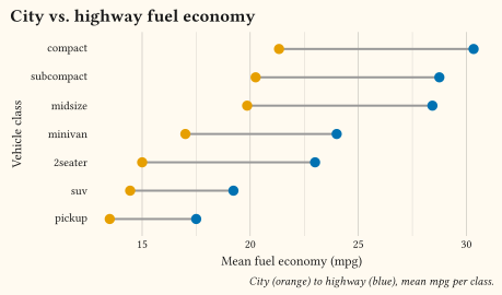
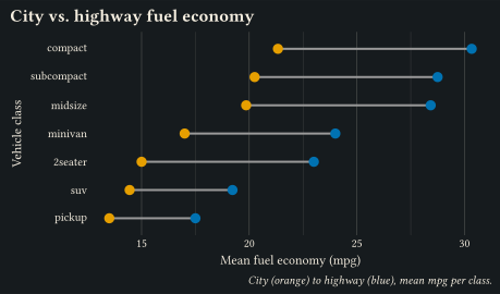
A dumbbell chart shows two values per category, joined by a connector. It is the same segment-plus-points idea, but the segment spans the two values instead of dropping to zero. Fixed colours identify the two ends, so the plot needs no legend. Name the two ends in the caption instead.
#let economy = {
  let classes = mpg.map(r => r.class).dedup()
  let means = classes.map(c => {
    let rows = mpg.filter(r => r.class == c)
    (
      class: c,
      cty: rows.map(r => r.cty).sum() / rows.len(),
      hwy: rows.map(r => r.hwy).sum() / rows.len(),
    )
  })
  means.sorted(key: r => r.hwy)
}

#plot(
  data: economy,
  mapping: aes(y: "class"),
  layers: (
    geom-segment(
      mapping: aes(x: "cty", xend: "hwy", yend: "class"),
      stroke: 1.5pt,
      colour: luma(60%),
    ),
    geom-point(mapping: aes(x: "cty"), size: 3.5pt, fill: okabe-ito.at(0)),
    geom-point(mapping: aes(x: "hwy"), size: 3.5pt, fill: okabe-ito.at(4)),
  ),
  scales: scales(y: scale-discrete(limits: economy.map(r => r.class))),
  labels: labels(
    title: "City vs. highway fuel economy",
    caption: "City (orange) to highway (blue), mean mpg per class.",
    x: "Mean fuel economy (mpg)",
    y: "Vehicle class",
  ),
  width: 12cm,
  height: 7cm,
)
Highlighting a group
To make one group pop, draw everything in a muted grey first, then redraw the group of interest on top. A layer’s data: accepts a function applied to the plot data, so the highlight layer filters inline without preparing a second dataset.
#plot(
  data: penguins,
  mapping: aes(x: "flipper-len", y: "body-mass"),
  layers: (
    geom-point(colour: luma(70%), size: 2pt),
    geom-point(
      data: rows => rows.filter(r => r.species == "Chinstrap"),
      colour: okabe-ito.at(5),
      size: 2.5pt,
    ),
    annotate(
      "text",
      x: 196,
      y: 4950,
      label: "Chinstrap",
      colour: okabe-ito.at(5),
    ),
  ),
  labels: labels(
    title: "Chinstrap sits between the other two species",
    x: "Flipper length (mm)",
    y: "Body mass (g)",
  ),
  width: 12cm,
  height: 7.5cm,
)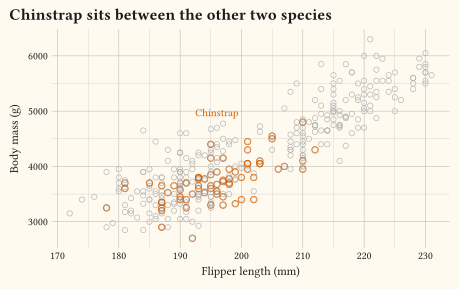
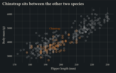
The base layer keeps every point in the scales, so the highlighted group sits in its true context rather than on a rescaled panel.
Zoom inset
To magnify a crowded region, render the same plot twice. The first render is full, with an annotate rectangle marking the window. The second cuts the scale limits to that window. The inset is ordinary content, so native place() pins it in a corner. A plain box gives it a backing card. On tinted paper, swap white for your page colour.
#let window = (x: (188, 200), y: (3200, 4300))

#let inset = plot(
  data: penguins,
  mapping: aes(x: "flipper-len", y: "body-mass", colour: "species"),
  layers: (geom-point(size: 2.5pt),),
  scales: scales(
    x: scale-continuous(limits: window.x),
    y: scale-continuous(limits: window.y),
  ),
  guides: guides(colour: none),
  labels: labels(x: none, y: none),
  theme: theme-minimal(),
  width: 4.6cm,
  height: 3.4cm,
)

#box({
  plot(
    data: penguins,
    mapping: aes(x: "flipper-len", y: "body-mass", colour: "species"),
    layers: (
      geom-point(size: 2pt),
      annotate(
        "rect",
        xmin: window.x.at(0),
        xmax: window.x.at(1),
        ymin: window.y.at(0),
        ymax: window.y.at(1),
        fill: none,
        stroke: 0.8pt + luma(40%),
      ),
    ),
    labels: labels(
      title: "Where Adelie and Chinstrap overlap",
      x: "Flipper length (mm)",
      y: "Body mass (g)",
    ),
    width: 13cm,
    height: 9cm,
  )
  place(
    top + left,
    dx: 1.9cm,
    dy: 1.4cm,
    box(
      fill: white,
      stroke: 0.5pt + luma(60%),
      inset: 2pt,
      inset,
    ),
  )
})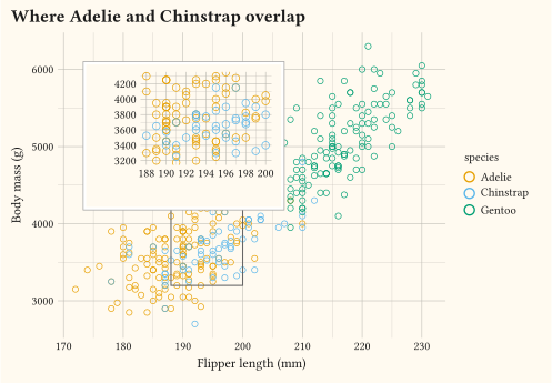
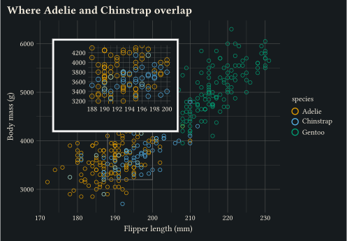
The default out-of-range handling drops rows outside the limits, which is exactly the zoom semantics the inset wants. To pin content at a data position instead of a page corner, use annotate("typst", x: …, y: …, label: …). It accepts any content block, including a whole plot.
Marginal distribution
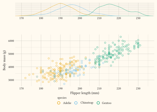
A marginal panel is a compose stack: a short density panel above the scatter. align-panels: true lines the two x axes up, and heights sets the panel proportions. Both panels share the same explicit x limits so their axes cover the same range. The top panel hides its legend, and the scatter moves its legend to the bottom. A right-hand legend would otherwise narrow one row against the other.
#let shared-x = scale-continuous(limits: (170, 235))
#let top = defer(
  plot,
  data: penguins,
  mapping: aes(x: "flipper-len", colour: "species"),
  layers: (geom-density(),),
  scales: scales(x: shared-x),
  guides: guides(colour: none),
  labels: labels(x: none, y: none),
  theme: theme-minimal(axis-text-y: element-blank()),
)
#let scatter = defer(
  plot,
  data: penguins,
  mapping: aes(x: "flipper-len", y: "body-mass", colour: "species"),
  layers: (geom-point(size: 2pt),),
  scales: scales(x: shared-x),
  guides: guides(colour: guide-legend(position: "bottom")),
  labels: labels(x: "Flipper length (mm)", y: "Body mass (g)"),
)

#box(
  width: 14cm,
  height: 10cm,
  compose(
    top,
    scatter,
    columns: 1,
    heights: (1, 3),
    align-panels: true,
  ),
)
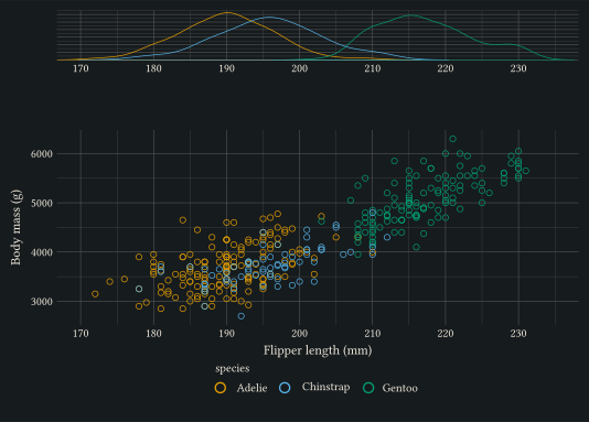
The same pattern gives a right-hand margin: put a geom-violin panel with a constant x beside the scatter in a two-column compose.
Irregular layouts
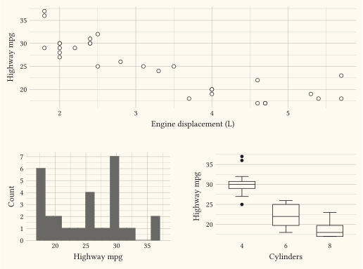
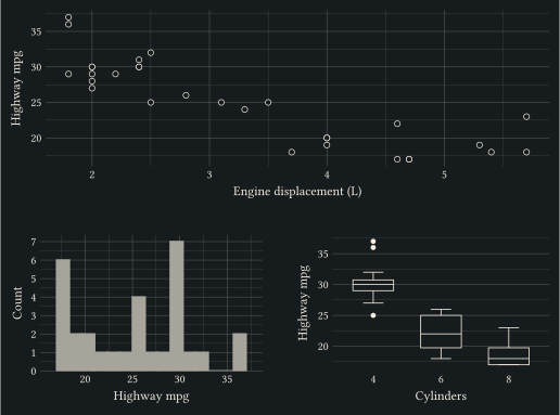
compose earns its keep when panels share legends or need aligned axes. For everything else, plots are content and native grid() already does irregular layouts, spanning cells, and empty spacer cells.
#let wide = plot(
  data: mpg,
  mapping: aes(x: "displ", y: "hwy"),
  layers: (geom-point(size: 2pt),),
  labels: labels(x: "Engine displacement (L)", y: "Highway mpg"),
  width: 13.5cm,
  height: 5cm,
)
#let left = plot(
  data: mpg,
  mapping: aes(x: "hwy"),
  layers: (geom-histogram(bins: 15),),
  labels: labels(x: "Highway mpg", y: "Count"),
  width: 6.5cm,
  height: 4.5cm,
)
#let right = plot(
  data: mpg,
  mapping: aes(x: as-factor("cyl"), y: "hwy"),
  layers: (geom-boxplot(),),
  labels: labels(x: "Cylinders", y: "Highway mpg"),
  width: 6.5cm,
  height: 4.5cm,
)

#grid(
  columns: (auto, auto),
  gutter: 0.5cm,
  grid.cell(colspan: 2, wide),
  left,
  right,
)
Line casing
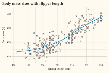
A trend line crossing a dense scatter reads better with a casing. Draw the same line first in the paper colour at a heavier weight. It then carries a thin halo that separates it from the points underneath. from-theme keeps the casing correct on any background.
#plot(
  data: penguins,
  mapping: aes(x: "flipper-len", y: "body-mass"),
  layers: (
    geom-point(size: 2pt, alpha: 0.6),
    geom-smooth(
      method: "loess",
      se: false,
      stroke: 4pt,
      mapping: aes(colour: from-theme("paper")),
    ),
    geom-smooth(method: "loess", se: false, stroke: 1.5pt, colour: okabe-ito.at(4)),
  ),
  labels: labels(
    title: "Body mass rises with flipper length",
    x: "Flipper length (mm)",
    y: "Body mass (g)",
  ),
  width: 12cm,
  height: 8cm,
)
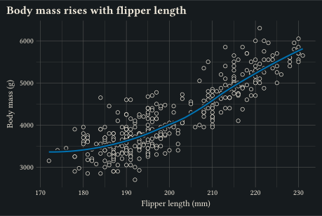
The same two-layer trick de-emphasises context. Draw background layers with a low alpha or a muted fixed colour. Reserve full saturation for the layer that carries the message.
See also
composeanddeferfor shared legends, tags, and aligned panels.annotatefor one-off marks, includingclip: falseoverlays that can leave the panel.geom-typstfor arbitrary Typst content pinned at data coordinates.- Theming for the
theme()keys used to mute or blank chrome in these recipes.