Wrangling data
Shape a dataset for #plot: coerce, summarise, reshape, and join a row-store with native Typst and the wrangle verbs.
Gribouille reads a dataset as a row-store: an array of dictionaries, one dictionary per row, with the column names as shared keys. That is exactly the shape csv("file.csv", row-type: dictionary) returns, and the shape #plot expects. Because a row-store is an ordinary Typst array, most preparation uses array methods you already have. The wrangle verbs fill the three gaps native Typst leaves open: grouped aggregation, reshaping, and joining. Every wrangle verb accepts a row-store (or a column-store dictionary of arrays) and returns a row-store, so its result feeds #plot with no adapter.
The wrangle verbs are experimental: their interfaces can change without notice while the design settles. They can also move into a dedicated Typst data-wrangling package in the future. Native Typst array methods and the plotting API remain stable.
Each example below uses only the bundled datasets (mpg, penguins).
Native Typst or a verb?
Reach for a wrangle verb only when native Typst has no clean equivalent. Rowwise work is already a one-liner, so wrapping it would add a name without adding power.
| Task | Use |
|---|---|
| Keep rows matching a condition | data.filter(row => row.hwy > 30) |
| Derive or rewrite a column | data.map(row => (..row, ratio: row.hwy / row.cty)) |
| Sort rows | data.sorted(key: row => row.hwy) (append .rev() to descend) |
| First or last few rows | data.slice(0, 5) |
| Drop exact duplicate rows | data.dedup() |
| Aggregate rows per group | summarise, count |
| Reshape long or wide | pivot-longer, pivot-wider |
| Combine two datasets on a key | left-join and friends |
The verbs that do exist for column work (select, rename, relocate, drop-na, distinct, slice-max) earn their place by naming a fiddly pattern. Those patterns are keyed de-duplication, per-group top-n, and missing-value handling that a bare .filter states awkwardly.
Coerce columns
A dataset read from a CSV arrives as strings, and real files spell missing values in several ways. as-numeric parses a column to numbers in one pass, and its na: argument blanks the placeholders so they do not survive as spurious values.
// A row-store as csv(..., row-type: dictionary) would return it.
#let raw = (
  (class: "compact", hwy: "29"),
  (class: "midsize", hwy: "NA"),
  (class: "suv", hwy: "18"),
)

#let clean = as-numeric(raw, "hwy", na: ("NA",))
// clean == ((class: "compact", hwy: 29.0),
//           (class: "midsize", hwy: none),
//           (class: "suv", hwy: 18.0))
Pair it with drop-na to remove the rows that became none, then plot. The bundled mpg is already typed, so the sections below skip this step.
Summarise by group
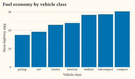
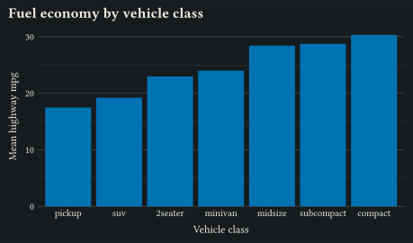
summarise collapses each group to a single row. Grouping is per-call through by:; there is no persistent grouped state to remember to undo. Each aggregation is a closure that receives the group’s rows and returns one cell. Any expression over the rows is therefore valid, including counts and multi-column ratios that a column-at-a-time helper cannot express.
#let by-class = summarise(
  mpg,
  mean-hwy: rows => rows.map(row => row.hwy).sum() / rows.len(),
  n: rows => rows.len(),
  by: "class",
).sorted(key: row => row.mean-hwy)

#plot(
  data: by-class,
  mapping: aes(x: "class", y: "mean-hwy"),
  layers: (geom-col(fill: okabe-ito.at(4)),),
  scales: scales(x: scale-discrete(limits: by-class.map(row => row.class))),
  labels: labels(
    title: "Fuel economy by vehicle class",
    x: "Vehicle class",
    y: "Mean highway mpg",
  ),
  width: 12cm,
  height: 7cm,
)
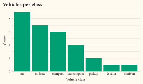
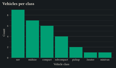
When the aggregation is a tally, count is the shorthand: it groups by the columns you name and adds an n column. The argument sort: true orders the groups from most to least frequent.
#let counts = count(mpg, "class", sort: true)

#plot(
  data: counts,
  mapping: aes(x: "class", y: "n"),
  layers: (geom-col(fill: okabe-ito.at(2)),),
  scales: scales(x: scale-discrete(limits: counts.map(row => row.class))),
  labels: labels(title: "Vehicles per class", x: "Vehicle class", y: "Count"),
  width: 12cm,
  height: 7cm,
)
Reshape long or wide
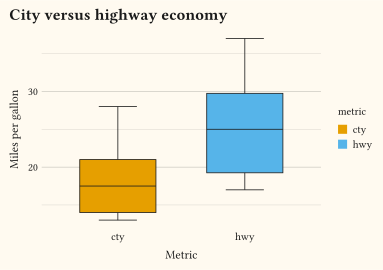
Two columns that measure the same thing, such as city and highway economy, are often easier to plot once melted. The melt gives a single value column with a label column beside it. pivot-longer gathers the named columns into a names-to/values-to pair, carrying the other columns through, so one mapping can colour or facet by the measurement.
#let long = pivot-longer(
  mpg,
  ("cty", "hwy"),
  names-to: "metric",
  values-to: "mpg",
)

#plot(
  data: long,
  mapping: aes(x: "metric", y: "mpg", fill: "metric"),
  layers: (geom-boxplot(),),
  labels: labels(title: "City versus highway economy", x: "Metric", y: "Miles per gallon"),
  width: 10cm,
  height: 7cm,
)
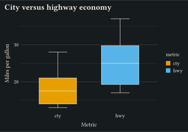
pivot-wider is the inverse: it spreads a label column back into one column per level, round-tripping the reshape when you need a wide table again.
Join a lookup
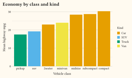
Enriching a dataset with a lookup table is a join, not a manual dict.at(key) per row. Build the lookup as its own small row-store, then left-join it on the shared key. The join keeps every row of the left dataset and adds the lookup’s extra columns.
#let by-class = summarise(
  mpg,
  mean-hwy: rows => rows.map(row => row.hwy).sum() / rows.len(),
  by: "class",
).sorted(key: row => row.mean-hwy)

#let kind = (
  (class: "compact", kind: "Car"),
  (class: "subcompact", kind: "Car"),
  (class: "midsize", kind: "Car"),
  (class: "2seater", kind: "Car"),
  (class: "minivan", kind: "Van"),
  (class: "suv", kind: "SUV"),
  (class: "pickup", kind: "Truck"),
)

#let enriched = left-join(by-class, kind, by: "class")

#plot(
  data: enriched,
  mapping: aes(x: "class", y: "mean-hwy", fill: "kind"),
  layers: (geom-col(),),
  scales: scales(x: scale-discrete(limits: enriched.map(row => row.class))),
  labels: labels(title: "Economy by class and kind", x: "Vehicle class", y: "Mean highway mpg", fill: "Kind"),
  width: 12cm,
  height: 7cm,
)
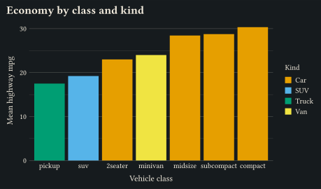
The other joins share the by: interface. inner-join keeps only matched rows, and full-join keeps both sides. semi-join and anti-join filter the left dataset by whether a key exists in the right, and add no columns. To stack datasets that share columns instead of matching on a key, bind-rows unions their rows and fills any missing columns with none.
Putting it together
A whole preparation reads as one expression: summarise, enrich, then hand the result straight to #plot. With a real CSV, start with as-numeric to type the measured columns.
#let data = left-join(
  summarise(
    mpg,
    mean-hwy: rows => rows.map(row => row.hwy).sum() / rows.len(),
    by: "class",
  ),
  kind,
  by: "class",
)

#plot(data: data, mapping: aes(x: "class", y: "mean-hwy", fill: "kind"), ...)
Where to go next
- The data wrangling reference documents every verb, its arguments, and its edge cases.
as-numericandas-factorcoerce a column to numbers or to a discrete factor.- The Recipes guide composes these prepared datasets into chart types that ship as dedicated geoms elsewhere.
- The bundled
mpg,penguins, andeconomicsdatasets are ready row-stores to experiment on.