Comparison and ranking
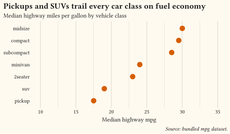
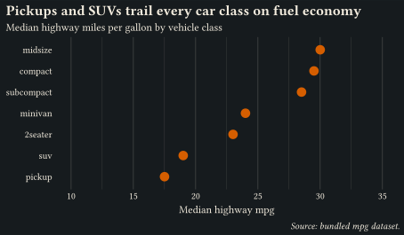
Which is bigger? Values across categories, sorted and directly labelled.
Find the right chart for your data, with the full source a click away.
Start from the question your figure should answer, not from a chart name. Each page below opens with curated, real-data showcases that follow data visualisation best practices, followed by focused feature demos. The By feature pages cover the finishing work that turns a correct chart into a clear one: annotation, colour, guides, layout, and theming. Every example lives in the examples/ directory of the repository, and its source can be copied from the page.
The gallery replaces the single /examples/ page, which is now an alias for this hub. The per-example anchors of that page are gone. To find an example again, open the intent page that matches it.
Which is bigger? Values across categories, sorted and directly labelled.
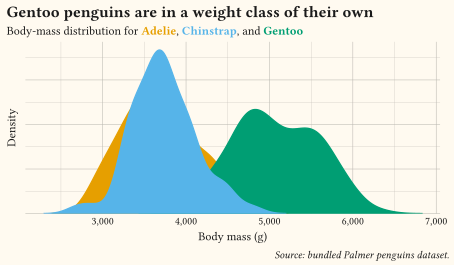
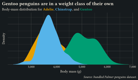
How do the values spread? Centre, spread, skew, and outliers, alone or across groups.
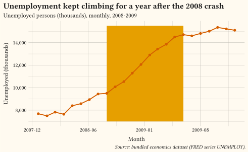
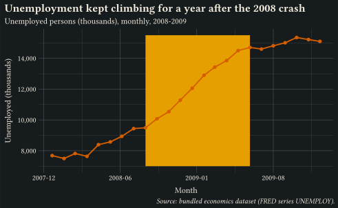
How did it change? Trends, turning points, and rank shifts over an ordered axis.
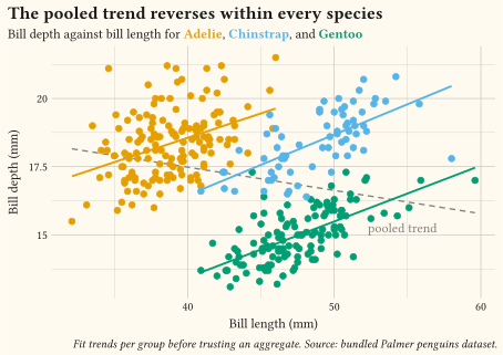
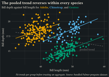
Do these variables move together? Association, clusters, and dense point clouds.
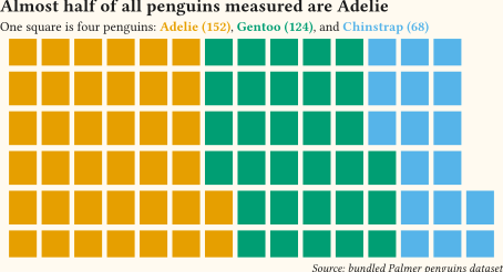
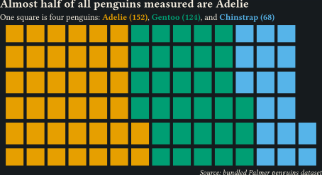
How do the parts make the total? Shares, compositions, and circular layouts.
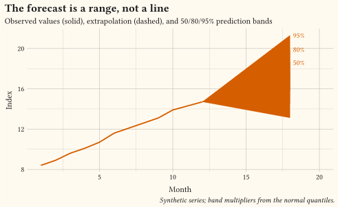
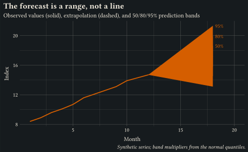
How sure are we? Intervals, ribbons, and confidence around estimates.
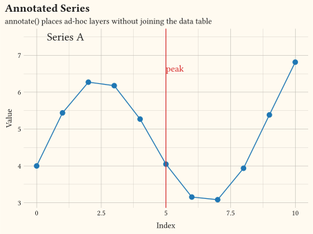
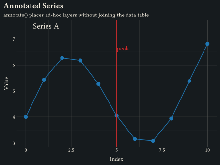
Reference lines, labels, and marks that point the reader at the finding.
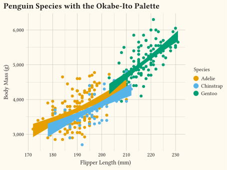
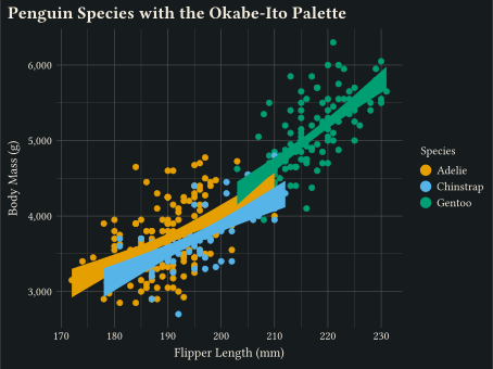
Palettes and scales for colour, size, shape, opacity, and line style.
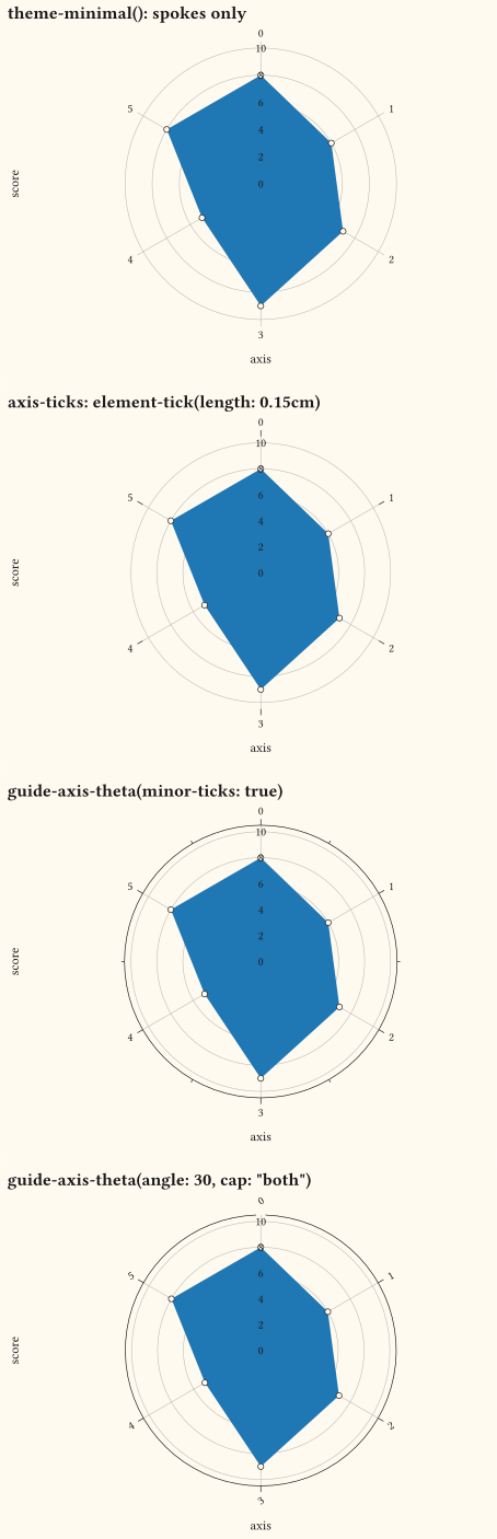
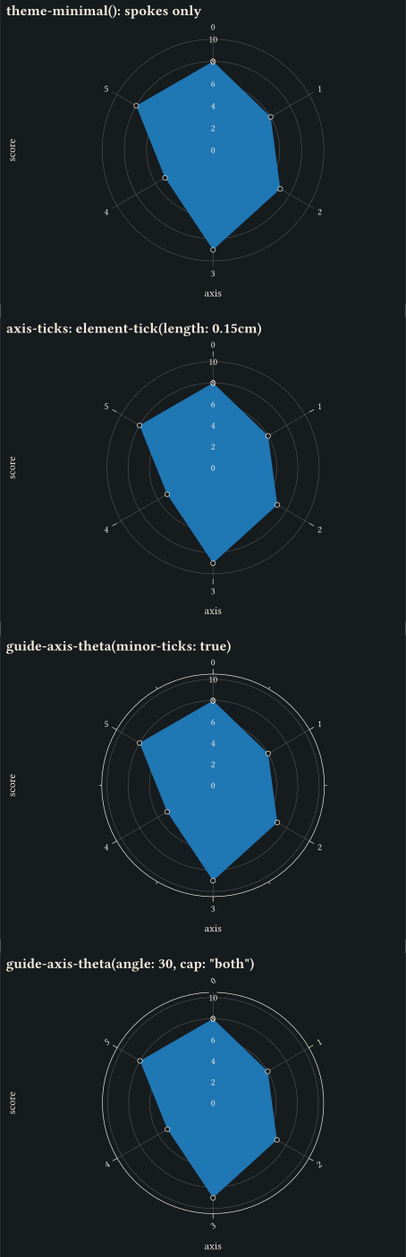
Tick labels, axis transforms, secondary axes, and legend layout.
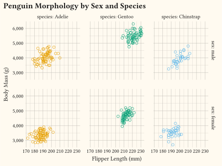
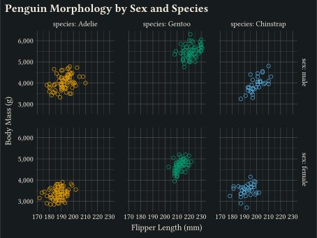
Small multiples, coordinate systems, and multi-panel composition.
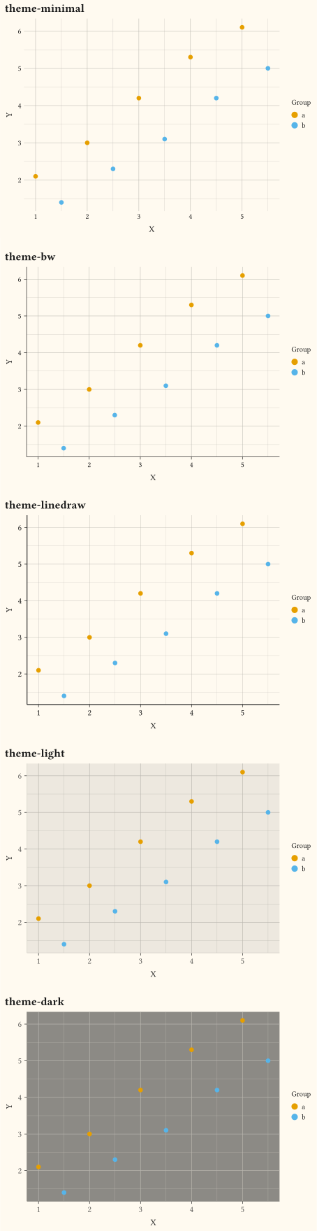
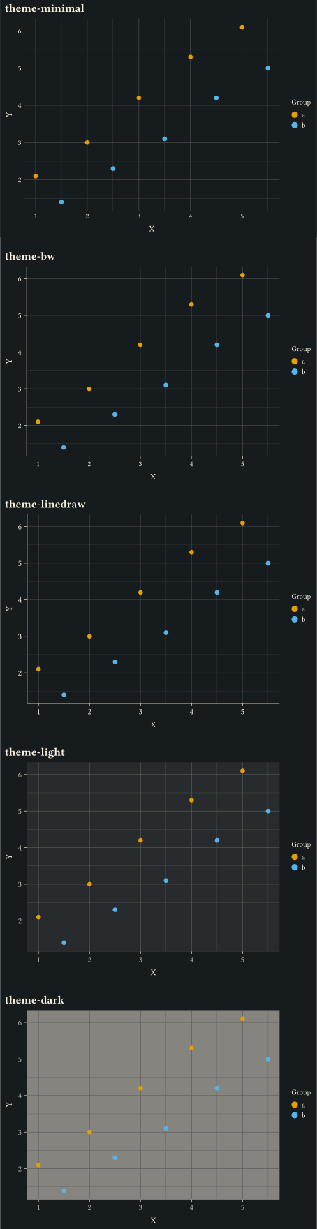
Presets and per-element overrides for everything that is not data.
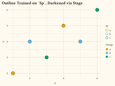
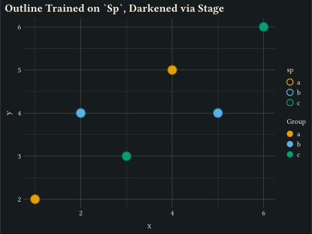
Late-binding aesthetics, identity scales, weights, and pipeline escape hatches.