Annotated timeline
time series line chart
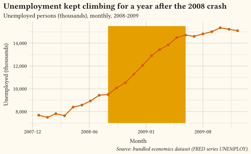
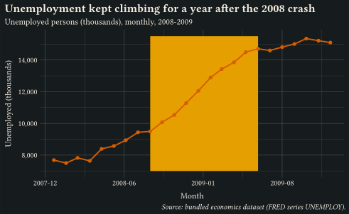
Unemployment over the 2008-2009 recession with a shaded context period and an in-plot label placed by annotate; the title states the finding.
Show how values change over time or along an ordered sequence.
These charts answer “how did it change?”: trends, seasonality, turning points, and rank shifts along an ordered axis. Lines are the default; areas add a sense of cumulative magnitude but need a zero baseline; steps suit values that hold between events. Label series directly at the line ends instead of relying on a legend, annotate the context that explains a shift, and split tangled series into small multiples rather than letting spaghetti build up. Every example ships its full source: click View source to copy it.
time series line chart
Unemployment over the 2008-2009 recession with a shaded context period and an in-plot label placed by annotate; the title states the finding.
time series small multiples
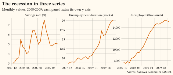
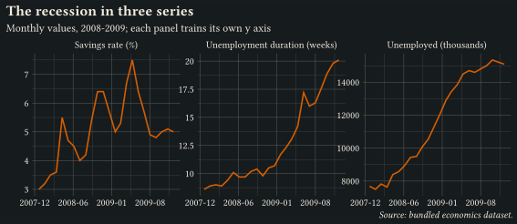
Three recession series reshaped with pivot-longer into facet-wrap panels with free y scales; separate panels beat overlaid lines when units differ.
time series area chart
time series line chart
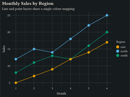
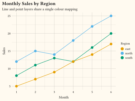
Lines and points share a discrete colour mapping. geom-line + geom-point.
time series
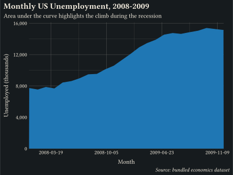
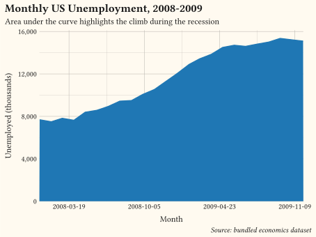
Filled polygon from y = 0 to y, drawn by geom-area.
time series step chart
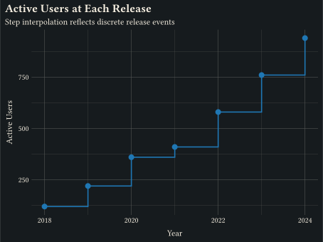
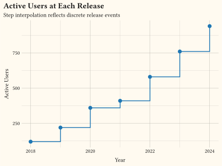
Discrete jumps between consecutive points via geom-step.
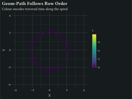
coordinates trajectory
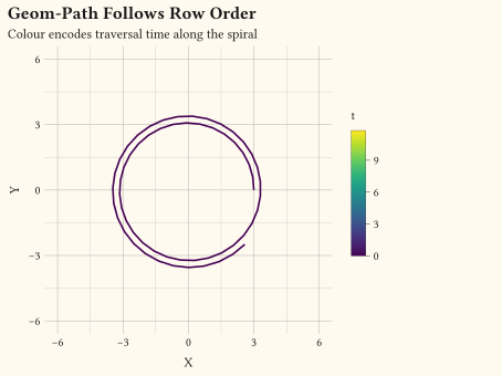
geom-path connects rows in input order, useful for trajectories.
time series
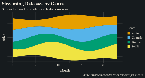
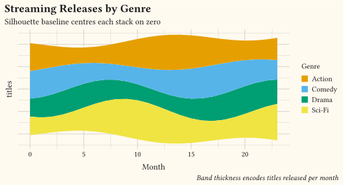
geom-area on a position-stack(offset: "silhouette") baseline centres each stack on zero for the classic ThemeRiver flow.
time series
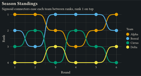
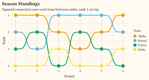
stat-connect(connection: "sigmoid") eases geom-line between ranks with logistic connectors; a reversed y scale puts rank 1 on top.
time series difference chart
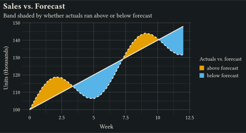
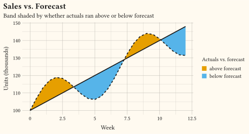
stat-difference shades the geom-ribbon between forecast and actuals by which series leads, splitting the band cleanly at every crossing via fill: after-stat("_sign").
time series step chart
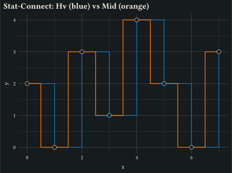
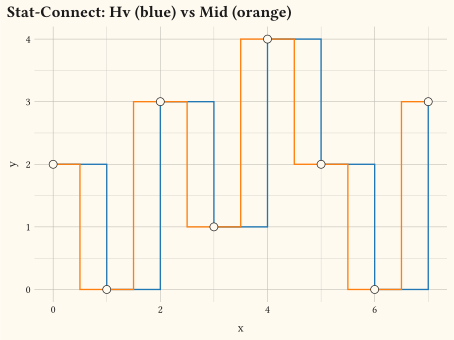
Insert intermediate vertices between consecutive points via stat-connect; two paths overlay the same data with connection: "hv" (step) and connection: "mid" (midpoint corner).
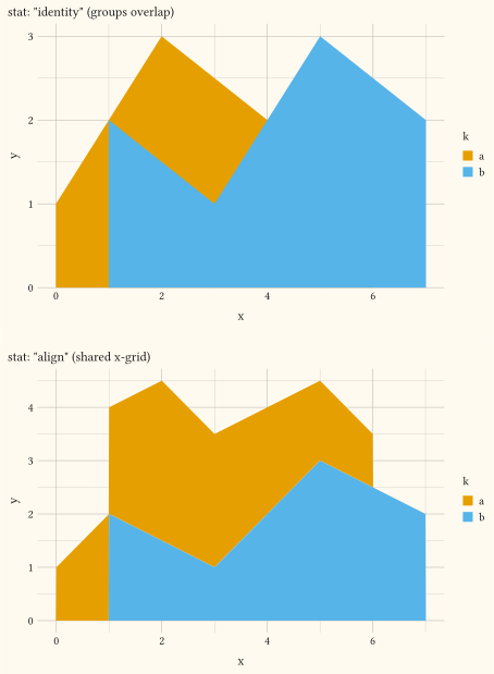
time series stacked area chart
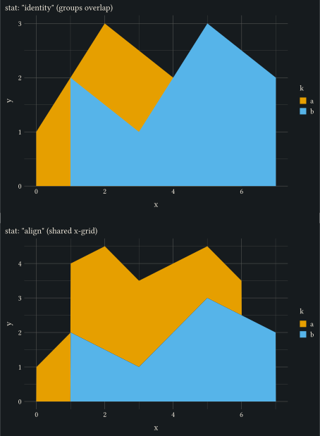
Resample groups onto a shared x-grid via stat-align so stacked geom-area layers join cleanly even when the per-group x values are mismatched.
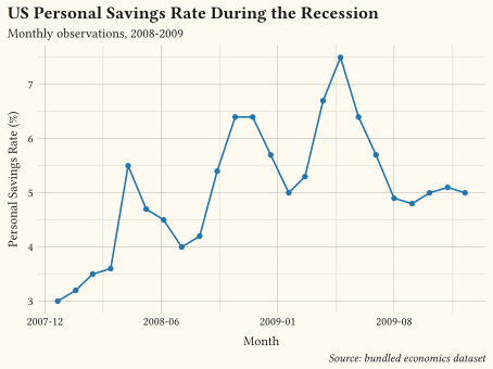
time series line chart
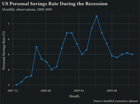
ISO date strings on x parsed and laid out by scale-date with year-month tick labels.
// Showcase: unemployment time series with an annotated context period and a
// finding stated in the title; annotation does the pointing, not a legend.
#import "@preview/gribouille:0.7.0": *
#set page(width: auto, height: auto, margin: 0cm)
#let accent = okabe-ito.at(5)
#let shade = okabe-ito.at(0)
#plot(
data: economics,
mapping: aes(x: "date", y: "unemploy"),
layers: (
annotate(
"rect",
xmin: "2008-09-01",
xmax: "2009-06-01",
ymin: 7000,
ymax: 15500,
fill: shade.transparentize(80%),
stroke: none,
),
geom-line(stroke: 1.4pt, colour: accent),
geom-point(size: 2pt, fill: accent),
annotate(
"text",
x: "2009-01-01",
y: 14500,
label: "post-crash surge",
size: 9pt,
colour: shade,
),
),
scales: scales(
x: scale-date(date-format: "[year]-[month repr:numerical]"),
y: scale-continuous(labels: format-comma()),
),
labels: labels(
title: "Unemployment kept climbing for a year after the 2008 crash",
subtitle: "Unemployed persons (thousands), monthly, 2008-2009",
x: "Month",
y: "Unemployed (thousands)",
caption: "Source: bundled economics dataset (FRED series UNEMPLOY).",
),
theme: theme-minimal(),
width: 13cm,
height: 8cm,
)// Showcase: three economic series as small multiples with free y scales;
// separate panels beat spaghetti when units and ranges differ.
#import "@preview/gribouille:0.7.0": *
#set page(width: auto, height: auto, margin: 0cm)
#let accent = okabe-ito.at(5)
#let series-names = (
psavert: "Savings rate (%)",
uempmed: "Unemployment duration (weeks)",
unemploy: "Unemployed (thousands)",
)
#let long = pivot-longer(
economics,
("psavert", "uempmed", "unemploy"),
names-to: "series",
values-to: "value",
).map(row => (..row, series: series-names.at(row.series)))
#plot(
data: long,
mapping: aes(x: "date", y: "value"),
layers: (geom-line(stroke: 1.2pt, colour: accent),),
scales: scales(x: scale-date(date-format: "[year]-[month repr:numerical]")),
facet: facet-wrap("series", ncolumn: 3, scales: "free_y"),
labels: labels(
title: "The recession in three series",
subtitle: "Monthly values, 2008-2009; each panel trains its own y axis",
x: none,
y: none,
caption: "Source: bundled economics dataset.",
),
theme: theme-minimal(),
width: 15cm,
height: 6.5cm,
)// Showcase: area chart of unemployment duration with the peak annotated;
// areas keep their zero baseline and the extremum gets named.
#import "@preview/gribouille:0.7.0": *
#set page(width: auto, height: auto, margin: 0cm)
#let accent = okabe-ito.at(1)
#let peak = slice-max(economics, "uempmed").first()
#plot(
data: economics,
mapping: aes(x: "date", y: "uempmed"),
layers: (
geom-area(fill: accent, alpha: 0.35),
geom-line(stroke: 1.4pt, colour: accent),
annotate(
"text",
x: peak.date,
y: peak.uempmed,
label: "peak: " + str(peak.uempmed) + " weeks",
anchor: "south-east",
nudge-y: 0.15cm,
size: 9pt,
),
),
scales: scales(
x: scale-date(date-format: "[year]-[month repr:numerical]", expand: (0, 0)),
y: scale-continuous(limits: (0, 22)),
),
labels: labels(
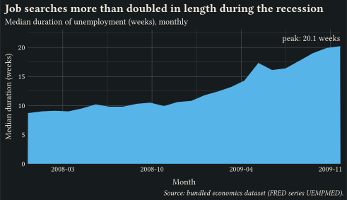
title: "Job searches more than doubled in length during the recession",
subtitle: "Median duration of unemployment (weeks), monthly",
x: "Month",
y: "Median duration (weeks)",
caption: "Source: bundled economics dataset (FRED series UEMPMED).",
),
theme: theme-minimal(),
width: 13cm,
height: 7.5cm,
)// Line plus point layers sharing discrete colour and fill mappings.
#import "@preview/gribouille:0.7.0": *
#set page(width: auto, height: auto, margin: 0cm)
#let trend = (
(month: 1, sales: 12, region: "north"),
(month: 2, sales: 15, region: "north"),
(month: 3, sales: 14, region: "north"),
(month: 4, sales: 18, region: "north"),
(month: 5, sales: 22, region: "north"),
(month: 6, sales: 25, region: "north"),
(month: 1, sales: 8, region: "south"),
(month: 2, sales: 11, region: "south"),
(month: 3, sales: 13, region: "south"),
(month: 4, sales: 12, region: "south"),
(month: 5, sales: 16, region: "south"),
(month: 6, sales: 20, region: "south"),
(month: 1, sales: 5, region: "east"),
(month: 2, sales: 7, region: "east"),
(month: 3, sales: 9, region: "east"),
(month: 4, sales: 12, region: "east"),
(month: 5, sales: 14, region: "east"),
(month: 6, sales: 17, region: "east"),
)
#plot(
data: trend,
mapping: aes(x: "month", y: "sales", colour: "region", fill: "region"),
layers: (
geom-line(stroke: 1pt),
geom-point(size: 3pt),
),
scales: scales(x: scale-continuous(breaks: (1, 2, 3, 4, 5, 6))),
labels: labels(
title: "Monthly Sales by Region",
subtitle: "Line and point layers share a single colour mapping",
x: "Month",
y: "Sales",
colour: "Region",
fill: "Region",
),
theme: theme-minimal(),
width: 12cm,
height: 9cm,
)// geom-area: filled polygon from y = 0 up to y along x.
#import "@preview/gribouille:0.7.0": *
#set page(width: auto, height: auto, margin: 0cm)
#plot(
data: economics,
mapping: aes(x: "date", y: "unemploy"),
layers: (
geom-area(alpha: 0.35, fill: rgb("#1f77b4")),
geom-line(stroke: 1pt, colour: rgb("#1f77b4")),
),
scales: scales(x: scale-date(expand: (0, 0)), y: scale-continuous(labels: format-comma())),
labels: labels(
title: "Monthly US Unemployment, 2008-2009",
subtitle: "Area under the curve highlights the climb during the recession",
x: "Month",
y: "Unemployed (thousands)",
caption: "Source: bundled economics dataset",
),
theme: theme-minimal(),
width: 12cm,
height: 9cm,
)// geom-step: stair-step interpolation between consecutive points.
#import "@preview/gribouille:0.7.0": *
#set page(width: auto, height: auto, margin: 0cm)
#let releases = (
(version: 1, year: 2018, users: 120),
(version: 2, year: 2019, users: 220),
(version: 3, year: 2020, users: 360),
(version: 4, year: 2021, users: 410),
(version: 5, year: 2022, users: 580),
(version: 6, year: 2023, users: 760),
(version: 7, year: 2024, users: 940),
)
#plot(
data: releases,
mapping: aes(x: "year", y: "users"),
layers: (
geom-step(stroke: 1.2pt, direction: "hv", colour: rgb("#1f77b4")),
geom-point(size: 3pt, fill: rgb("#1f77b4")),
),
scales: scales(x: scale-continuous(breaks: (2018, 2020, 2022, 2024)), y: scale-continuous(labels: format-comma())),
labels: labels(
title: "Active Users at Each Release",
subtitle: "Step interpolation reflects discrete release events",
x: "Year",
y: "Active Users",
),
theme: theme-minimal(),
width: 12cm,
height: 9cm,
)// geom-path: connects rows in input order, not sorted by x.
#import "@preview/gribouille:0.7.0": *
#set page(width: auto, height: auto, margin: 0cm)
#let spiral = ()
#for i in range(0, 60) {
let t = i * 0.2
let r = 3 + t * 0.05
spiral.push((x: calc.cos(t) * r, y: calc.sin(t) * r, t: t))
}
#plot(
data: spiral,
mapping: aes(x: "x", y: "y", colour: "t"),
layers: (geom-path(stroke: 1.2pt),),
scales: scales(colour: scale-viridis-c(), x: scale-continuous(breaks: (-6, -3, 0, 3, 6)), y: scale-continuous(breaks: (-6, -3, 0, 3, 6))),
coord: coord-fixed(),
labels: labels(
title: "Geom-Path Follows Row Order",
subtitle: "Colour encodes traversal time along the spiral",
x: "X",
y: "Y",
colour: "t",
),
theme: theme-minimal(),
width: 12cm,
height: 9cm,
)// streamgraph: stacked geom-area on a silhouette baseline (ThemeRiver).
#import "@preview/gribouille:0.7.0": *
#set page(width: auto, height: auto, margin: 0cm)
#let genres = ("Drama", "Comedy", "Action", "Sci-Fi")
#let releases = ()
#for (gi, genre) in genres.enumerate() {
for month in range(0, 24) {
let wave = calc.sin(month * 0.4 + gi * 1.3) * (1.2 + gi * 0.4)
let base = 4 + gi * 0.6 + month * 0.05
releases.push((month: month, titles: base + wave, genre: genre))
}
}
#plot(
data: releases,
mapping: aes(x: "month", y: "titles", fill: "genre"),
layers: (
geom-area(position: position-stack(offset: "silhouette"), alpha: 0.85),
),
scales: scales(fill: scale-okabe-ito(name: "Genre")),
labels: labels(
title: "Streaming Releases by Genre",
subtitle: "Silhouette baseline centres each stack on zero",
x: "Month",
caption: "Band thickness encodes titles released per month",
),
guides: guides(y: none),
theme: theme-minimal(),
width: 13cm,
height: 7cm,
)// bump-chart: rank trajectories eased through sigmoid connectors.
#import "@preview/gribouille:0.7.0": *
#set page(width: auto, height: auto, margin: 0cm)
#let ranks = (
Alpha: (1, 1, 2, 3, 2, 1),
Boreal: (2, 3, 1, 1, 1, 2),
Cirrus: (3, 2, 4, 2, 3, 4),
Delta: (4, 4, 3, 4, 4, 3),
)
#let standings = ()
#for (team, rs) in ranks {
for (i, r) in rs.enumerate() {
standings.push((round: i + 1, rank: r, team: team))
}
}
#plot(
data: standings,
mapping: aes(x: "round", y: "rank", colour: "team", fill: "team"),
layers: (
geom-line(stat: stat-connect(connection: "sigmoid"), stroke: 2pt),
geom-point(size: 4pt,),
),
scales: scales(
x: scale-continuous(breaks: (1, 2, 3, 4, 5, 6)),
y: scale-continuous(transform: "reverse", breaks: (1, 2, 3, 4)),
colour: scale-okabe-ito(name: "Team"),
fill: scale-okabe-ito(name: "Team"),
),
labels: labels(
title: "Season Standings",
subtitle: "Sigmoid connectors ease each team between ranks, rank 1 on top",
x: "Round",
y: "Rank",
),
theme: theme-minimal(),
width: 13cm,
height: 7cm,
)// diff-forecast: shade the band between forecast and actuals by which leads.
#import "@preview/gribouille:0.7.0": *
#set page(width: auto, height: auto, margin: 0cm)
#let series = range(0, 25).map(i => {
let x = i * 0.5
(
week: x,
forecast: 100 + x * 4,
actual: 100 + x * 3.6 + calc.sin(x * 0.9) * 12,
)
})
#plot(
data: series,
mapping: aes(x: "week"),
layers: (
geom-ribbon(
mapping: aes(ymin: "forecast", ymax: "actual", fill: after-stat("_sign")),
stat: stat-difference(levels: ("above forecast", "below forecast")),
alpha: 0.55,
),
geom-line(mapping: aes(y: "forecast"), stroke: 1.3pt),
geom-line(mapping: aes(y: "actual"), stroke: 1.3pt, linetype: "dashed"),
),
scales: scales(fill: scale-okabe-ito()),
labels: labels(
title: "Sales vs. Forecast",
subtitle: "Band shaded by whether actuals ran above or below forecast",
x: "Week",
y: "Units (thousands)",
fill: "Actuals vs. forecast",
),
theme: theme-minimal(),
width: 13cm,
height: 7cm,
)// stat-connect inserts intermediate vertices between consecutive points.
// Two layers compare "hv" (default, step) and "mid" (midpoint corner)
// connection modes against the same dataset.
#import "@preview/gribouille:0.7.0": *
#set page(width: auto, height: auto, margin: 0cm)
#let d = range(0, 8).map(i => (x: i, y: calc.rem(i * 3 + 2, 5)))
#plot(
data: d,
mapping: aes(x: "x", y: "y"),
layers: (
geom-path(
stat: stat-connect(connection: "hv"),
stroke: 1pt,
colour: rgb("#1f77b4"),
),
geom-path(
stat: stat-connect(connection: "mid"),
stroke: 1pt,
colour: rgb("#ff7f0e"),
),
geom-point(size: 3pt),
),
labels: labels(title: "Stat-Connect: Hv (blue) vs Mid (orange)"),
theme: theme-minimal(),
width: 12cm,
height: 9cm,
)// stat-align resamples each group onto a shared x-grid so stacked areas
// share clean vertices even when the inputs use mismatched x values.
// Side by side: the raw `stat: "identity"` overlap versus the aligned stack.
#import "@preview/gribouille:0.7.0": *
#set page(width: auto, height: auto, margin: 0cm)
#let d = (
(x: 0, y: 1, k: "a"),
(x: 2, y: 3, k: "a"),
(x: 4, y: 2, k: "a"),
(x: 6, y: 1, k: "a"),
(x: 1, y: 2, k: "b"),
(x: 3, y: 1, k: "b"),
(x: 5, y: 3, k: "b"),
(x: 7, y: 2, k: "b"),
)
#let panel(stat, subtitle) = plot(
data: d,
mapping: aes(x: "x", y: "y", fill: "k"),
layers: (geom-area(stat: stat, alpha: 0.7),),
labels: labels(subtitle: subtitle),
theme: theme-minimal(),
width: 12cm,
height: 8cm,
)
#grid(
columns: 1,
row-gutter: 1em,
panel("identity", "stat: \"identity\" (groups overlap)"),
panel("align", "stat: \"align\" (shared x-grid)"),
)// scale-date parses ISO date strings on x and renders year-month tick labels.
#import "@preview/gribouille:0.7.0": *
#set page(width: auto, height: auto, margin: 0cm)
#plot(
data: economics,
mapping: aes(x: "date", y: "psavert"),
layers: (
geom-line(stroke: 1.2pt, colour: rgb("#1f77b4")),
geom-point(size: 2pt, fill: rgb("#1f77b4")),
),
scales: scales(x: scale-date(date-format: "[year]-[month repr:numerical]")),
labels: labels(
title: "US Personal Savings Rate During the Recession",
subtitle: "Monthly observations, 2008-2009",
x: "Month",
y: "Personal Savings Rate (%)",
caption: "Source: bundled economics dataset",
),
theme: theme-minimal(),
width: 12cm,
height: 9cm,
)