Continuous alpha and linewidth
three or more variables
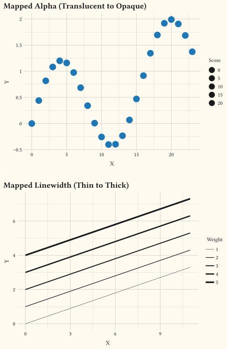
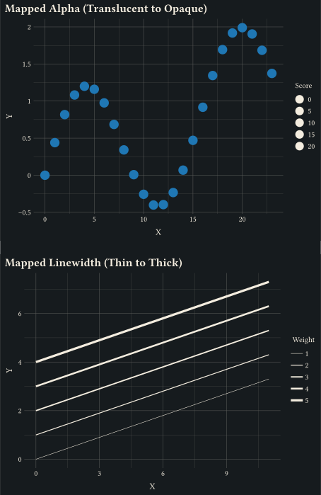
Promoted aesthetics: alpha and linewidth map directly to numeric columns through scale-continuous and scale-continuous.
Map data to colour, size, shape, opacity, and line style.
Scales decide how a data column becomes a visual property; getting them right is most of what makes a chart readable. Use a colour-vision-deficiency-safe palette such as Okabe-Ito for categories, a perceptually uniform ramp such as Viridis for continuous values, and a diverging gradient only when the data has a meaningful midpoint. Beyond colour, these examples map size, shape, opacity, stroke, and line style, and show manual and binned variants of each family. See the accessibility guide for the reasoning behind these defaults. Every example ships its full source: click View source to copy it.
three or more variables
Promoted aesthetics: alpha and linewidth map directly to numeric columns through scale-continuous and scale-continuous.
three or more variables
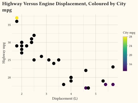
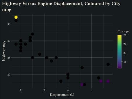
A colourbar appears automatically when colour is trained on a continuous variable via scale-continuous.
three or more variables
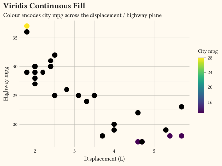
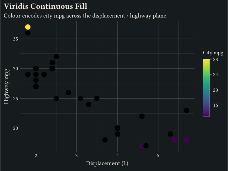
scale-viridis-c maps a continuous variable through the Viridis palette.
any
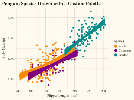
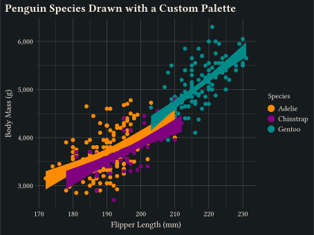
User-supplied colours passed to scale-manual.
three or more variables scatter with fits
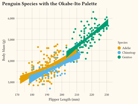
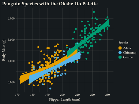
The colour-vision-deficiency-safe discrete palette applied through scale-okabe-ito and scale-okabe-ito.
any
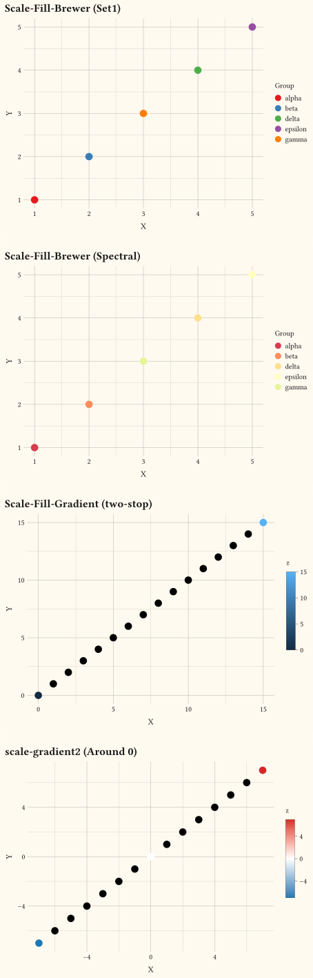
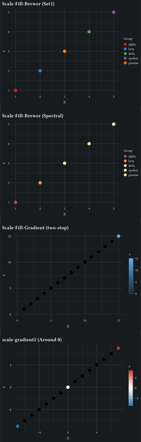
Discrete scale-brewer palettes alongside continuous scale-gradient and scale-gradient2.
any
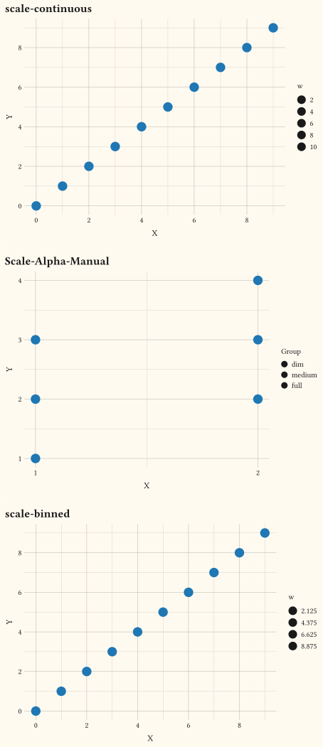
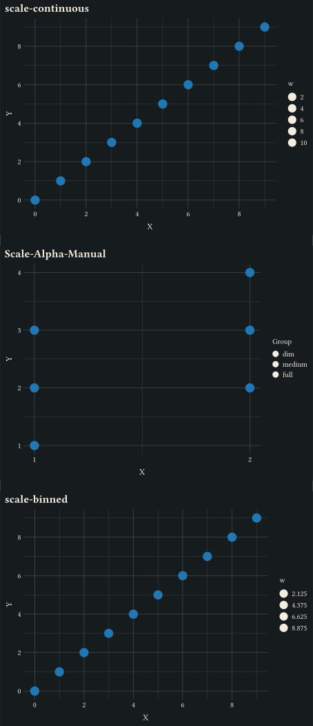
Continuous, manual per-level, and binned variants via the scale-alpha-* family.
any
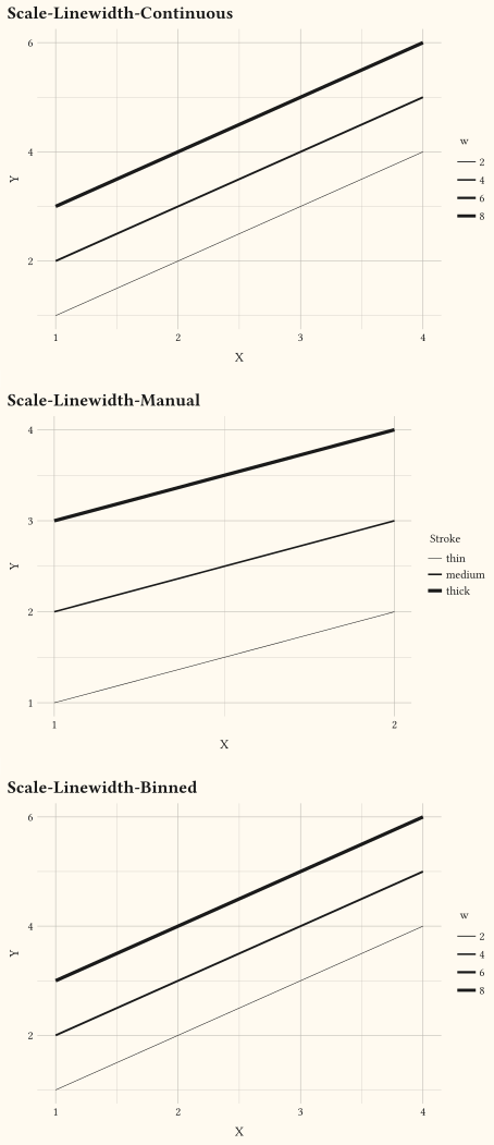
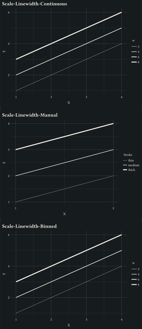
Continuous, manual per-level, and binned variants via the scale-linewidth-* family.
any
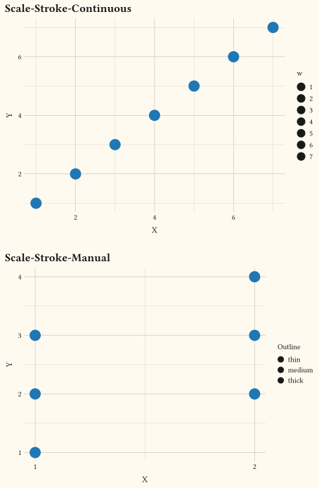
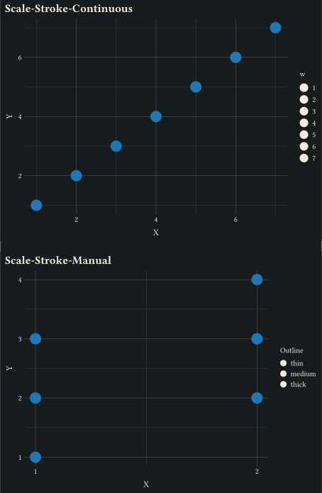
Marker-outline thickness driven by the stroke aesthetic via scale-continuous or scale-manual.
any
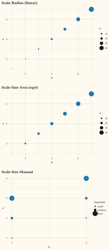
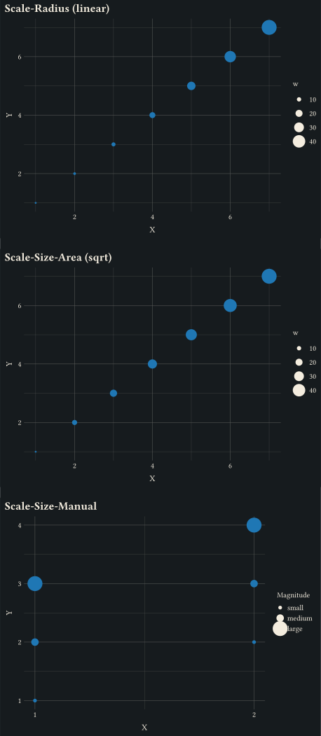
scale-radius, scale-area, and scale-manual compared on the same data.
any
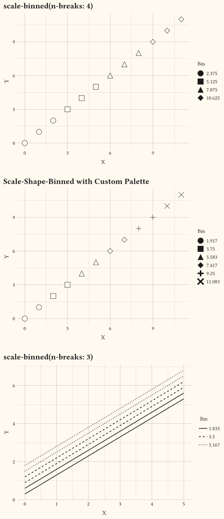
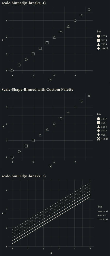
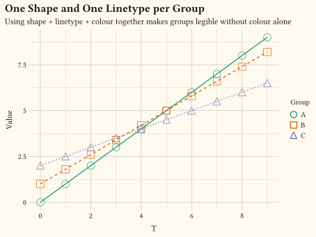
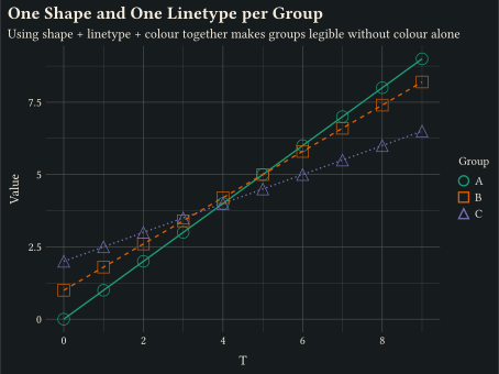
Cut a continuous variable into shape or dash bins with scale-binned keyed to shape or linetype.
any
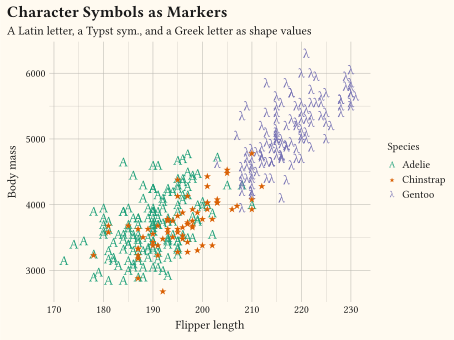
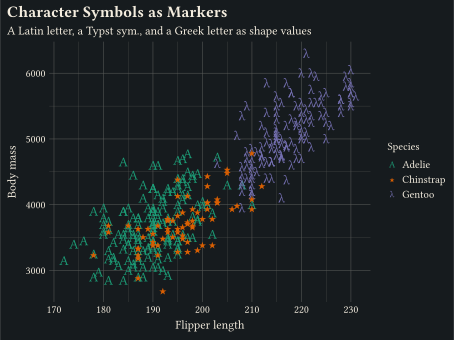
Map scale-manual to a plain character, a Typst sym. symbol, or an emoji; any value outside the built-in keywords renders as a literal glyph.
any
A single grouping maps to scale-discrete, scale-discrete, and a discrete colour.
any
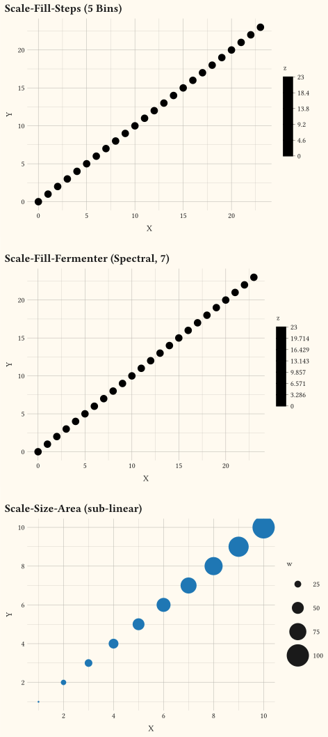
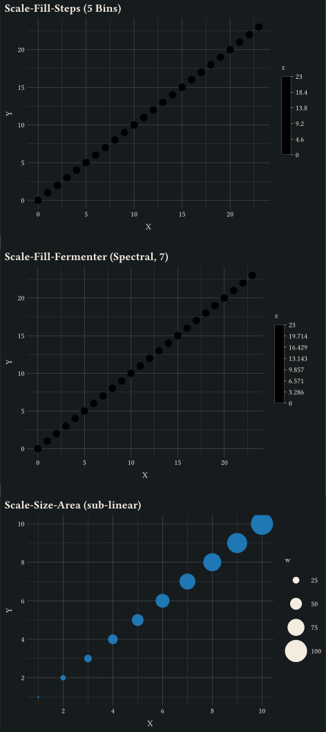
Stepped colour gradients and area-preserving size scales via scale-steps, scale-fermenter, and scale-area.
any
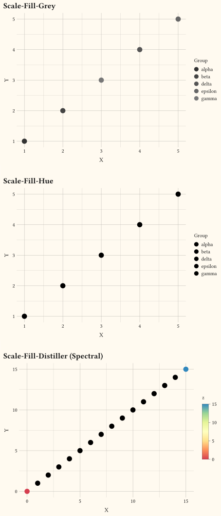
Niche fill scales: scale-grey, scale-hue, and scale-distiller.
// Promoted alpha and linewidth aesthetics, both mapped to numeric columns.

#import "@preview/gribouille:0.7.0": *

#set page(width: auto, height: auto, margin: 0cm)

#let scatter-data = ()
#for i in range(0, 24) {
  scatter-data.push((x: i, y: calc.sin(i * 0.4) + i * 0.05, score: i))
}

#let line-data = ()
#for grp-idx in range(0, 5) {
  let weight = grp-idx + 1
  for i in range(0, 12) {
    line-data.push((
      x: i,
      y: i * 0.3 + grp-idx,
      grp: str(grp-idx),
      w: weight,
    ))
  }
}

#grid(
  columns: 1,
  row-gutter: 0.5cm,
  plot(
    data: scatter-data,
    mapping: aes(x: "x", y: "y", alpha: "score"),
    layers: (geom-point(size: 5pt, fill: rgb("#1f77b4")),),
    scales: scales(alpha: scale-continuous(range: (0.1, 1))),
    labels: labels(
      title: "Mapped Alpha (Translucent to Opaque)",
      x: "X",
      y: "Y",
      alpha: "Score",
    ),
    theme: theme-minimal(),
    width: 12cm,
    height: 9cm,
  ),
  plot(
    data: line-data,
    mapping: aes(x: "x", y: "y", group: "grp", linewidth: "w"),
    layers: (geom-line(),),
    scales: scales(linewidth: scale-continuous(range: (0.4pt, 2.4pt))),
    labels: labels(
      title: "Mapped Linewidth (Thin to Thick)",
      x: "X",
      y: "Y",
      linewidth: "Weight",
    ),
    theme: theme-minimal(),
    width: 12cm,
    height: 9cm,
  ),
)// A colourbar guide appears automatically when fill is trained continuously.
#import "@preview/gribouille:0.7.0": *
#set page(width: auto, height: auto, margin: 0cm)
#plot(
data: mpg,
mapping: aes(x: "displ", y: "hwy", fill: "cty"),
layers: (geom-point(size: 4pt, alpha: 0.85),),
labels: labels(
title: "Highway Versus Engine Displacement, Coloured by City mpg",
x: "Displacement (L)",
y: "Highway mpg",
fill: "City mpg",
),
theme: theme-minimal(),
width: 12cm,
height: 9cm,
)// Viridis continuous fill scale.
#import "@preview/gribouille:0.7.0": *
#set page(width: auto, height: auto, margin: 0cm)
#plot(
data: mpg,
mapping: aes(x: "displ", y: "hwy", fill: "cty"),
layers: (geom-point(size: 4pt, alpha: 0.9),),
scales: scales(fill: scale-viridis-c()),
labels: labels(
title: "Viridis Continuous Fill",
subtitle: "Colour encodes city mpg across the displacement / highway plane",
x: "Displacement (L)",
y: "Highway mpg",
fill: "City mpg",
),
theme: theme-minimal(),
width: 12cm,
height: 9cm,
)// scale-manual and scale-manual: user-supplied palettes.
#import "@preview/gribouille:0.7.0": *
#set page(width: auto, height: auto, margin: 0cm)
#let palette = (rgb("#ff8c00"), rgb("#800080"), rgb("#008B8B"))
#plot(
data: penguins,
mapping: aes(
x: "flipper-len",
y: "body-mass",
colour: "species",
fill: "species",
),
layers: (
geom-point(size: 2pt, alpha: 0.7),
geom-smooth(method: "lm", alpha: 0.15),
),
scales: scales(colour: scale-manual(values: palette), fill: scale-manual(values: palette), y: scale-continuous(labels: format-comma())),
labels: labels(
title: "Penguin Species Drawn with a Custom Palette",
x: "Flipper Length (mm)",
y: "Body Mass (g)",
colour: "Species",
fill: "Species",
),
theme: theme-minimal(),
width: 12cm,
height: 9cm,
)// scale-okabe-ito and scale-okabe-ito: CVD-safe discrete palette.
#import "@preview/gribouille:0.7.0": *
#set page(width: auto, height: auto, margin: 0cm)
#plot(
data: penguins,
mapping: aes(
x: "flipper-len",
y: "body-mass",
colour: "species",
fill: "species",
),
layers: (
geom-point(size: 2pt, alpha: 0.7),
geom-smooth(method: "lm", alpha: 0.15),
),
scales: scales(colour: scale-okabe-ito(), fill: scale-okabe-ito(), y: scale-continuous(labels: format-comma())),
labels: labels(
title: "Penguin Species with the Okabe-Ito Palette",
x: "Flipper Length (mm)",
y: "Body Mass (g)",
colour: "Species",
fill: "Species",
),
theme: theme-minimal(),
width: 12cm,
height: 9cm,
)// ColorBrewer plus gradient/gradient2 scales.
#import "@preview/gribouille:0.7.0": *
#set page(width: auto, height: auto, margin: 0cm)
#let discrete-d = (
(x: 1, y: 1, g: "alpha"),
(x: 2, y: 2, g: "beta"),
(x: 3, y: 3, g: "gamma"),
(x: 4, y: 4, g: "delta"),
(x: 5, y: 5, g: "epsilon"),
)
#let continuous-d = range(0, 16).map(i => (x: i, y: i, z: i * 1.0))
#let diverging-d = range(-7, 8).map(i => (x: i, y: i, z: i * 1.0))
#let theme0 = theme-minimal()
#grid(
columns: 1,
row-gutter: 0.5cm,
plot(
data: discrete-d,
mapping: aes(x: "x", y: "y", fill: "g"),
layers: (geom-point(size: 4pt),),
scales: scales(fill: scale-brewer(palette: "Set1")),
labels: labels(
title: "Scale-Fill-Brewer (Set1)",
x: "X",
y: "Y",
fill: "Group",
),
theme: theme0,
width: 12cm,
height: 9cm,
),
plot(
data: discrete-d,
mapping: aes(x: "x", y: "y", fill: "g"),
layers: (geom-point(size: 4pt),),
scales: scales(fill: scale-brewer(palette: "Spectral")),
labels: labels(
title: "Scale-Fill-Brewer (Spectral)",
x: "X",
y: "Y",
fill: "Group",
),
theme: theme0,
width: 12cm,
height: 9cm,
),
plot(
data: continuous-d,
mapping: aes(x: "x", y: "y", fill: "z"),
layers: (geom-point(size: 4pt),),
scales: scales(fill: scale-gradient()),
labels: labels(
title: "Scale-Fill-Gradient (two-stop)",
x: "X",
y: "Y",
fill: "z",
),
theme: theme0,
width: 12cm,
height: 9cm,
),
plot(
data: diverging-d,
mapping: aes(x: "x", y: "y", fill: "z"),
layers: (geom-point(size: 4pt),),
scales: scales(fill: scale-gradient2(midpoint: 0)),
labels: labels(
title: "scale-gradient2 (Around 0)",
x: "X",
y: "Y",
fill: "z",
),
theme: theme0,
width: 12cm,
height: 9cm,
),
)// scale-alpha family: continuous, manual per-level opacities, and binned.
#import "@preview/gribouille:0.7.0": *
#set page(width: auto, height: auto, margin: 0cm)
#let accent = rgb("#1f77b4")
#let cont = range(0, 10).map(i => (x: i, y: i, w: i + 1))
#let manual = (
(x: 1, y: 1, g: "dim"),
(x: 2, y: 2, g: "dim"),
(x: 1, y: 2, g: "medium"),
(x: 2, y: 3, g: "medium"),
(x: 1, y: 3, g: "full"),
(x: 2, y: 4, g: "full"),
)
#let cont-plot(scale-layer, title) = plot(
data: cont,
mapping: aes(x: "x", y: "y", alpha: "w"),
layers: (geom-point(size: 5pt, fill: accent),),
scales: scales(alpha: scale-layer),
labels: labels(title: title, x: "X", y: "Y", alpha: "w"),
theme: theme-minimal(),
width: 12cm,
height: 9cm,
)
#grid(
columns: 1,
row-gutter: 0.4cm,
cont-plot(scale-continuous(range: (0.2, 1)), "scale-continuous"),
plot(
data: manual,
mapping: aes(x: "x", y: "y", alpha: "g"),
layers: (geom-point(size: 5pt, fill: accent),),
scales: scales(alpha: scale-manual(values: (0.2, 0.55, 1),
limits: ("dim", "medium", "full"),)),
labels: labels(title: "Scale-Alpha-Manual", x: "X", y: "Y", alpha: "Group"),
theme: theme-minimal(),
width: 12cm,
height: 9cm,
),
cont-plot(
scale-binned(n-breaks: 4, range: (0.2, 1)),
"scale-binned",
),
)// scale-linewidth family: continuous, manual per-level lengths, and binned.
#import "@preview/gribouille:0.7.0": *
#set page(width: auto, height: auto, margin: 0cm)
#let cont = (
(x: 1, y: 1, w: 1, g: "low"),
(x: 2, y: 2, w: 1, g: "low"),
(x: 3, y: 3, w: 1, g: "low"),
(x: 4, y: 4, w: 1, g: "low"),
(x: 1, y: 2, w: 5, g: "mid"),
(x: 2, y: 3, w: 5, g: "mid"),
(x: 3, y: 4, w: 5, g: "mid"),
(x: 4, y: 5, w: 5, g: "mid"),
(x: 1, y: 3, w: 9, g: "high"),
(x: 2, y: 4, w: 9, g: "high"),
(x: 3, y: 5, w: 9, g: "high"),
(x: 4, y: 6, w: 9, g: "high"),
)
#let manual = (
(x: 1, y: 1, g: "thin"),
(x: 2, y: 2, g: "thin"),
(x: 1, y: 2, g: "medium"),
(x: 2, y: 3, g: "medium"),
(x: 1, y: 3, g: "thick"),
(x: 2, y: 4, g: "thick"),
)
#grid(
columns: 1,
row-gutter: 0.4cm,
plot(
data: cont,
mapping: aes(x: "x", y: "y", linewidth: "w", group: "g"),
layers: (geom-line(),),
scales: scales(linewidth: scale-continuous(range: (0.4pt, 2.4pt))),
labels: labels(
title: "Scale-Linewidth-Continuous",
x: "X",
y: "Y",
linewidth: "w",
),
theme: theme-minimal(),
width: 12cm,
height: 9cm,
),
plot(
data: manual,
mapping: aes(x: "x", y: "y", linewidth: "g", group: "g"),
layers: (geom-line(),),
scales: scales(linewidth: scale-manual(values: (0.4pt, 1.2pt, 2.4pt),
limits: ("thin", "medium", "thick"),)),
labels: labels(
title: "Scale-Linewidth-Manual",
x: "X",
y: "Y",
linewidth: "Stroke",
),
theme: theme-minimal(),
width: 12cm,
height: 9cm,
),
plot(
data: cont,
mapping: aes(x: "x", y: "y", linewidth: "w", group: "g"),
layers: (geom-line(),),
scales: scales(linewidth: scale-binned(n-breaks: 4, range: (0.4pt, 2.4pt))),
labels: labels(
title: "Scale-Linewidth-Binned",
x: "X",
y: "Y",
linewidth: "w",
),
theme: theme-minimal(),
width: 12cm,
height: 9cm,
),
)// scale-stroke: marker outline thickness driven by the stroke aesthetic.
#import "@preview/gribouille:0.7.0": *
#set page(width: auto, height: auto, margin: 0cm)
#let accent = rgb("#1f77b4")
#let cont = range(1, 8).map(i => (x: i, y: i, w: i))
#let manual = (
(x: 1, y: 1, g: "thin"),
(x: 2, y: 2, g: "thin"),
(x: 1, y: 2, g: "medium"),
(x: 2, y: 3, g: "medium"),
(x: 1, y: 3, g: "thick"),
(x: 2, y: 4, g: "thick"),
)
#grid(
columns: 1,
row-gutter: 0.4cm,
plot(
data: cont,
mapping: aes(x: "x", y: "y", stroke: "w"),
layers: (geom-point(size: 6pt, fill: accent),),
scales: scales(stroke: scale-continuous(range: (0.2pt, 2pt))),
labels: labels(
title: "Scale-Stroke-Continuous",
x: "X",
y: "Y",
stroke: "w",
),
theme: theme-minimal(),
width: 12cm,
height: 9cm,
),
plot(
data: manual,
mapping: aes(x: "x", y: "y", stroke: "g"),
layers: (geom-point(size: 6pt, fill: accent),),
scales: scales(stroke: scale-manual(values: (0.2pt, 0.8pt, 2pt),
limits: ("thin", "medium", "thick"),)),
labels: labels(
title: "Scale-Stroke-Manual",
x: "X",
y: "Y",
stroke: "Outline",
),
theme: theme-minimal(),
width: 12cm,
height: 9cm,
),
)// scale-manual and scale-radius alongside the existing area variant.
#import "@preview/gribouille:0.7.0": *
#set page(width: auto, height: auto, margin: 0cm)
#let accent = rgb("#1f77b4")
#let cont = range(1, 8).map(i => (x: i, y: i, w: i * i))
#let manual = (
(x: 1, y: 1, g: "small"),
(x: 2, y: 2, g: "small"),
(x: 1, y: 2, g: "medium"),
(x: 2, y: 3, g: "medium"),
(x: 1, y: 3, g: "large"),
(x: 2, y: 4, g: "large"),
)
#grid(
columns: 1,
row-gutter: 0.4cm,
plot(
data: cont,
mapping: aes(x: "x", y: "y", size: "w"),
layers: (geom-point(fill: accent),),
scales: scales(size: scale-radius(range: (1pt, 8pt))),
labels: labels(title: "Scale-Radius (linear)", x: "X", y: "Y", size: "w"),
theme: theme-minimal(),
width: 12cm,
height: 9cm,
),
plot(
data: cont,
mapping: aes(x: "x", y: "y", size: "w"),
layers: (geom-point(fill: accent),),
scales: scales(size: scale-area(range: (1pt, 8pt))),
labels: labels(title: "Scale-Size-Area (sqrt)", x: "X", y: "Y", size: "w"),
theme: theme-minimal(),
width: 12cm,
height: 9cm,
),
plot(
data: manual,
mapping: aes(x: "x", y: "y", size: "g"),
layers: (geom-point(fill: accent),),
scales: scales(size: scale-manual(values: (2pt, 4pt, 8pt),
limits: ("small", "medium", "large"),)),
labels: labels(
title: "Scale-Size-Manual",
x: "X",
y: "Y",
size: "Magnitude",
),
theme: theme-minimal(),
width: 12cm,
height: 9cm,
),
)// Binned shape and linetype scales: continuous variable cut into n bins, each bin gets one
// shape (point geom) or one dash pattern (line geom).
#import "@preview/gribouille:0.7.0": *
#set page(width: auto, height: auto, margin: 0cm)
#let pts = range(0, 12).map(i => (x: i, y: i, w: i + 1))
#let lined = ()
#for q in range(1, 7) {
for x in range(0, 6) {
lined.push((x: x, y: x + q * 0.3, q: q))
}
}
#grid(
columns: 1,
row-gutter: 0.4cm,
plot(
data: pts,
mapping: aes(x: "x", y: "y", shape: "w"),
layers: (geom-point(size: 4pt),),
scales: scales(shape: scale-binned(n-breaks: 4)),
labels: labels(
title: "scale-binned(n-breaks: 4)",
x: "X",
y: "Y",
shape: "Bin",
),
theme: theme-minimal(),
width: 12cm,
height: 9cm,
),
plot(
data: pts,
mapping: aes(x: "x", y: "y", shape: "w"),
layers: (geom-point(size: 4pt),),
scales: scales(shape: scale-binned(n-breaks: 6,
palette: ("circle", "square", "triangle", "diamond", "cross", "x"),)),
labels: labels(
title: "Scale-Shape-Binned with Custom Palette",
x: "X",
y: "Y",
shape: "Bin",
),
theme: theme-minimal(),
width: 12cm,
height: 9cm,
),
plot(
data: lined,
mapping: aes(x: "x", y: "y", linetype: "q", group: "q"),
layers: (geom-line(stroke: 1pt),),
scales: scales(linetype: scale-binned(n-breaks: 3)),
labels: labels(
title: "scale-binned(n-breaks: 3)",
x: "X",
y: "Y",
linetype: "Bin",
),
theme: theme-minimal(),
width: 12cm,
height: 9cm,
),
)// Character symbols: shape values outside the built-in keywords render as
// literal glyphs. Values may be a plain character or a Typst `sym.` symbol,
// mixed freely across levels.
#import "@preview/gribouille:0.7.0": *
#set page(width: auto, height: auto, margin: 0cm)
#plot(
data: penguins,
mapping: aes(
x: "flipper-len",
y: "body-mass",
shape: "species",
colour: "species",
),
layers: (
geom-point(size: 5pt),
),
scales: scales(shape: scale-manual(values: ("A", sym.star.filled, "λ")), colour: scale-brewer(palette: "Dark2")),
labels: labels(
title: "Character Symbols as Markers",
subtitle: "A Latin letter, a Typst sym., and a Greek letter as shape values",
x: "Flipper length",
y: "Body mass",
shape: "Species",
colour: "Species",
),
theme: theme-minimal(),
width: 12cm,
height: 9cm,
)// shape and linetype aesthetics: one mark and one dash style per group.
#import "@preview/gribouille:0.7.0": *
#set page(width: auto, height: auto, margin: 0cm)
#let obs = ()
#for i in range(0, 10) {
obs.push((t: i, value: i, group: "A"))
obs.push((t: i, value: i * 0.8 + 1, group: "B"))
obs.push((t: i, value: i * 0.5 + 2, group: "C"))
}
#plot(
data: obs,
mapping: aes(
x: "t",
y: "value",
shape: "group",
linetype: "group",
colour: "group",
),
layers: (
geom-line(stroke: 1pt),
geom-point(size: 4pt),
),
scales: scales(colour: scale-brewer(palette: "Dark2")),
labels: labels(
title: "One Shape and One Linetype per Group",
subtitle: "Using shape + linetype + colour together makes groups legible without colour alone",
x: "T",
y: "Value",
colour: "Group",
shape: "Group",
linetype: "Group",
),
theme: theme-minimal(),
width: 12cm,
height: 9cm,
)// Binned scale family: stepped fill gradient, fermenter palette, area sizing.
#import "@preview/gribouille:0.7.0": *
#set page(width: auto, height: auto, margin: 0cm)
#let continuous-d = range(0, 24).map(i => (x: i, y: i, z: i * 1.0))
#let area-d = range(1, 11).map(i => (x: i, y: i, w: i * i))
#let common-theme = theme-minimal()
#grid(
columns: 1,
row-gutter: 0.5cm,
plot(
data: continuous-d,
mapping: aes(x: "x", y: "y", fill: "z"),
layers: (geom-point(size: 4pt),),
scales: scales(fill: scale-steps(n-breaks: 5)),
labels: labels(
title: "Scale-Fill-Steps (5 Bins)",
x: "X",
y: "Y",
fill: "z",
),
theme: common-theme,
width: 12cm,
height: 9cm,
),
plot(
data: continuous-d,
mapping: aes(x: "x", y: "y", fill: "z"),
layers: (geom-point(size: 4pt),),
scales: scales(fill: scale-fermenter(palette: "Spectral", n-breaks: 7)),
labels: labels(
title: "Scale-Fill-Fermenter (Spectral, 7)",
x: "X",
y: "Y",
fill: "z",
),
theme: common-theme,
width: 12cm,
height: 9cm,
),
plot(
data: area-d,
mapping: aes(x: "x", y: "y", size: "w"),
layers: (geom-point(fill: rgb("#1f77b4")),),
scales: scales(size: scale-area(range: (1pt, 12pt))),
labels: labels(
title: "Scale-Size-Area (sub-linear)",
x: "X",
y: "Y",
size: "w",
),
theme: common-theme,
width: 12cm,
height: 9cm,
),
)// Niche fill scales: grey ramp, hue wheel, distiller.
#import "@preview/gribouille:0.7.0": *
#set page(width: auto, height: auto, margin: 0cm)
#let discrete-d = (
(x: 1, y: 1, g: "alpha"),
(x: 2, y: 2, g: "beta"),
(x: 3, y: 3, g: "gamma"),
(x: 4, y: 4, g: "delta"),
(x: 5, y: 5, g: "epsilon"),
)
#let continuous-d = range(0, 16).map(i => (x: i, y: i, z: i * 1.0))
#let theme0 = theme-minimal()
#grid(
columns: 1,
row-gutter: 0.5cm,
plot(
data: discrete-d,
mapping: aes(x: "x", y: "y", fill: "g"),
layers: (geom-point(size: 4pt),),
scales: scales(fill: scale-grey()),
labels: labels(title: "Scale-Fill-Grey", x: "X", y: "Y", fill: "Group"),
theme: theme0,
width: 12cm,
height: 9cm,
),
plot(
data: discrete-d,
mapping: aes(x: "x", y: "y", fill: "g"),
layers: (geom-point(size: 4pt),),
scales: scales(fill: scale-hue()),
labels: labels(title: "Scale-Fill-Hue", x: "X", y: "Y", fill: "Group"),
theme: theme0,
width: 12cm,
height: 9cm,
),
plot(
data: continuous-d,
mapping: aes(x: "x", y: "y", fill: "z"),
layers: (geom-point(size: 4pt),),
scales: scales(fill: scale-distiller(palette: "Spectral")),
labels: labels(
title: "Scale-Fill-Distiller (Spectral)",
x: "X",
y: "Y",
fill: "z",
),
theme: theme0,
width: 12cm,
height: 9cm,
),
)