Simpson's paradox
three or more variables scatter with trend lines
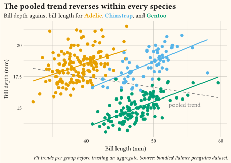
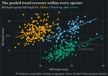
Per-species geom-smooth fits slope up while the pooled dashed trend slopes down: fit trends within groups before trusting an aggregate.
Show how two or more variables move together.
Pick these charts when the question is “do these variables move together?”: association, clusters, and surfaces over two dimensions. The scatter plot is the workhorse; add a smoother to make the trend explicit, and fit it per group before trusting any aggregate trend. When points pile up, switch from raw markers to 2D bins, hexagons, or contours, and name the outliers that would otherwise invite speculation. Every example ships its full source: click View source to copy it.
three or more variables scatter with trend lines
Per-species geom-smooth fits slope up while the pooled dashed trend slopes down: fit trends within groups before trusting an aggregate.
two numerics scatter with trend line
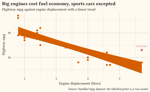
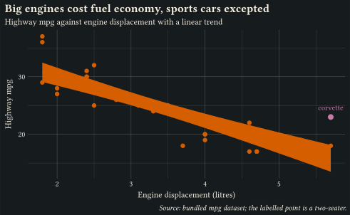
A linear geom-smooth trend with the off-trend two-seater highlighted and labelled via a filtered geom-text layer; name the points that defy your trend.
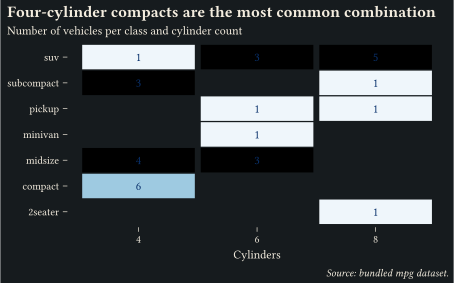
two categoricals heatmap
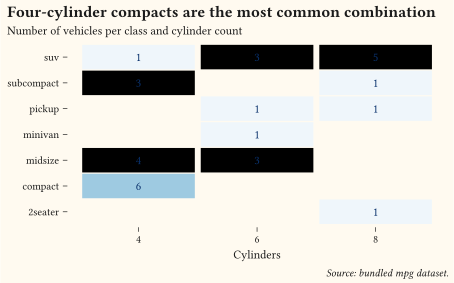
Class-by-cylinder counts from count drawn with geom-tile on a single-hue scale-gradient, with the number printed in every cell.
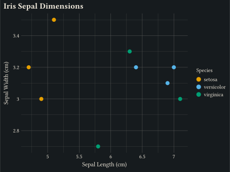
two numerics scatter plot
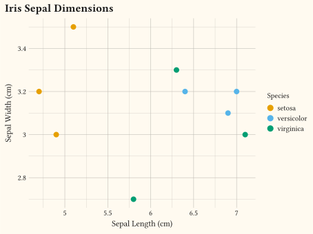
Inline iris sample plotted with a single geom-point layer and continuous x/y scales.
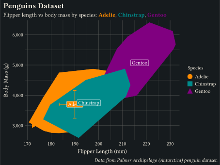
two numerics scatter plot
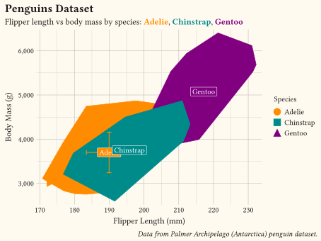
CSV-loaded dataset: flipper length versus body mass, coloured by species.
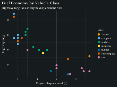
two numerics scatter plot
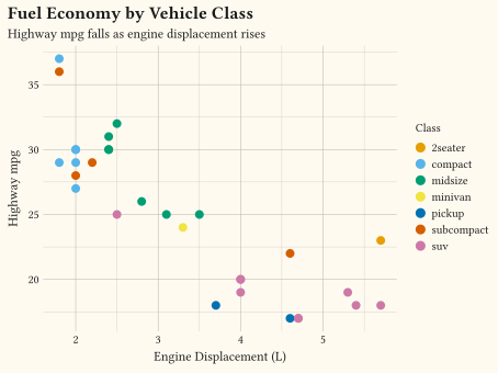
Highway mpg against engine displacement, filled by class: a quick look at the bundled mpg dataset.
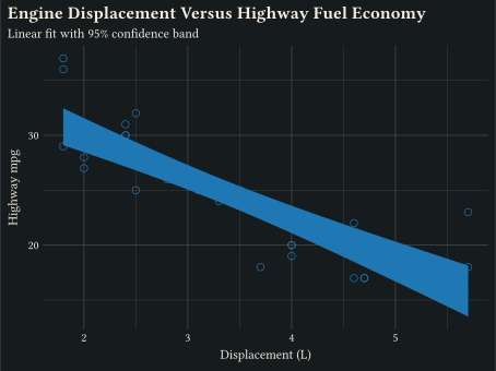
two numerics scatter with trend line
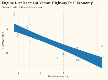
Scatter plus a linear fit with a 95% confidence ribbon from geom-smooth.
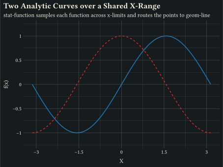
any function curve
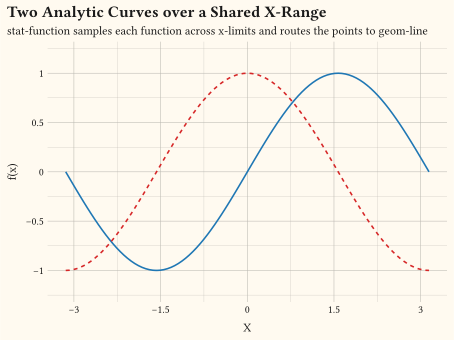
stat-function samples an analytic function over xlim and routes the points to any line geom.
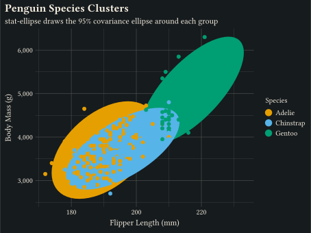
two numerics scatter with ellipses
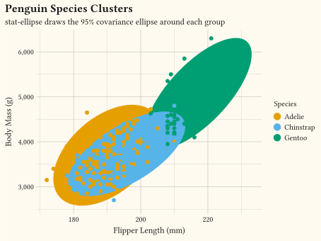
stat-ellipse draws the 95% covariance ellipse around each colour group.
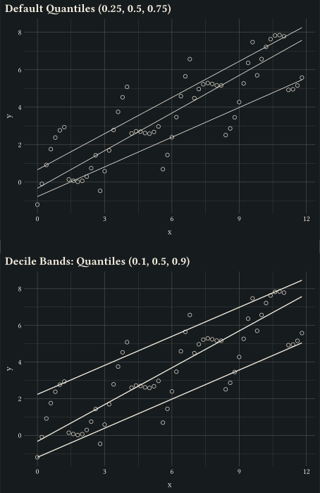
two numerics quantile regression
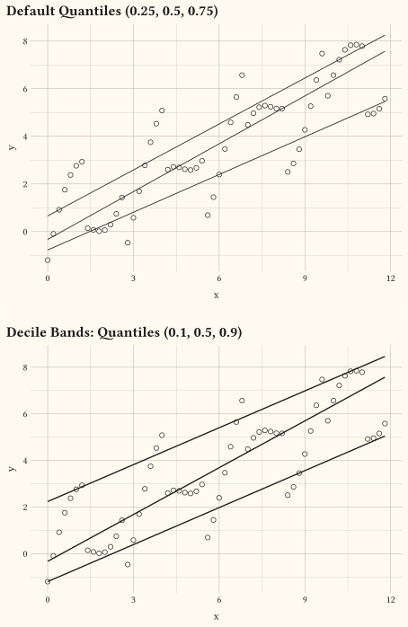
Per-tau quantile regression curves via geom-quantile.
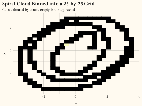
two numerics 2D bin heatmap
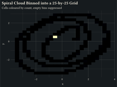
Drop (x, y) samples into a uniform grid via geom-bin-2d; cells colour by count.
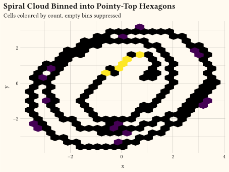
two numerics hexbin plot
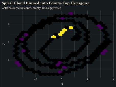
Pointy-top hex cells via geom-hex, the hexagonal counterpart to geom-bin-2d.
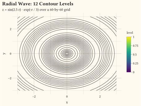
three or more variables contour plot
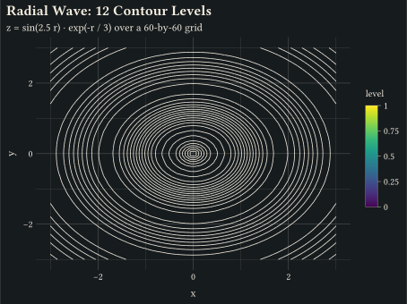
Marching-squares iso-lines on a regular (x, y, z) grid via geom-contour.
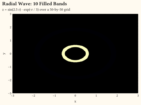
three or more variables filled contour
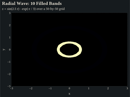
Closed iso-bands between contour levels via geom-contour-filled.
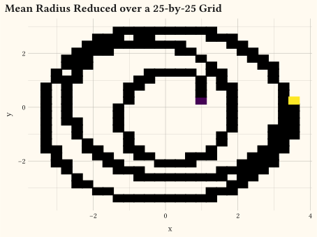
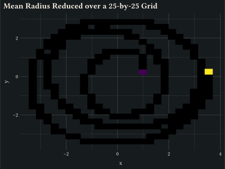
three or more variables 2D summary heatmap
stat-summary-2d reduces a z aesthetic over a grid; cells colour by the mean rather than the count.
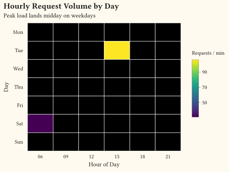
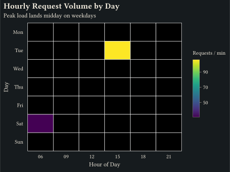
three or more variables
geom-tile renders an x/y/fill grid as filled rectangles.
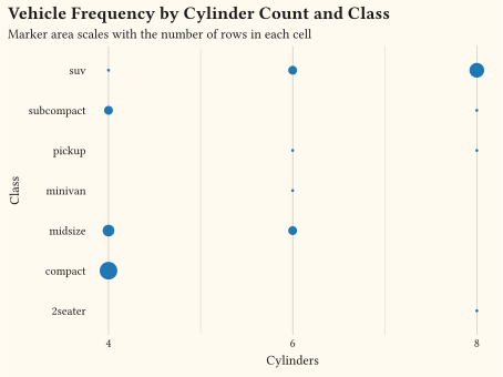
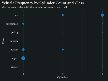
two categoricals count bubble chart
geom-count uses stat-sum to draw one marker per unique (x, y) sized by count.
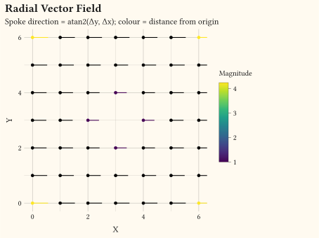
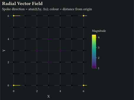
coordinates
geom-spoke draws short oriented segments from an angle and a radius.
// Showcase: Simpson's paradox in bill dimensions; the pooled trend (dashed)
// slopes down while every within-species trend slopes up.
#import "@preview/gribouille:0.7.0": *
#set page(width: auto, height: auto, margin: 0cm)
#let species-colours = (
Adelie: okabe-ito.at(0),
Chinstrap: okabe-ito.at(1),
Gentoo: okabe-ito.at(2),
)
#let species-scale = scale-discrete(
limits: species-colours.keys(),
palette: species-colours.values(),
)
#let bills = drop-na(penguins, "bill-len", "bill-dep")
#plot(
data: bills,
mapping: aes(
x: "bill-len",
y: "bill-dep",
colour: "species",
fill: "species",
),
layers: (
geom-smooth(
inherit-aes: false,
mapping: aes(x: "bill-len", y: "bill-dep"),
method: "lm",
se: false,
linetype: (4pt, 3pt),
colour: luma(50%),
),
geom-point(size: 2.2pt, alpha: 0.45),
geom-smooth(method: "lm", se: false, stroke: 1.4pt),
geom-text(
inherit-aes: false,
data: ((x: 57, y: 15.2, note: "pooled trend"),),
mapping: aes(x: "x", y: "y", label: "note"),
size: 9pt,
colour: luma(50%),
anchor: "east",
),
),
scales: scales(colour: species-scale, fill: species-scale),
labels: labels(
title: "The pooled trend reverses within every species",
subtitle: typst({
[Bill depth against bill length for ]
species-colours
.pairs()
.map(pair => text(fill: pair.at(1), weight: "bold")[#pair.at(0)])
.join([, ], last: [, and ])
}),
x: "Bill length (mm)",
y: "Bill depth (mm)",
caption: "Fit trends per group before trusting an aggregate. Source: bundled Palmer penguins dataset.",
),
guides: guides(default: none),
theme: theme-minimal(),
width: 12cm,
height: 8.5cm,
)// Showcase: scatter with a trend line and a named outlier; the two-seater
// that defies the trend gets a label instead of leaving readers guessing.
#import "@preview/gribouille:0.7.0": *
#set page(width: auto, height: auto, margin: 0cm)
#let accent = okabe-ito.at(5)
#let alert = okabe-ito.at(6)
#let two-seaters = mpg.filter(row => row.class == "2seater")
#plot(
data: mpg,
mapping: aes(x: "displ", y: "hwy"),
layers: (
geom-smooth(
method: "lm",
se: true,
alpha: 0.15,
colour: accent,
fill: accent,
),
geom-point(size: 2.4pt, alpha: 0.55, fill: accent),
geom-point(
inherit-aes: false,
data: two-seaters,
mapping: aes(x: "displ", y: "hwy"),
size: 3pt,
fill: alert,
),
geom-text(
inherit-aes: false,
data: two-seaters,
mapping: aes(x: "displ", y: "hwy", label: "model"),
nudge-y: 0.35cm,
size: 8pt,
colour: alert,
),
),
labels: labels(
title: "Big engines cost fuel economy, sports cars excepted",
subtitle: "Highway mpg against engine displacement with a linear trend",
x: "Engine displacement (litres)",
y: "Highway mpg",
caption: "Source: bundled mpg dataset; the labelled point is a two-seater.",
),
theme: theme-minimal(),
width: 13cm,
height: 8cm,
)// Showcase: count heatmap with values printed in the cells; a single-hue
// sequential ramp encodes magnitude and the numbers remove the guesswork.
// The ramp stops at a mid tone so the fixed dark ink reads on every cell,
// including the palest; a full light-to-dark ramp would strand the labels.
#import "@preview/gribouille:0.7.0": *
#set page(width: auto, height: auto, margin: 0cm)
#let ink = rgb("#08306b")
#let cells = count(mpg, "class", "cyl")
#plot(
data: cells,
mapping: aes(x: as-factor("cyl"), y: "class", fill: "n"),
layers: (
geom-tile(width: 0.95, height: 0.95),
geom-text(mapping: aes(label: "n"), size: 9pt, colour: ink),
),
scales: scales(
fill: scale-gradient(low: rgb("#eff6fb"), high: rgb("#9ecae1")),
),
labels: labels(
title: "Four-cylinder compacts are the most common combination",
subtitle: "Number of vehicles per class and cylinder count",
x: "Cylinders",
y: none,
caption: "Source: bundled mpg dataset.",
),
guides: guides(default: none),
theme: theme-minimal(axis-ticks: element-tick(length: 0.12cm)),
width: 12cm,
height: 7.5cm,
)// Minimal scatter plot with inline data.
#import "@preview/gribouille:0.7.0": *
#set page(width: auto, height: auto, margin: 0cm)
#let iris = (
(sepal-length: 5.1, sepal-width: 3.5, species: "setosa"),
(sepal-length: 4.9, sepal-width: 3.0, species: "setosa"),
(sepal-length: 4.7, sepal-width: 3.2, species: "setosa"),
(sepal-length: 7.0, sepal-width: 3.2, species: "versicolor"),
(sepal-length: 6.4, sepal-width: 3.2, species: "versicolor"),
(sepal-length: 6.9, sepal-width: 3.1, species: "versicolor"),
(sepal-length: 6.3, sepal-width: 3.3, species: "virginica"),
(sepal-length: 5.8, sepal-width: 2.7, species: "virginica"),
(sepal-length: 7.1, sepal-width: 3.0, species: "virginica"),
)
#plot(
data: iris,
mapping: aes(x: "sepal-length", y: "sepal-width", fill: "species"),
layers: (geom-point(size: 3pt),),
labels: labels(
title: "Iris Sepal Dimensions",
x: "Sepal Length (cm)",
y: "Sepal Width (cm)",
fill: "Species",
),
theme: theme-minimal(),
width: 12cm,
height: 9cm,
)// Bundled penguins dataset: flipper length vs body mass by species.
#import "@preview/gribouille:0.7.0": *
#set page(width: auto, height: auto, margin: 0cm)
#let species-colours = (
Adelie: rgb("#ff8c00"),
Chinstrap: rgb("#008B8B"),
Gentoo: rgb("#800080"),
)
#plot(
data: penguins,
mapping: aes(
x: "flipper-len",
y: "body-mass",
colour: "species",
fill: "species",
shape: "species",
),
layers: (
geom-point(size: 2pt, alpha: 0.25, stroke: 0.5pt, colour: rgb("#ffffff")),
geom-smooth(method: "lm", se: true, alpha: 0.2),
geom-mark(method: "hull", expand: 5pt, alpha: 0.25),
geom-errorbar(stat: stat-summary(fun: "mean-sd"), width: 5pt),
geom-errorbarh(stat: stat-summary(fun: "mean-sd"), height: 5pt),
geom-label(
stat: stat-summary(fun: "mean"),
mapping: aes(label: "species"),
colour: rgb("#ffffff"),
size: 8pt,
),
),
scales: scales(x: scale-continuous(), y: scale-continuous(labels: format-comma()), colour: scale-discrete(limits: species-colours.keys(),
palette: species-colours.values(),), fill: scale-discrete(limits: species-colours.keys(),
palette: species-colours.values(),)),
labels: labels(
title: typst("Penguins *Dataset*"),
subtitle: typst({
[Flipper length vs body mass by species: ]
species-colours
.pairs()
.map(p => text(fill: p.at(1), weight: "bold")[#p.at(0)])
.join(", ")
}),
caption: "Data from Palmer Archipelago (Antarctica) penguin dataset.",
colour: "Species",
fill: "Species",
shape: "Species",
x: "Flipper Length (mm)",
y: "Body Mass (g)",
),
theme: theme-minimal(),
width: 12cm,
height: 9cm,
)// Bundled mpg dataset: highway mpg vs engine displacement, filled by class.
#import "@preview/gribouille:0.7.0": *
#set page(width: auto, height: auto, margin: 0cm)
#plot(
data: mpg,
mapping: aes(x: "displ", y: "hwy", fill: "class"),
layers: (geom-point(size: 3pt, alpha: 0.85),),
labels: labels(
title: "Fuel Economy by Vehicle Class",
subtitle: "Highway mpg falls as engine displacement rises",
x: "Engine Displacement (L)",
y: "Highway mpg",
fill: "Class",
),
theme: theme-minimal(),
width: 12cm,
height: 9cm,
)// Scatter with an OLS smoother and 95% CI band.
#import "@preview/gribouille:0.7.0": *
#set page(width: auto, height: auto, margin: 0cm)
#let accent = rgb("#1f77b4")
#plot(
data: mpg,
mapping: aes(x: "displ", y: "hwy"),
layers: (
geom-point(size: 2.5pt, alpha: 0.75, colour: accent),
geom-smooth(method: "lm", colour: accent, fill: accent, alpha: 0.2),
),
labels: labels(
title: "Engine Displacement Versus Highway Fuel Economy",
subtitle: "Linear fit with 95% confidence band",
x: "Displacement (L)",
y: "Highway mpg",
),
theme: theme-minimal(),
width: 12cm,
height: 9cm,
)// stat-function samples an analytic function and feeds the result into any geom.
#import "@preview/gribouille:0.7.0": *
#set page(width: auto, height: auto, margin: 0cm)
#let frame = ((x: -calc.pi, y: -1.2), (x: calc.pi, y: 1.2))
#plot(
data: frame,
mapping: aes(x: "x", y: "y"),
layers: (
geom-blank(),
geom-line(
stat: stat-function(fun: x => calc.sin(x), x-limits: (-calc.pi, calc.pi)),
colour: rgb("#1f77b4"),
stroke: 1.2pt,
),
geom-line(
stat: stat-function(fun: x => calc.cos(x), x-limits: (-calc.pi, calc.pi)),
colour: rgb("#d62728"),
stroke: 1.2pt,
linetype: "dashed",
),
),
scales: scales(x: scale-continuous(breaks: (-3, -1.5, 0, 1.5, 3))),
labels: labels(
title: "Two Analytic Curves over a Shared X-Range",
subtitle: "stat-function samples each function across x-limits and routes the points to geom-line",
x: "X",
y: "f(x)",
),
theme: theme-minimal(),
width: 12cm,
height: 9cm,
)// stat-ellipse: per-group covariance ellipse drawn through geom-ellipse.
#import "@preview/gribouille:0.7.0": *
#set page(width: auto, height: auto, margin: 0cm)
#plot(
data: penguins,
mapping: aes(
x: "flipper-len",
y: "body-mass",
fill: "species",
colour: "species",
),
layers: (
geom-ellipse(stat: stat-ellipse(level: 0.95), alpha: 0.2),
geom-point(size: 2pt, alpha: 0.85),
),
scales: scales(y: scale-continuous(labels: format-comma())),
labels: labels(
title: "Penguin Species Clusters",
subtitle: "stat-ellipse draws the 95% covariance ellipse around each group",
x: "Flipper Length (mm)",
y: "Body Mass (g)",
colour: "Species",
fill: "Species",
),
theme: theme-minimal(),
width: 12cm,
height: 9cm,
)// geom-quantile: quantile-regression lines at user-supplied tau values.
#import "@preview/gribouille:0.7.0": *
#set page(width: auto, height: auto, margin: 0cm)
#let d = ()
#for i in range(0, 60) {
let x = i * 0.2
let y = 0.6 * x + calc.sin(i * 0.4) * 1.5 + (calc.rem(i, 7) - 3) * 0.4
d.push((x: x, y: y))
}
#plot(
data: d,
mapping: aes(x: "x", y: "y"),
layers: (
geom-point(size: 2pt, alpha: 0.4),
geom-quantile(),
),
labels: labels(title: "Default Quantiles (0.25, 0.5, 0.75)"),
theme: theme-minimal(),
width: 12cm,
height: 9cm,
)
#plot(
data: d,
mapping: aes(x: "x", y: "y"),
layers: (
geom-point(size: 2pt, alpha: 0.4),
geom-quantile(quantiles: (0.1, 0.5, 0.9), stroke: 1pt),
),
labels: labels(title: "Decile Bands: Quantiles (0.1, 0.5, 0.9)"),
theme: theme-minimal(),
width: 12cm,
height: 9cm,
)// Two-dimensional rectangular binning. Every (x, y) sample is dropped into a
// uniform grid; cell counts colour the rectangles via the fill scale.
#import "@preview/gribouille:0.7.0": *
#set page(width: auto, height: auto, margin: 0cm)
#let n = 600
#let d = range(0, n).map(i => {
let t = i / n
let theta = t * 6 * calc.pi
let r = 1 + t * 3 + calc.sin(theta * 2) * 0.4
(
x: r * calc.cos(theta) + calc.sin(t * 11.0) * 0.3,
y: r * calc.sin(theta) + calc.cos(t * 13.0) * 0.3,
)
})
#plot(
data: d,
mapping: aes(x: "x", y: "y"),
layers: (geom-bin-2d(bins: 25),),
scales: scales(fill: scale-viridis-c(option: "magma")),
labels: labels(
title: "Spiral Cloud Binned into a 25-by-25 Grid",
subtitle: "Cells coloured by count, empty bins suppressed",
fill: "count",
),
theme: theme-minimal(),
width: 12cm,
height: 9cm,
)// Hexagonal binning. Each (x, y) sample drops into a pointy-top hex cell;
// cells colour by count via the fill scale.
#import "@preview/gribouille:0.7.0": *
#set page(width: auto, height: auto, margin: 0cm)
#let n = 800
#let d = range(0, n).map(i => {
let t = i / n
let theta = t * 6 * calc.pi
let r = 1 + t * 3 + calc.sin(theta * 2) * 0.4
(
x: r * calc.cos(theta) + calc.sin(t * 11.0) * 0.3,
y: r * calc.sin(theta) + calc.cos(t * 13.0) * 0.3,
)
})
#plot(
data: d,
mapping: aes(x: "x", y: "y"),
layers: (geom-hex(bins: 22),),
scales: scales(fill: scale-viridis-c(option: "viridis")),
labels: labels(
title: "Spiral Cloud Binned into Pointy-Top Hexagons",
subtitle: "Cells coloured by count, empty bins suppressed",
fill: "count",
),
theme: theme-minimal(),
width: 12cm,
height: 9cm,
)// Marching-squares contour lines on a regular (x, y, z) grid. Sampling a
// classic radial-wave field gives a clean ring of iso-lines.
#import "@preview/gribouille:0.7.0": *
#set page(width: auto, height: auto, margin: 0cm)
#let n = 60
#let d = ()
#for i in range(n) {
for j in range(n) {
let x = -3 + 6 * i / (n - 1)
let y = -3 + 6 * j / (n - 1)
let r = calc.sqrt(x * x + y * y)
d.push((x: x, y: y, z: calc.sin(r * 2.5) * calc.exp(-r / 3)))
}
}
#plot(
data: d,
mapping: aes(x: "x", y: "y", z: "z", colour: "level"),
layers: (geom-contour(bins: 12, stroke: 0.6pt),),
scales: scales(colour: scale-viridis-c(option: "viridis")),
labels: labels(
title: "Radial Wave: 12 Contour Levels",
subtitle: "z = sin(2.5 r) · exp(-r / 3) over a 60-by-60 grid",
colour: "level",
),
theme: theme-minimal(),
width: 12cm,
height: 9cm,
)#import "@preview/gribouille:0.7.0": *
#set page(width: auto, height: auto, margin: 0cm)
#let n = 50
#let d = ()
#for i in range(n) {
for j in range(n) {
let x = -3 + 6 * i / (n - 1)
let y = -3 + 6 * j / (n - 1)
let r = calc.sqrt(x * x + y * y)
d.push((x: x, y: y, z: calc.sin(r * 2.5) * calc.exp(-r / 3)))
}
}
#plot(
data: d,
mapping: aes(x: "x", y: "y", z: "z"),
layers: (geom-contour-filled(bins: 10),),
scales: scales(
x: scale-continuous(expand: (0, 0)),
y: scale-continuous(expand: (0, 0)),
fill: scale-viridis-c(option: "magma"),
),
labels: labels(
title: "Radial Wave: 10 Filled Bands",
subtitle: "z = sin(2.5 r) · exp(-r / 3) over a 50-by-50 grid",
fill: "level",
),
theme: theme-minimal(),
width: 12cm,
height: 9cm,
)// Reduce a `z` aesthetic over a 2D grid: each cell colours by the mean of
// the values that fell inside it, instead of the cell count.
#import "@preview/gribouille:0.7.0": *
#set page(width: auto, height: auto, margin: 0cm)
#let n = 600
#let d = range(0, n).map(i => {
let t = i / n
let theta = t * 6 * calc.pi
let r = 1 + t * 3
let x = r * calc.cos(theta) + calc.sin(t * 11.0) * 0.3
let y = r * calc.sin(theta) + calc.cos(t * 13.0) * 0.3
(x: x, y: y, z: r)
})
#plot(
data: d,
mapping: aes(x: "x", y: "y", z: "z"),
layers: (geom-rect(stat: stat-summary-2d(fun: "mean", bins: 25)),),
scales: scales(fill: scale-viridis-c()),
labels: labels(
title: "Mean Radius Reduced over a 25-by-25 Grid",
fill: "mean(r)",
),
theme: theme-minimal(),
width: 12cm,
height: 9cm,
)// geom-tile: heatmap of x/y/fill.
#import "@preview/gribouille:0.7.0": *
#set page(width: auto, height: auto, margin: 0cm)
#let weeks = ("Mon", "Tue", "Wed", "Thu", "Fri", "Sat", "Sun")
#let hours = ("06", "09", "12", "15", "18", "21")
#let traffic = ()
#for (i, day) in weeks.enumerate() {
for (j, hour) in hours.enumerate() {
let weekend = day == "Sat" or day == "Sun"
let peak = if weekend { 60 } else { 100 }
let request-count = (
peak * (1.0 - calc.abs(j - 2.5) / 5.0) + calc.rem(i * 7 + j * 3, 17)
)
traffic.push((day: day, hour: hour, requests: request-count))
}
}
#plot(
data: traffic,
mapping: aes(x: "hour", y: "day", fill: "requests"),
layers: (geom-tile(stroke: 0.5pt, colour: rgb("#ffffff")),),
scales: scales(fill: scale-viridis-c(name: "Requests / min"), x: scale-discrete(limits: hours), y: scale-discrete(limits: weeks.rev())),
labels: labels(
title: "Hourly Request Volume by Day",
subtitle: "Peak load lands midday on weekdays",
x: "Hour of Day",
y: "Day",
),
theme: theme-minimal(),
width: 12cm,
height: 9cm,
)// geom-count: scatter where each unique (x, y) is drawn once and the count
// is exposed as the size aesthetic via stat-sum.
#import "@preview/gribouille:0.7.0": *
#set page(width: auto, height: auto, margin: 0cm)
#plot(
data: mpg,
mapping: aes(x: "cyl", y: "class"),
layers: (geom-count(fill: rgb("#1f77b4"), alpha: 0.7),),
scales: scales(x: scale-continuous(breaks: (4, 6, 8))),
labels: labels(
title: "Vehicle Frequency by Cylinder Count and Class",
subtitle: "Marker area scales with the number of rows in each cell",
x: "Cylinders",
y: "Class",
size: "Vehicles",
),
theme: theme-minimal(),
width: 12cm,
height: 9cm,
)// geom-spoke: vector field of unit-length arrows on a small grid.
#import "@preview/gribouille:0.7.0": *
#set page(width: auto, height: auto, margin: 0cm)
#let field = ()
#for i in range(0, 7) {
for j in range(0, 7) {
let dx = i - 3
let dy = j - 3
let mag = calc.sqrt(dx * dx + dy * dy)
if mag == 0 { continue }
field.push((
x: i,
y: j,
angle: calc.atan2(dy, dx),
r: 0.35 + 0.05 * mag,
mag: mag,
))
}
}
#plot(
data: field,
mapping: aes(x: "x", y: "y", angle: "angle", radius: "r", colour: "mag", fill: "mag"),
layers: (
geom-spoke(stroke: 0.8pt),
geom-point(size: 1.5pt),
),
scales: scales(colour: scale-viridis-c(), fill: scale-viridis-c()),
coord: coord-fixed(),
labels: labels(
title: "Radial Vector Field",
subtitle: "Spoke direction = atan2(Δy, Δx); colour = distance from origin",
x: "X",
y: "Y",
colour: "Magnitude",
fill: "Magnitude",
),
theme: theme-minimal(),
width: 12cm,
height: 9cm,
)