Titles and labels
any
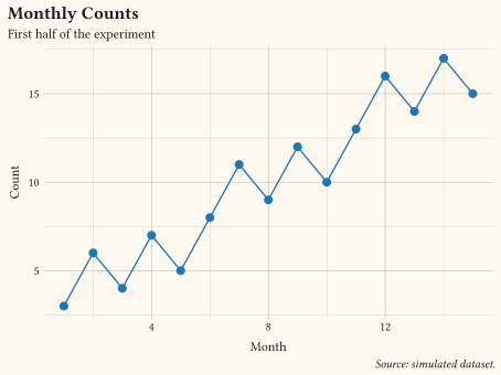
Title, subtitle, caption, and axis labels set in a single labels call.
Add reference lines, labels, and marks that guide the reader.
A chart tells a story when the annotations do the pointing: a threshold line, a named outlier, a shaded period, a title that states the finding. These examples cover reference lines, text and boxed labels, ad-hoc annotate layers, cluster marks, and free-form shapes drawn from coordinates. Write titles as findings rather than descriptions, and annotate the few points that matter instead of labelling everything. Every example ships its full source: click View source to copy it.
any
Title, subtitle, caption, and axis labels set in a single labels call.
any
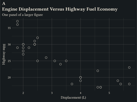
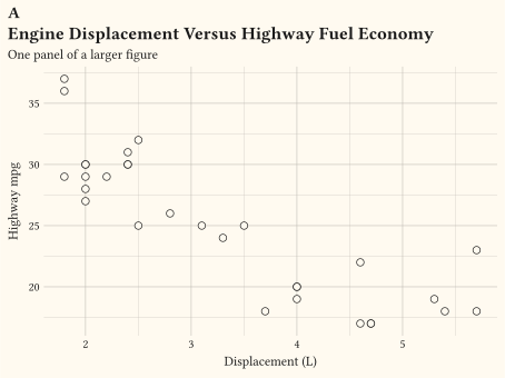
A figure tag drawn above the title via labels tag, styled by the plot-tag theme element.
two numerics
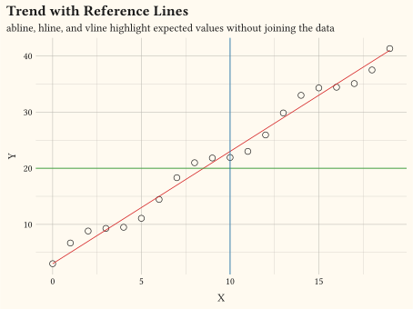
geom-abline, geom-hline, and geom-vline overlaid on a trend.
two numerics
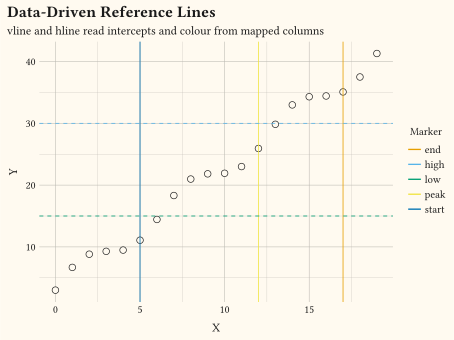
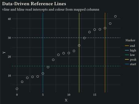
geom-vline and geom-hline read their intercepts and colour from mapped columns via aes.
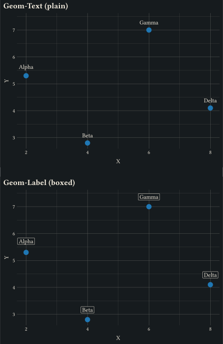
two numerics labelled scatter
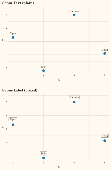
Points annotated with geom-text and boxed geom-label.
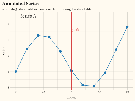
any
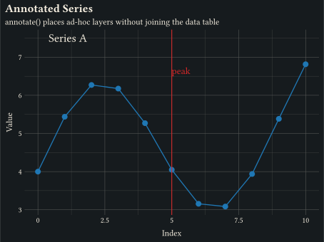
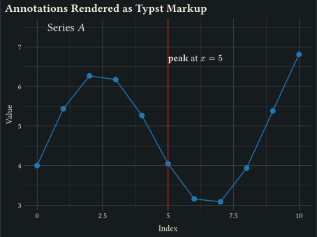
annotate places extra layers (text, vline) without joining them to the data table.
any
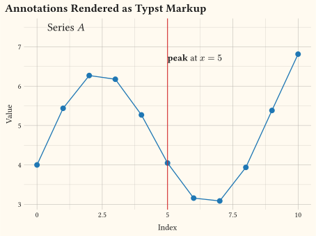
annotate("typst", label: "...") always evaluates the label as Typst markup; typst() forces evaluation inside annotate("text", ...).
any
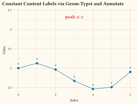
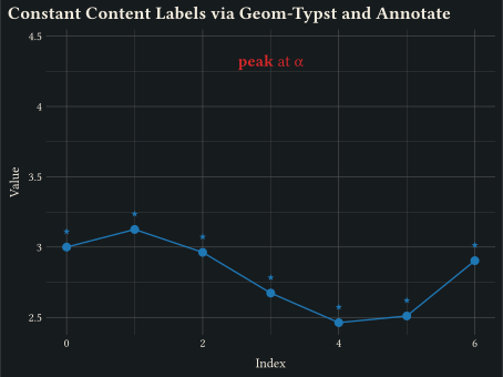
Set a content block on every row via geom-typst(label: [...]); or place a single content label with annotate("typst", label: [...]).
two numerics cluster marks
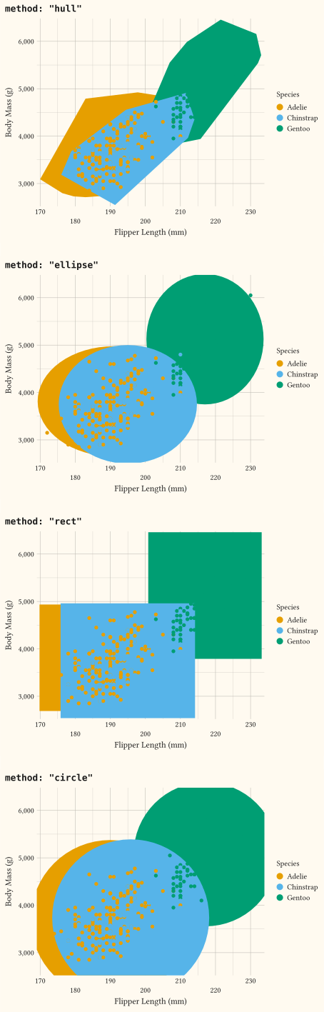
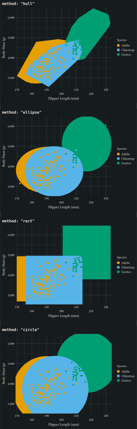
Enclose each cluster with a chosen shape via geom-mark (hull, ellipse, rect, circle).
coordinates
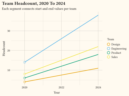
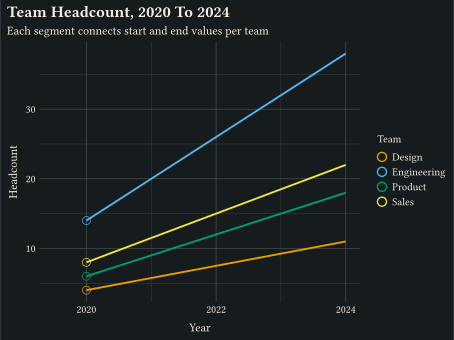
Lines from (x, y) to (xend, yend) via geom-segment.
coordinates
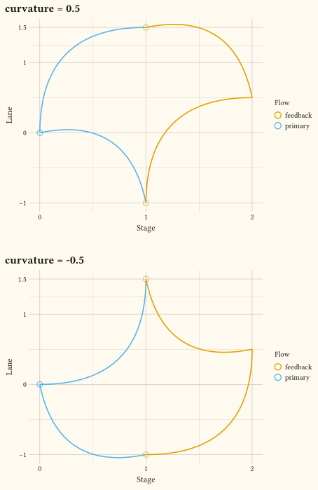
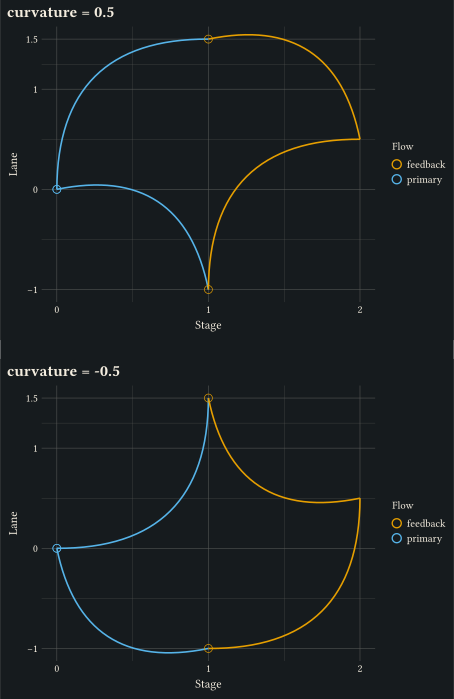
Quadratic bezier connectors with mapped colour via geom-curve.
coordinates
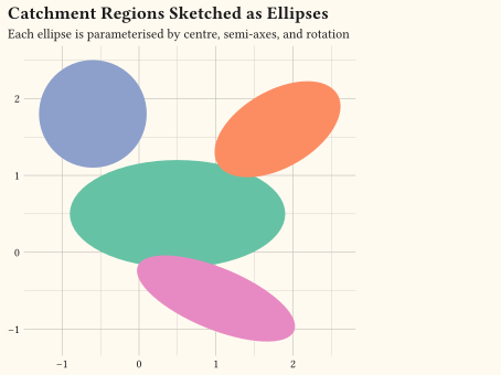
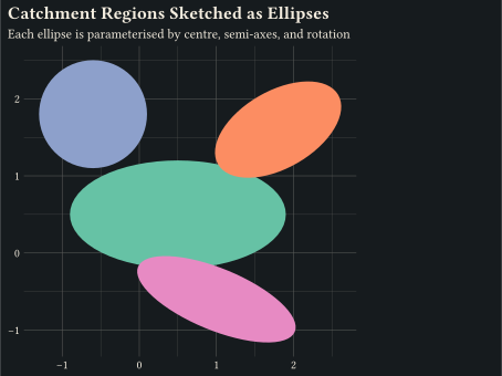
Ellipses with mapped centre, semi-axes, and rotation via geom-ellipse.
coordinates
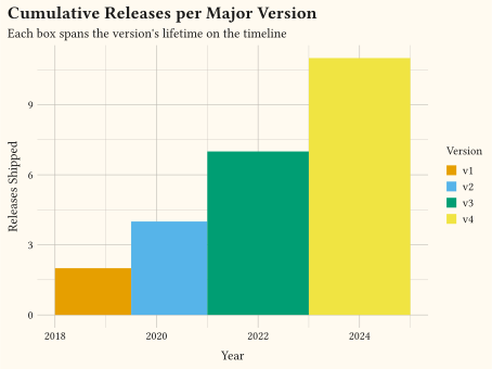
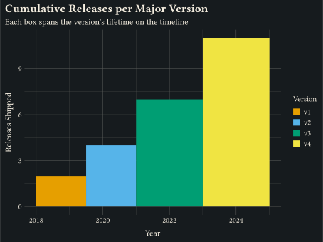
geom-rect draws filled boxes from xmin/xmax/ymin/ymax.
coordinates
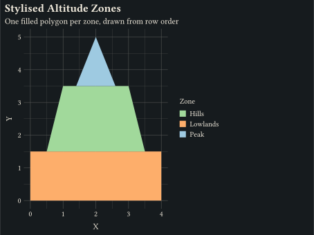
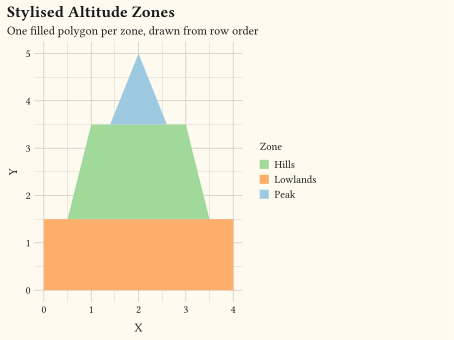
Closed filled regions, one per group, drawn by geom-polygon.
// labels(): title, subtitle, caption, and axis labels in one call.
#import "@preview/gribouille:0.7.0": *
#set page(width: auto, height: auto, margin: 0cm)
#let df = range(1, 16).map(i => (x: i, y: i + calc.rem(i * 7, 5)))
#plot(
data: df,
mapping: aes(x: "x", y: "y"),
layers: (
geom-line(stroke: 1pt, colour: rgb("#1f77b4")),
geom-point(size: 3pt, fill: rgb("#1f77b4")),
),
labels: labels(
title: "Monthly Counts",
subtitle: "First half of the experiment",
caption: "Source: simulated dataset.",
x: "Month",
y: "Count",
),
theme: theme-minimal(),
width: 12cm,
height: 9cm,
)// A figure tag drawn above the title, styled by the plot-tag theme element.
#import "@preview/gribouille:0.7.0": *
#set page(width: auto, height: auto, margin: 0cm)
#plot(
data: mpg,
mapping: aes(x: "displ", y: "hwy"),
layers: (geom-point(size: 2.5pt, alpha: 0.75),),
labels: labels(
tag: "A",
title: "Engine Displacement Versus Highway Fuel Economy",
subtitle: "One panel of a larger figure",
x: "Displacement (L)",
y: "Highway mpg",
),
theme: theme-minimal(),
width: 12cm,
height: 9cm,
)// Reference lines: hline, vline, and abline overlaid on a scatter plot.
#import "@preview/gribouille:0.7.0": *
#set page(width: auto, height: auto, margin: 0cm)
#let df = range(0, 20).map(i => (x: i, y: 2 * i + 3 + calc.sin(i) * 2))
#plot(
data: df,
mapping: aes(x: "x", y: "y"),
layers: (
geom-point(size: 2.5pt, alpha: 0.85),
geom-abline(slope: 2, intercept: 3, colour: rgb("#d62728")),
geom-hline(yintercept: 20, colour: rgb("#2ca02c")),
geom-vline(xintercept: 10, colour: rgb("#1f77b4")),
),
labels: labels(
title: "Trend with Reference Lines",
subtitle: "abline, hline, and vline highlight expected values without joining the data",
x: "X",
y: "Y",
),
theme: theme-minimal(),
width: 12cm,
height: 9cm,
)// Data-driven reference lines: bind the intercept channels through `aes()` so
// each row of an annotations frame draws its own line, coloured per row.
#import "@preview/gribouille:0.7.0": *
#set page(width: auto, height: auto, margin: 0cm)
#let df = range(0, 20).map(i => (x: i, y: 2 * i + 3 + calc.sin(i) * 2))
#let events = (
(at: 5, grp: "start"),
(at: 12, grp: "peak"),
(at: 17, grp: "end"),
)
#let bands = (
(lo: 15, lvl: "low"),
(lo: 30, lvl: "high"),
)
#plot(
data: df,
mapping: aes(x: "x", y: "y"),
layers: (
geom-point(size: 2.5pt, alpha: 0.85),
geom-vline(mapping: aes(xintercept: "at", colour: "grp"), data: events),
geom-hline(
mapping: aes(yintercept: "lo", colour: "lvl"),
data: bands,
linetype: "dashed",
),
),
labels: labels(
title: "Data-Driven Reference Lines",
subtitle: "vline and hline read intercepts and colour from mapped columns",
x: "X",
y: "Y",
colour: "Marker",
),
theme: theme-minimal(),
width: 12cm,
height: 9cm,
)// geom-text and geom-label: annotate points with their name.
#import "@preview/gribouille:0.7.0": *
#set page(width: auto, height: auto, margin: 0cm)
#let cities = (
(x: 2.0, y: 5.3, name: "Alpha"),
(x: 4.0, y: 2.8, name: "Beta"),
(x: 6.0, y: 7.0, name: "Gamma"),
(x: 8.0, y: 4.1, name: "Delta"),
)
#let accent = rgb("#1f77b4")
#grid(
columns: 1,
row-gutter: 0.5cm,
plot(
data: cities,
mapping: aes(x: "x", y: "y", label: "name"),
layers: (
geom-point(size: 4pt, fill: accent),
geom-text(mapping: aes(nudge-y: 0.3cm), size: 9pt, anchor: "south"),
),
scales: scales(y: scale-continuous(expand: (5%, 15%))),
labels: labels(title: "Geom-Text (plain)", x: "X", y: "Y"),
theme: theme-minimal(),
width: 12cm,
height: 9cm,
),
plot(
data: cities,
mapping: aes(x: "x", y: "y", label: "name"),
layers: (
geom-point(size: 4pt, fill: accent),
geom-label(mapping: aes(nudge-y: 0.35cm), size: 9pt, anchor: "south"),
),
scales: scales(y: scale-continuous(expand: (5%, 15%))),
labels: labels(title: "Geom-Label (boxed)", x: "X", y: "Y"),
theme: theme-minimal(),
width: 12cm,
height: 9cm,
),
)// annotate() adds ad-hoc text labels and reference lines to a base plot.
#import "@preview/gribouille:0.7.0": *
#set page(width: auto, height: auto, margin: 0cm)
#let accent = rgb("#1f77b4")
#let alert = rgb("#d62728")
#let df = range(0, 11).map(i => (x: i, y: 4 + 2 * calc.sin(i * 0.7) + i * 0.15))
#plot(
data: df,
mapping: aes(x: "x", y: "y"),
layers: (
geom-line(stroke: 1pt, colour: accent, alpha: 0.5),
geom-point(size: 3pt, fill: accent),
annotate("vline", xintercept: 5, colour: alert, stroke: 0.8pt),
annotate(
"text",
x: 5,
y: 6.4,
label: "peak",
anchor: "west",
nudge-y: 0.3cm,
size: 10pt,
colour: alert,
),
annotate(
"text",
x: 0.4,
y: 7.5,
label: "Series A",
anchor: "west",
size: 12pt,
),
),
labels: labels(
title: "Annotated Series",
subtitle: "annotate() places ad-hoc layers without joining the data table",
x: "Index",
y: "Value",
),
theme: theme-minimal(),
width: 12cm,
height: 9cm,
)// Two routings for Typst markup in annotations:
// - annotate("typst", label: "...") — the typst geom always evaluates the label.
// - annotate("text", label: typst("...")) — the typst() tag forces evaluation.
#import "@preview/gribouille:0.7.0": *
#set page(width: auto, height: auto, margin: 0cm)
#let accent = rgb("#1f77b4")
#let alert = rgb("#d62728")
#let df = range(0, 11).map(i => (x: i, y: 4 + 2 * calc.sin(i * 0.7) + i * 0.15))
#plot(
data: df,
mapping: aes(x: "x", y: "y"),
layers: (
geom-line(stroke: 1pt, colour: accent, alpha: 0.5),
geom-point(size: 3pt, fill: accent),
annotate("vline", xintercept: 5, colour: alert, stroke: 0.8pt),
annotate(
"typst",
x: 5,
y: 6.5,
label: "*peak* at $x = 5$",
anchor: "west",
nudge-y: 0.3cm,
size: 10pt,
),
annotate(
"text",
x: 0.4,
y: 7.5,
label: typst("Series _A_"),
anchor: "west",
size: 12pt,
),
),
labels: labels(
title: "Annotations Rendered as Typst Markup",
x: "Index",
y: "Value",
),
theme: theme-minimal(),
width: 12cm,
height: 9cm,
)// Constant Typst content as a label, set directly on the layer.
// - geom-typst(label: [...]) — content block applied to every row.
// - annotate("typst", label: [...]) — content block on a single row.
// Both forms accept content directly; no `typst()` wrapper is needed.
#import "@preview/gribouille:0.7.0": *
#set page(width: auto, height: auto, margin: 0cm)
#let accent = rgb("#1f77b4")
#let alert = rgb("#d62728")
#let df = range(0, 7).map(i => (x: i, y: 2 + calc.cos(i * 0.6) + i * 0.3))
#plot(
data: df,
mapping: aes(x: "x", y: "y"),
layers: (
geom-line(stroke: 1pt, colour: accent, alpha: 0.5),
geom-point(size: 3pt, fill: accent),
geom-typst(mapping: aes(nudge-y: 0.4cm), label: [#math.star], size: 12pt, colour: accent),
annotate(
"typst",
x: 3,
y: 4.2,
label: [*peak* at #math.alpha],
colour: alert,
anchor: "south",
nudge-y: 0.2cm,
size: 11pt,
),
),
scales: scales(y: scale-continuous(expand: (5%, 20%))),
labels: labels(
title: "Constant Content Labels via Geom-Typst and Annotate",
x: "Index",
y: "Value",
),
theme: theme-minimal(),
width: 12cm,
height: 9cm,
)// geom-mark: enclose each cluster with a chosen shape.
#import "@preview/gribouille:0.7.0": *
#set page(width: auto, height: auto, margin: 0cm)
#let panel(title, method, expand) = plot(
data: penguins,
mapping: aes(x: "flipper-len", y: "body-mass", fill: "species"),
layers: (
geom-mark(method: method, expand: expand, alpha: 0.25),
geom-point(size: 2pt, alpha: 0.85),
),
scales: scales(y: scale-continuous(labels: format-comma())),
guides: guides(
x: guide-axis(n-dodge: 2),
),
labels: labels(
title: title,
x: "Flipper Length (mm)",
y: "Body Mass (g)",
fill: "Species",
),
theme: theme-minimal(),
width: 12cm,
height: 9cm,
)
#grid(
columns: 1,
row-gutter: 0.5cm,
panel(`method: "hull"`, "hull", 8pt),
panel(`method: "ellipse"`, "ellipse", 10pt),
panel(`method: "rect"`, "rect", 8pt),
panel(`method: "circle"`, "circle", 8pt),
)// geom-segment: straight lines from (x, y) to (xend, yend).
#import "@preview/gribouille:0.7.0": *
#set page(width: auto, height: auto, margin: 0cm)
#let changes = (
(
team: "Engineering",
year-start: 2020,
headcount-start: 14,
year-end: 2024,
headcount-end: 38,
),
(
team: "Design",
year-start: 2020,
headcount-start: 4,
year-end: 2024,
headcount-end: 11,
),
(
team: "Product",
year-start: 2020,
headcount-start: 6,
year-end: 2024,
headcount-end: 18,
),
(
team: "Sales",
year-start: 2020,
headcount-start: 8,
year-end: 2024,
headcount-end: 22,
),
)
#plot(
data: changes,
mapping: aes(
x: "year-start",
y: "headcount-start",
xend: "year-end",
yend: "headcount-end",
colour: "team",
),
layers: (
geom-segment(stroke: 1.4pt),
geom-point(size: 3pt),
),
scales: scales(x: scale-continuous(breaks: (2020, 2022, 2024))),
labels: labels(
title: "Team Headcount, 2020 To 2024",
subtitle: "Each segment connects start and end values per team",
x: "Year",
y: "Headcount",
colour: "Team",
),
theme: theme-minimal(),
width: 12cm,
height: 9cm,
)// geom-curve: quadratic bezier connectors with mapped colour.
#import "@preview/gribouille:0.7.0": *
#set page(width: auto, height: auto, margin: 0cm)
#let connections = (
(x: 0, y: 0, xend: 1, yend: 1.5, flow: "primary"),
(x: 0, y: 0, xend: 1, yend: -1, flow: "primary"),
(x: 1, y: 1.5, xend: 2, yend: 0.5, flow: "feedback"),
(x: 1, y: -1, xend: 2, yend: 0.5, flow: "feedback"),
)
#let panel(title, curvature) = plot(
data: connections,
mapping: aes(x: "x", y: "y", xend: "xend", yend: "yend", colour: "flow"),
layers: (
geom-curve(curvature: curvature, stroke: 1.2pt),
geom-point(size: 3pt),
),
scales: scales(x: scale-continuous(breaks: (0, 1, 2)), y: scale-continuous(breaks: (-1, 0, 1, 1.5))),
labels: labels(title: title, x: "Stage", y: "Lane", colour: "Flow"),
theme: theme-minimal(),
width: 12cm,
height: 9cm,
)
#grid(
columns: 1,
row-gutter: 0.5cm,
panel("curvature = 0.5", 0.5),
panel("curvature = -0.5", -0.5),
)// geom-ellipse: parametric ellipses with mapped fill and rotation.
#import "@preview/gribouille:0.7.0": *
#set page(width: auto, height: auto, margin: 0cm)
#let regions = (
(x0: 0.5, y0: 0.5, a: 1.4, b: 0.7, angle: 0, region: "Coastal"),
(x0: 1.8, y0: 1.6, a: 0.9, b: 0.5, angle: calc.pi / 6, region: "Mountain"),
(x0: -0.6, y0: 1.8, a: 0.7, b: 0.7, angle: 0, region: "Plateau"),
(x0: 1.0, y0: -0.6, a: 1.1, b: 0.4, angle: -calc.pi / 8, region: "Valley"),
)
#plot(
data: regions,
mapping: aes(
x0: "x0",
y0: "y0",
a: "a",
b: "b",
angle: "angle",
fill: "region",
),
layers: (geom-ellipse(alpha: 0.5, stroke: 0.6pt),),
scales: scales(fill: scale-brewer(palette: "Set2")),
coord: coord-fixed(),
labels: labels(
title: "Catchment Regions Sketched as Ellipses",
subtitle: "Each ellipse is parameterised by centre, semi-axes, and rotation",
x: "Easting (km)",
y: "Northing (km)",
fill: "Region",
),
theme: theme-minimal(),
width: 12cm,
height: 9cm,
)// geom-rect: filled boxes from xmin/xmax/ymin/ymax.
#import "@preview/gribouille:0.7.0": *
#set page(width: auto, height: auto, margin: 0cm)
#let releases = (
(xmin: 2018, xmax: 2019.5, ymin: 0, ymax: 2, version: "v1"),
(xmin: 2019.5, xmax: 2021, ymin: 0, ymax: 4, version: "v2"),
(xmin: 2021, xmax: 2023, ymin: 0, ymax: 7, version: "v3"),
(xmin: 2023, xmax: 2025, ymin: 0, ymax: 11, version: "v4"),
)
#plot(
data: releases,
mapping: aes(
xmin: "xmin",
xmax: "xmax",
ymin: "ymin",
ymax: "ymax",
fill: "version",
),
layers: (geom-rect(alpha: 0.5, stroke: 0.5pt),),
scales: scales(x: scale-continuous(breaks: (2018, 2020, 2022, 2024))),
labels: labels(
title: "Cumulative Releases per Major Version",
subtitle: "Each box spans the version's lifetime on the timeline",
x: "Year",
y: "Releases Shipped",
fill: "Version",
),
theme: theme-minimal(),
width: 12cm,
height: 9cm,
)// geom-polygon: closed filled polygons, one per group.
#import "@preview/gribouille:0.7.0": *
#set page(width: auto, height: auto, margin: 0cm)
#let zones = (
(x: 0, y: 0, zone: "Lowlands"),
(x: 4, y: 0, zone: "Lowlands"),
(x: 4, y: 1.5, zone: "Lowlands"),
(x: 0, y: 1.5, zone: "Lowlands"),
(x: 0.5, y: 1.5, zone: "Hills"),
(x: 3.5, y: 1.5, zone: "Hills"),
(x: 3, y: 3.5, zone: "Hills"),
(x: 1, y: 3.5, zone: "Hills"),
(x: 1.4, y: 3.5, zone: "Peak"),
(x: 2.6, y: 3.5, zone: "Peak"),
(x: 2, y: 5, zone: "Peak"),
)
#plot(
data: zones,
mapping: aes(x: "x", y: "y", fill: "zone"),
layers: (geom-polygon(alpha: 0.6, stroke: 0.6pt),),
scales: scales(fill: scale-manual(values: (
rgb("#a1d99b"),
rgb("#fdae6b"),
rgb("#9ecae1"),
))),
coord: coord-fixed(),
labels: labels(
title: "Stylised Altitude Zones",
subtitle: "One filled polygon per zone, drawn from row order",
x: "X",
y: "Y",
fill: "Zone",
),
theme: theme-minimal(),
width: 12cm,
height: 9cm,
)