Overlaid densities, direct labels
numeric vs categorical density plot
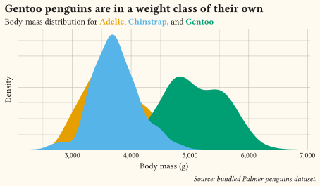
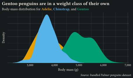
Body-mass distributions per species via geom-density: translucent fills keep every curve readable and the coloured subtitle replaces the legend.
Show how a numeric variable spreads, alone or across groups.
Use these charts to answer “how are the values spread?”: centre, spread, skew, modes, and outliers. Histograms and density curves describe a single variable; boxplots, strip plots, and ridgelines compare that spread across groups. Summaries hide as much as they show, so keep raw points visible behind boxplots when the sample is small, and order groups by their median rather than alphabetically. Every example ships its full source: click View source to copy it.
numeric vs categorical density plot
Body-mass distributions per species via geom-density: translucent fills keep every curve readable and the coloured subtitle replaces the legend.
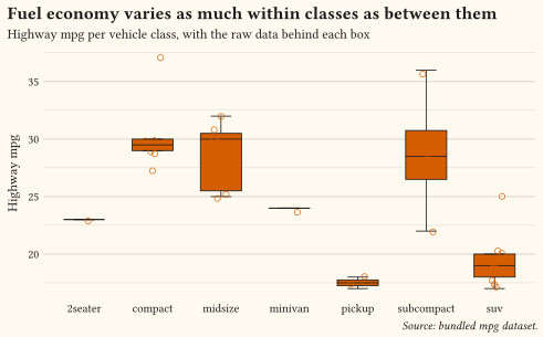
numeric vs categorical boxplot
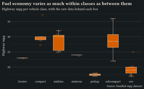
geom-boxplot with the raw observations jittered behind each box; summaries never hide the data they summarise.
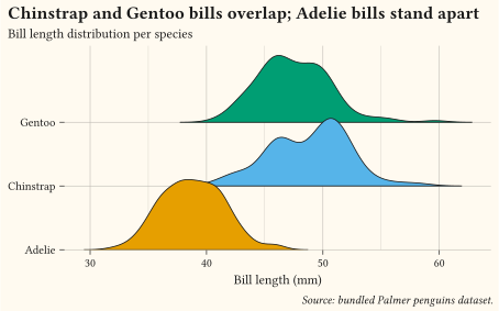
numeric vs categorical ridgeline
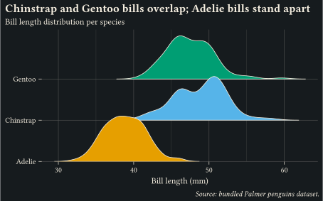
Bill-length distributions stacked as ridges via geom-density-ridges: small multiples of the same distribution without a legend.
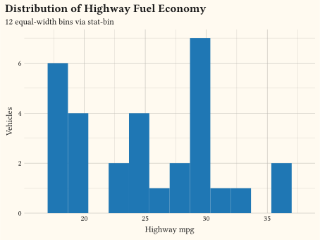
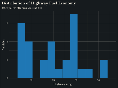
one numeric
Continuous x binned with stat-bin via geom-histogram.
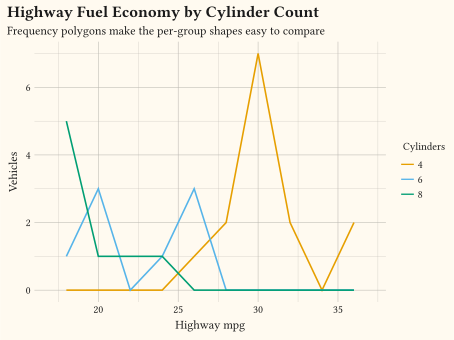
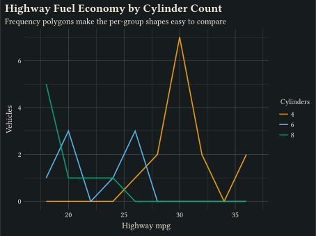
numeric vs categorical frequency polygon
Line through binned counts via geom-freqpoly, the line counterpart to a histogram.
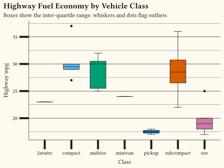
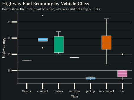
numeric vs categorical boxplot
stat-boxplot reduces each group to a five-number summary; geom-boxplot draws the Tukey box.
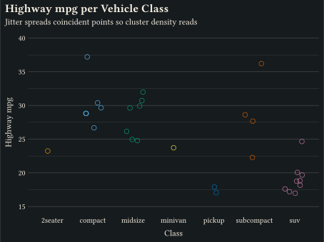
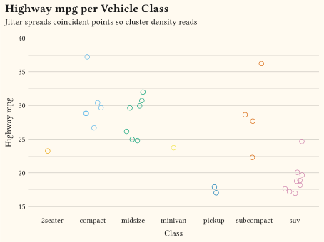
numeric vs categorical strip plot
geom-jitter spreads coincident points using position-jitter.
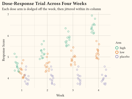
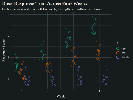
three or more variables strip plot
position-jitterdodge dodges colour groups apart, then jitters within each.
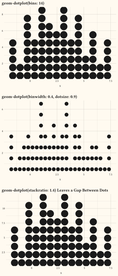
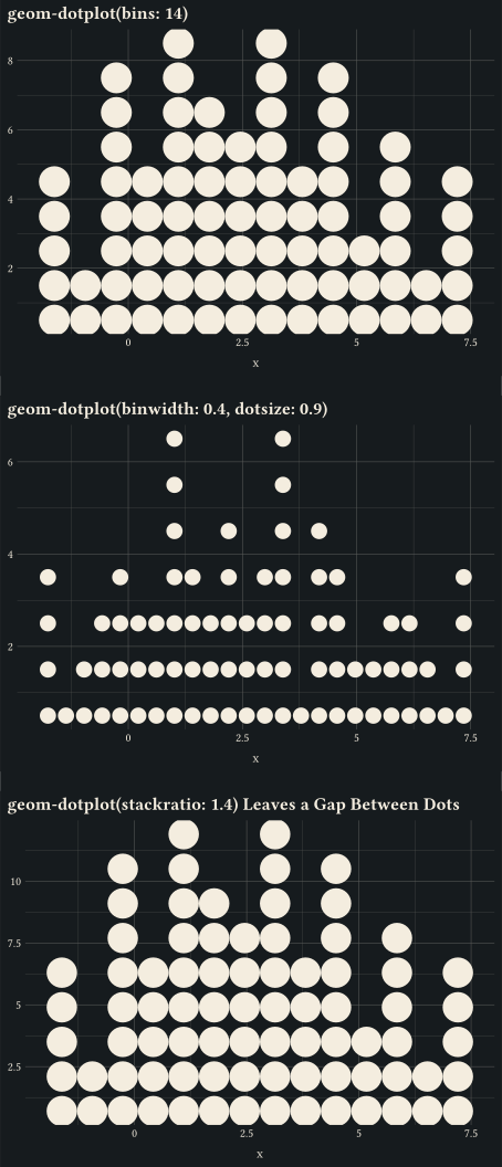
one numeric dot plot
Stacked dots over a binned x distribution via geom-dotplot; tune bins, binwidth, dotsize, and stackratio.
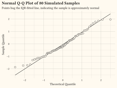
one numeric Q-Q plot
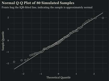
geom-qq with geom-qq-line compares sample quantiles to a theoretical distribution.
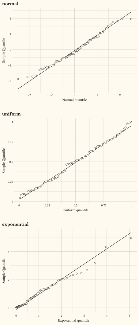
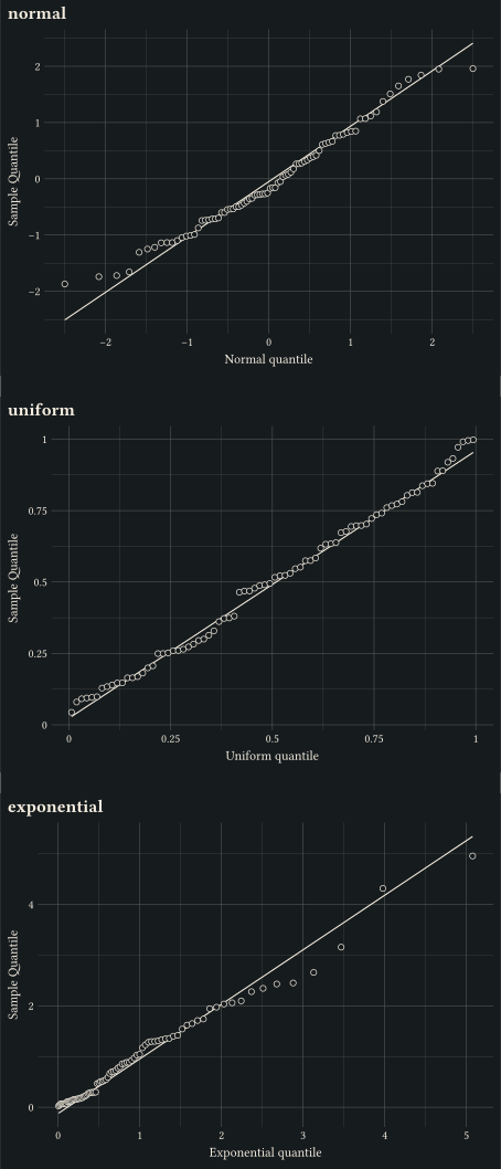
one numeric Q-Q plot
Pass distribution: to stat-qq / stat-qq-line to compare against uniform or exponential references.
// Showcase: overlaid body-mass densities per species, labelled in the
// subtitle instead of a legend; translucent fills keep every curve readable.
#import "@preview/gribouille:0.7.0": *
#set page(width: auto, height: auto, margin: 0cm)
#let species-colours = (
Adelie: okabe-ito.at(0),
Chinstrap: okabe-ito.at(1),
Gentoo: okabe-ito.at(2),
)
#let species-scale = scale-discrete(
limits: species-colours.keys(),
palette: species-colours.values(),
)
#plot(
data: drop-na(penguins, "body-mass"),
mapping: aes(x: "body-mass", colour: "species", fill: "species"),
layers: (
geom-density(fill: auto, alpha: 0.35, stroke: 1pt),
),
scales: scales(
x: scale-continuous(labels: format-comma()),
colour: species-scale,
fill: species-scale,
),
labels: labels(
title: "Gentoo penguins are in a weight class of their own",
subtitle: typst({
[Body-mass distribution for ]
species-colours
.pairs()
.map(pair => text(fill: pair.at(1), weight: "bold")[#pair.at(0)])
.join([, ], last: [, and ])
}),
x: "Body mass (g)",
y: "Density",
caption: "Source: bundled Palmer penguins dataset.",
),
guides: guides(default: none),
theme: theme-minimal()
+ theme-sub-axis-y(text: element-blank(), ticks: element-blank()),
width: 12cm,
height: 7cm,
)// Showcase: boxplots ordered by median with the raw observations jittered
// behind them; summaries never hide the data they summarise.
#import "@preview/gribouille:0.7.0": *
#set page(width: auto, height: auto, margin: 0cm)
#let accent = okabe-ito.at(5)
#plot(
data: mpg,
mapping: aes(x: "class", y: "hwy"),
layers: (
geom-boxplot(fill: accent, alpha: 0.35, outlier-size: 0pt),
geom-jitter(
size: 2pt,
alpha: 0.5,
colour: accent,
position: position-jitter(width: 0.12, seed: 42),
),
),
labels: labels(
title: "Fuel economy varies as much within classes as between them",
subtitle: "Highway mpg per vehicle class, with the raw data behind each box",
x: none,
y: "Highway mpg",
caption: "Source: bundled mpg dataset.",
),
theme: theme-minimal(),
width: 13cm,
height: 8cm,
)// Showcase: ridgeline of bill length per species; stacked densities read as
// small multiples of the same distribution without a shared-legend detour.
#import "@preview/gribouille:0.7.0": *
#set page(width: auto, height: auto, margin: 0cm)
#let species-colours = (
Adelie: okabe-ito.at(0),
Chinstrap: okabe-ito.at(1),
Gentoo: okabe-ito.at(2),
)
#plot(
data: drop-na(penguins, "bill-len"),
mapping: aes(x: "bill-len", y: "species", fill: "species"),
layers: (
geom-density-ridges(scale: 1.1, alpha: 0.6),
),
scales: scales(
y: scale-discrete(expand: (0%, 60%)),
fill: scale-discrete(
limits: species-colours.keys(),
palette: species-colours.values(),
)
),
labels: labels(
title: "Chinstrap and Gentoo bills overlap; Adelie bills stand apart",
subtitle: "Bill length distribution per species",
x: "Bill length (mm)",
y: none,
caption: "Source: bundled Palmer penguins dataset.",
),
guides: guides(default: none),
theme: theme-minimal(
axis-ticks: element-tick(length: 0.12cm),
panel-grid-major-y: element-line()
),
width: 12cm,
height: 7.5cm,
)// Histogram: continuous x binned via stat-bin.
#import "@preview/gribouille:0.7.0": *
#set page(width: auto, height: auto, margin: 0cm)
#plot(
data: mpg,
mapping: aes(x: "hwy"),
layers: (geom-histogram(bins: 12, fill: rgb("#1f77b4"), alpha: 0.85),),
labels: labels(
title: "Distribution of Highway Fuel Economy",
subtitle: "12 equal-width bins via stat-bin",
x: "Highway mpg",
y: "Vehicles",
),
theme: theme-minimal(),
width: 12cm,
height: 9cm,
)// geom-freqpoly: line through binned counts, the line counterpart to a histogram.
#import "@preview/gribouille:0.7.0": *
#set page(width: auto, height: auto, margin: 0cm)
#plot(
data: mpg,
mapping: aes(x: "hwy", colour: as-factor("cyl")),
layers: (geom-freqpoly(bins: 10, stroke: 1.2pt),),
labels: labels(
title: "Highway Fuel Economy by Cylinder Count",
subtitle: "Frequency polygons make the per-group shapes easy to compare",
x: "Highway mpg",
y: "Vehicles",
colour: "Cylinders",
),
theme: theme-minimal(),
width: 12cm,
height: 9cm,
)// stat-boxplot reduces each group to a five-number summary; geom-boxplot draws the Tukey box.
#import "@preview/gribouille:0.7.0": *
#set page(width: auto, height: auto, margin: 0cm)
#plot(
data: mpg,
mapping: aes(x: "class", y: "hwy", fill: "class"),
layers: (geom-boxplot(),),
guides: guides(fill: none),
labels: labels(
title: "Highway Fuel Economy by Vehicle Class",
subtitle: "Boxes show the inter-quartile range; whiskers and dots flag outliers",
x: "Class",
y: "Highway mpg",
),
theme: theme(
axis-ticks: element-tick(length: 0.5cm, stroke: 3pt),
),
width: 12cm,
height: 9cm,
)// geom-jitter spreads overlapping points so density per category is visible.
#import "@preview/gribouille:0.7.0": *
#set page(width: auto, height: auto, margin: 0cm)
#plot(
data: mpg,
mapping: aes(x: "class", y: "hwy", colour: "class"),
layers: (
geom-jitter(
size: 2.5pt,
alpha: 0.85,
position: position-jitter(width: 0.25),
),
),
scales: scales(y: scale-continuous(breaks: (15, 20, 25, 30, 35, 40))),
guides: guides(colour: none),
labels: labels(
title: "Highway mpg per Vehicle Class",
subtitle: "Jitter spreads coincident points so cluster density reads",
x: "Class",
y: "Highway mpg",
),
theme: theme-minimal(),
width: 12cm,
height: 9cm,
)// position-jitterdodge: dodge groups apart, then jitter within each group.
#import "@preview/gribouille:0.7.0": *
#set page(width: auto, height: auto, margin: 0cm)
#let trial = ()
#for arm in ("placebo", "low", "high") {
for week in (1, 2, 3, 4) {
for i in range(0, 12) {
let drift = if arm == "high" { 0.6 } else if arm == "low" { 0.3 } else {
0.0
}
let baseline = 4.0 + drift * week + 0.05 * (i - 6)
trial.push((
week: week,
response: baseline + calc.sin(i * 0.7) * 0.3,
arm: arm,
))
}
}
}
#plot(
data: trial,
mapping: aes(x: "week", y: "response", colour: "arm"),
layers: (
geom-jitter(
size: 2pt,
alpha: 0.85,
position: position-jitterdodge(width: 0.12, dodge-width: 0.6),
),
),
scales: scales(x: scale-continuous(breaks: (1, 2, 3, 4)), colour: scale-brewer(palette: "Dark2")),
labels: labels(
title: "Dose-Response Trial Across Four Weeks",
subtitle: "Each dose arm is dodged off the week, then jittered within its column",
x: "Week",
y: "Response Score",
colour: "Arm",
),
theme: theme-minimal(),
width: 12cm,
height: 9cm,
)// geom-dotplot: stacked dots over a binned x-distribution.
#import "@preview/gribouille:0.7.0": *
#set page(width: auto, height: auto, margin: 0cm)
#let d = range(0, 80).map(i => (
x: calc.sin(i * 0.27) * 3 + i * 0.06,
))
#plot(
data: d,
mapping: aes(x: "x"),
layers: (geom-dotplot(bins: 14),),
labels: labels(title: "geom-dotplot(bins: 14)"),
theme: theme-minimal(),
width: 12cm,
height: 9cm,
)
#plot(
data: d,
mapping: aes(x: "x"),
layers: (geom-dotplot(binwidth: 0.4, dotsize: 0.9),),
labels: labels(title: "geom-dotplot(binwidth: 0.4, dotsize: 0.9)"),
theme: theme-minimal(),
width: 12cm,
height: 9cm,
)
#plot(
data: d,
mapping: aes(x: "x"),
layers: (geom-dotplot(bins: 14, stackratio: 1.4),),
labels: labels(
title: "geom-dotplot(stackratio: 1.4) Leaves a Gap Between Dots",
),
theme: theme-minimal(),
width: 12cm,
height: 9cm,
)// Q-Q plot: 80 normal-ish samples (sum of 12 uniforms) against standard-normal quantiles.
#import "@preview/gribouille:0.7.0": *
#set page(width: auto, height: auto, margin: 0cm)
// Linear-congruential generator: 80 normal-ish draws via the sum of 12
// uniforms minus 6. Seeded for reproducibility.
#let _draw-samples(n) = {
let seed = 1234567
let out = ()
let i = 0
while i < n {
let acc = 0.0
let j = 0
while j < 12 {
seed = calc.rem(seed * 1103515245 + 12345, 2147483648)
acc = acc + seed / 2147483648
j = j + 1
}
out.push((v: acc - 6.0))
i = i + 1
}
out
}
#plot(
data: _draw-samples(80),
mapping: aes(y: "v"),
layers: (
geom-qq-line(stroke: 0.8pt),
geom-qq(size: 2.5pt, alpha: 0.85),
),
labels: labels(
title: "Normal Q-Q Plot of 80 Simulated Samples",
subtitle: "Points hug the IQR-fitted line, indicating the sample is approximately normal",
x: "Theoretical Quantile",
y: "Sample Quantile",
),
theme: theme-minimal(),
width: 12cm,
height: 9cm,
)// Q-Q plots against three reference distributions: normal, uniform, exponential.
#import "@preview/gribouille:0.7.0": *
#set page(width: auto, height: auto, margin: 0cm)
#let _lcg(seed) = {
calc.rem(seed * 1103515245 + 12345, 2147483648)
}
#let _draw-normal(n) = {
let seed = 1234567
let out = ()
let i = 0
while i < n {
let acc = 0.0
let j = 0
while j < 12 {
seed = _lcg(seed)
acc = acc + seed / 2147483648
j = j + 1
}
out.push((v: acc - 6.0))
i = i + 1
}
out
}
#let _draw-uniform(n) = {
let seed = 2468013
let out = ()
let i = 0
while i < n {
seed = _lcg(seed)
out.push((v: seed / 2147483648))
i = i + 1
}
out
}
#let _draw-exponential(n) = {
let seed = 9876543
let out = ()
let i = 0
while i < n {
seed = _lcg(seed)
let u = (seed + 1) / 2147483649
out.push((v: -calc.ln(1 - u)))
i = i + 1
}
out
}
#let panel(title, data, dist, x-name) = plot(
data: data,
mapping: aes(y: "v"),
layers: (
geom-qq-line(stroke: 0.8pt, distribution: dist),
geom-qq(size: 2pt, alpha: 0.85, distribution: dist),
),
labels: labels(title: title, x: x-name, y: "Sample Quantile"),
theme: theme-minimal(),
width: 12cm,
height: 9cm,
)
#grid(
columns: 1,
row-gutter: 0.5cm,
panel("normal", _draw-normal(80), "normal", "Normal quantile"),
panel("uniform", _draw-uniform(80), "uniform", "Uniform quantile"),
panel(
"exponential",
_draw-exponential(80),
"exponential",
"Exponential quantile",
),
)