Sorted dot plot
numeric vs categorical dot plot
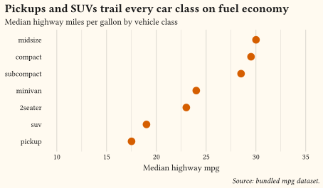
Median highway economy per class as a Cleveland dot plot: dots over bars for point estimates, categories sorted by value, and no legend. Built with summarise and geom-point.
Compare magnitudes across categories, or rank them.
Reach for these charts when the question is “which is bigger?”: one value per category, or one value per category within groups. Bars remain the most accurate encoding for magnitude, and dot plots do the same job with less ink when you only show a point estimate. Sort categories by value rather than alphabetically, flip to horizontal bars when labels are long, and label bars directly instead of forcing readers through a legend. Every example ships its full source: click View source to copy it.
numeric vs categorical dot plot
Median highway economy per class as a Cleveland dot plot: dots over bars for point estimates, categories sorted by value, and no legend. Built with summarise and geom-point.
one categorical horizontal bar chart
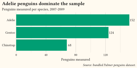
Counts per category flipped horizontal via coord-flip with the value printed at each bar end by geom-text, so no value axis guesswork remains.
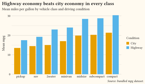
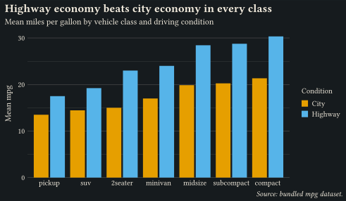
three or more variables grouped bar chart
City and highway means per class reshaped with pivot-longer and dodged via position-dodge; classes sorted by value and coloured with the Okabe-Ito palette.
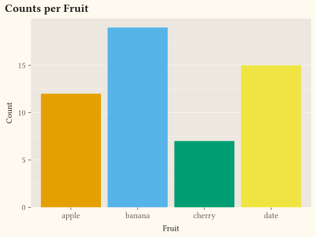
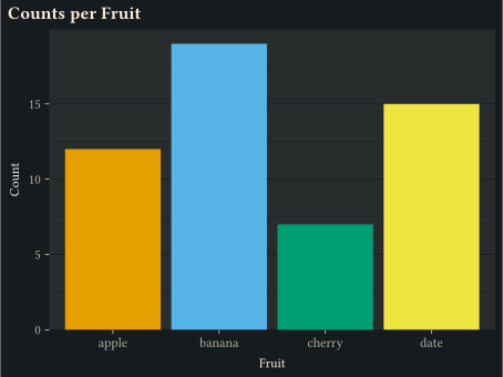
one categorical bar chart
Discrete x counted with geom-bar.
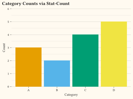
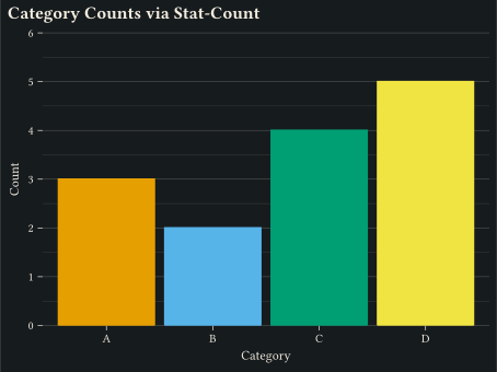
one categorical bar chart
geom-bar backed by stat-count to tally observations per category.
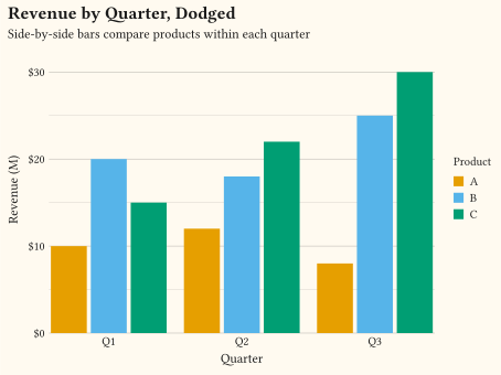
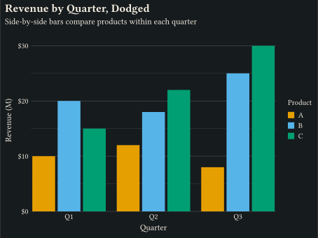
two categoricals grouped bar chart
Side-by-side bars per group via position-dodge on geom-col.
two categoricals grouped bar chart
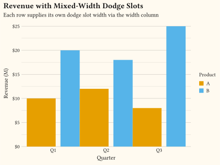
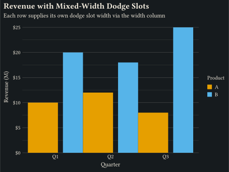
Per-row width column lets position-dodge give one product a wider slot than another.
numeric vs categorical horizontal bar chart
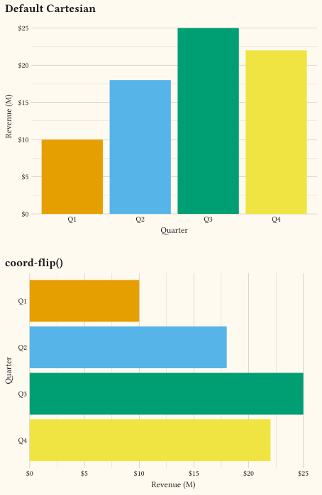
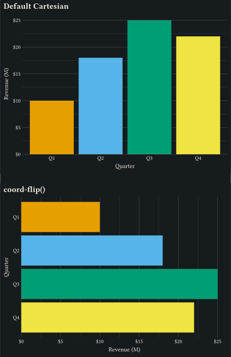
coord-flip swaps x and y so vertical bars read horizontally.