Shares, not counts
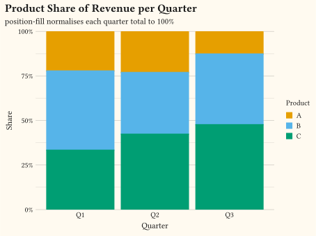
two categoricals proportional bar chart
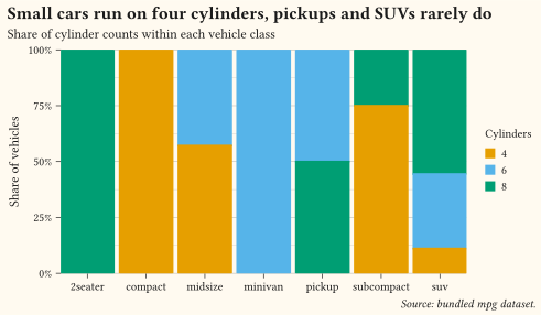
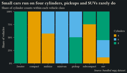
position-fill normalises every bar to 1 so composition, not volume, is the message; the y axis reads as percentages via format-percent.
Show shares of a total, or wrap a sequence around a circle.
Use these charts when the total matters as much as the parts, or when the data is inherently circular (hours, compass directions, repeated cycles). Stacked and filled bars compare shares across groups; waffles make a single share countable; pies are fine for a handful of directly labelled slices, and misleading beyond that. Keep segment order consistent across bars, label slices directly rather than through a legend, and reserve radial layouts for data with a genuine angular meaning. Every example ships its full source: click View source to copy it.
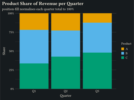
two categoricals proportional bar chart
position-fill normalises every bar to 1 so composition, not volume, is the message; the y axis reads as percentages via format-percent.
one categorical waffle chart
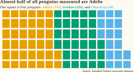
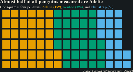
stat-waffle turns shares into countable unit squares (one square is four penguins) where a pie would force angle comparison; the coloured subtitle carries the key.
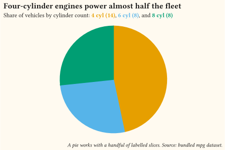
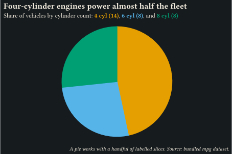
one categorical pie chart
When a pie is fine: three slices under coord-radial, keyed directly in the coloured subtitle, no legend to shuttle between.
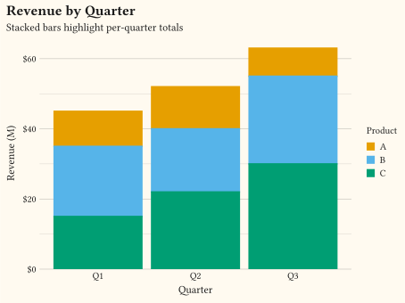
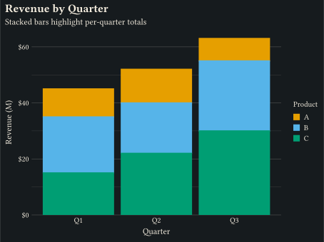
two categoricals stacked bar chart
geom-col with position-stack for cumulative totals per group.
two categoricals proportional bar chart
Each column normalised to 1 with position-fill to compare shares.
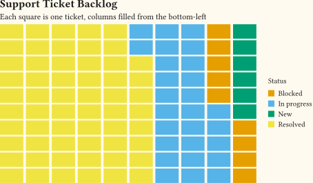
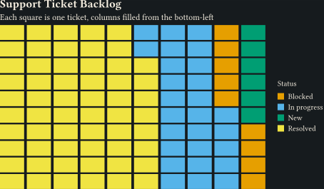
one categorical
stat-waffle turns per-group counts into unit geom-tile cells, filling the grid column by column from the bottom-left.
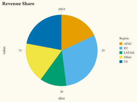
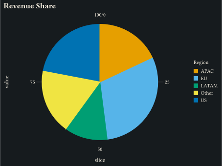
one categorical pie chart
coord-radial(theta: "y") with stacked geom-col turns one stacked bar into a pie chart of revenue share.
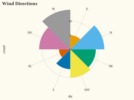
one categorical
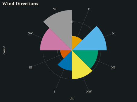
Discrete categories distributed around the circle via coord-radial(theta: "x") with geom-col; bar height encodes the count.
time series radial chart
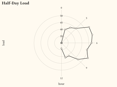
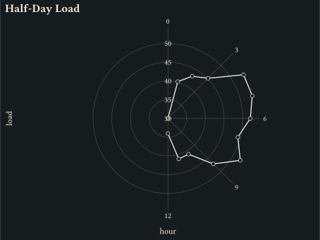
Pass end: calc.pi to coord-radial for a partial sweep; the panel becomes a half-circle and domain endpoints land at distinct angles instead of stacking.
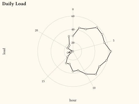
time series radial chart
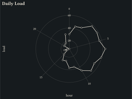
Wrap an hourly series around a circle via coord-radial(theta: "x"): hour drives the angle and load the radius.
three or more variables
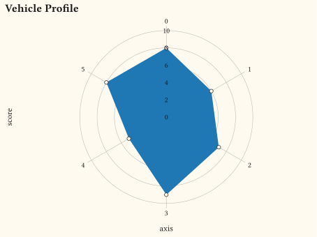
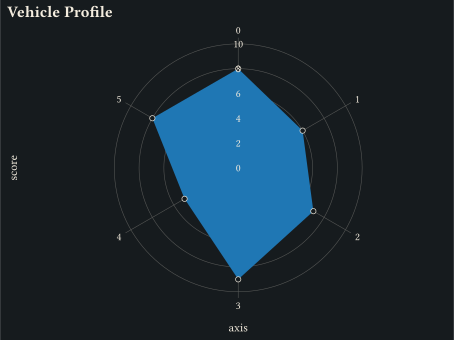
Closed polygon under coord-radial(theta: "x") with one vertex per axis, drawn via geom-polygon.
numeric vs categorical radial ranges
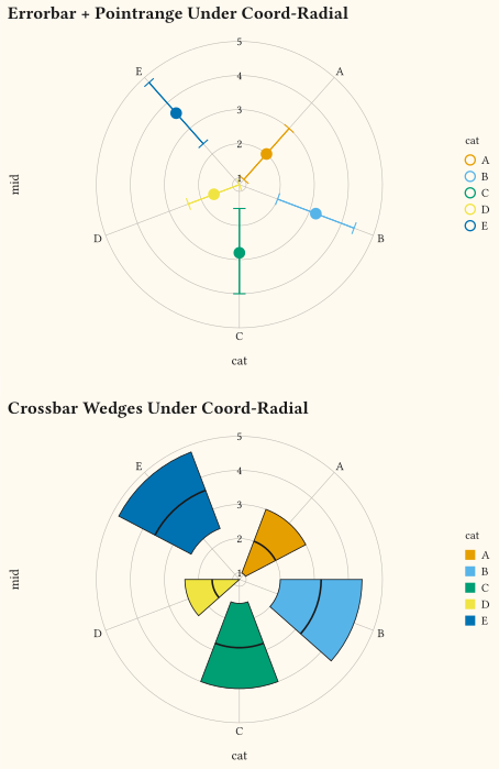
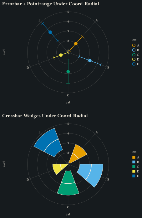
Errorbars, point ranges, line ranges, crossbars, and boxplots all switch to polar wedges, radial spines, and arc caps under coord-radial.
// Showcase: filled bars comparing cylinder shares across classes; every bar
// normalises to 1 so composition, not volume, is the message.
#import "@preview/gribouille:0.7.0": *
#set page(width: auto, height: auto, margin: 0cm)
#let shares = count(mpg, "class", "cyl")
#plot(
data: shares,
mapping: aes(x: "class", y: "n", fill: as-factor("cyl")),
layers: (geom-col(position: "fill"),),
scales: scales(
x: scale-discrete(expand: (0, 0)),
y: scale-continuous(labels: format-percent(scale: 100)),
fill: scale-okabe-ito(),
),
labels: labels(
title: "Small cars run on four cylinders, pickups and SUVs rarely do",
subtitle: "Share of cylinder counts within each vehicle class",
x: none,
y: "Share of vehicles",
fill: "Cylinders",
caption: "Source: bundled mpg dataset.",
),
theme: theme-minimal(axis-ticks: element-tick(length: 0.12cm)),
width: 13cm,
height: 7.5cm,
)// Showcase: waffle of species shares; units stay countable where a pie would
// force angle comparison, and the subtitle carries the colour key.
#import "@preview/gribouille:0.7.0": *
#set page(width: auto, height: auto, margin: 0cm)
#let species-colours = (
Adelie: okabe-ito.at(0),
Chinstrap: okabe-ito.at(1),
Gentoo: okabe-ito.at(2),
)
#let species-counts = count(penguins, "species", sort: true)
#let scaled = species-counts.map(row => (
..row,
units: calc.round(row.n / 4),
))
#plot(
data: scaled,
mapping: aes(fill: "species", weight: "units"),
layers: (geom-tile(stat: stat-waffle(rows: 6), width: 0.85, height: 0.85),),
scales: scales(fill: scale-discrete(
limits: species-colours.keys(),
palette: species-colours.values(),
)),
labels: labels(
title: "Almost half of all penguins measured are Adelie",
subtitle: typst({
[One square is four penguins: ]
species-counts
.map(row => text(
fill: species-colours.at(row.species),
weight: "bold",
)[#row.species (#row.n)])
.join([, ], last: [, and ])
}),
x: none,
y: none,
caption: "Source: bundled Palmer penguins dataset.",
),
guides: guides(default: none, x: none, y: none),
theme: theme-void(),
width: 12cm,
height: 6.5cm,
)// Showcase: a pie that earns its keep; three slices, directly keyed in the
// subtitle, no legend to shuttle between.
#import "@preview/gribouille:0.7.0": *
#set page(width: auto, height: auto, margin: 0cm)
#let cyl-colours = (
"4": okabe-ito.at(0),
"6": okabe-ito.at(1),
"8": okabe-ito.at(2),
)
#let shares = count(mpg, "cyl").map(row => (
slice: "all",
cyl: str(row.cyl),
n: row.n,
))
#plot(
data: shares,
mapping: aes(x: "slice", y: "n", fill: "cyl"),
layers: (geom-col(width: 1, position: "stack"),),
coord: coord-radial(theta: "y"),
scales: scales(
y: scale-continuous(expand: false),
fill: scale-discrete(
limits: cyl-colours.keys(),
palette: cyl-colours.values(),
),
),
labels: labels(
title: "Four-cylinder engines power almost half the fleet",
subtitle: typst({
[Share of vehicles by cylinder count: ]
shares
.map(row => text(
fill: cyl-colours.at(row.cyl),
weight: "bold",
)[#row.cyl cyl (#row.n)])
.join([, ], last: [, and ])
}),
caption: "A pie works with a handful of labelled slices. Source: bundled mpg dataset.",
),
guides: guides(default: none),
theme: theme-void(plot-background: element-rect(outset: 0.5cm)),
width: 12cm,
height: 8cm,
)// Stacked bars: quarters on x, revenue by product stacked within each quarter.
#import "@preview/gribouille:0.7.0": *
#set page(width: auto, height: auto, margin: 0cm)
#let sales = (
(q: "Q1", product: "A", revenue: 10),
(q: "Q1", product: "B", revenue: 20),
(q: "Q1", product: "C", revenue: 15),
(q: "Q2", product: "A", revenue: 12),
(q: "Q2", product: "B", revenue: 18),
(q: "Q2", product: "C", revenue: 22),
(q: "Q3", product: "A", revenue: 8),
(q: "Q3", product: "B", revenue: 25),
(q: "Q3", product: "C", revenue: 30),
)
#plot(
data: sales,
mapping: aes(x: "q", y: "revenue", fill: "product"),
layers: (geom-col(position: "stack"),),
scales: scales(y: scale-continuous(labels: format-currency(symbol: "$", digits: 0))),
labels: labels(
title: "Revenue by Quarter",
subtitle: "Stacked bars highlight per-quarter totals",
x: "Quarter",
y: "Revenue (M)",
fill: "Product",
),
theme: theme-minimal(),
width: 12cm,
height: 9cm,
)// Filled bars: each quarter's total normalised to 1 (product share).
#import "@preview/gribouille:0.7.0": *
#set page(width: auto, height: auto, margin: 0cm)
#let sales = (
(q: "Q1", product: "A", revenue: 10),
(q: "Q1", product: "B", revenue: 20),
(q: "Q1", product: "C", revenue: 15),
(q: "Q2", product: "A", revenue: 12),
(q: "Q2", product: "B", revenue: 18),
(q: "Q2", product: "C", revenue: 22),
(q: "Q3", product: "A", revenue: 8),
(q: "Q3", product: "B", revenue: 25),
(q: "Q3", product: "C", revenue: 30),
)
#plot(
data: sales,
mapping: aes(x: "q", y: "revenue", fill: "product"),
layers: (geom-col(position: "fill"),),
scales: scales(y: scale-continuous(labels: format-percent(),)),
labels: labels(
title: "Product Share of Revenue per Quarter",
subtitle: "position-fill normalises each quarter total to 100%",
x: "Quarter",
y: "Share",
fill: "Product",
),
theme: theme-minimal(),
width: 12cm,
height: 9cm,
)// waffle: per-group counts turned into unit grid cells via stat-waffle.
#import "@preview/gribouille:0.7.0": *
#set page(width: auto, height: auto, margin: 0cm)
#let tickets = (
(status: "Resolved", n: 58),
(status: "In progress", n: 27),
(status: "Blocked", n: 9),
(status: "New", n: 6),
)
#plot(
data: tickets,
mapping: aes(fill: "status", weight: "n"),
layers: (geom-tile(stat: stat-waffle(rows: 10), width: 0.9, height: 0.9),),
scales: scales(fill: scale-okabe-ito(name: "Status")),
labels: labels(
title: "Support Ticket Backlog",
subtitle: "Each square is one ticket, columns filled from the bottom-left",
x: none,
y: none,
),
guides: guides(x: none, y: none),
theme: theme-void(),
width: 12cm,
height: 7cm,
)// coord-radial(theta: "y") + geom-col + position-stack produces a pie chart.
#import "@preview/gribouille:0.7.0": *
#set page(width: auto, height: auto, margin: 0cm)
#let revenue = (
(slice: "all", value: 30, region: "EU"),
(slice: "all", value: 22, region: "US"),
(slice: "all", value: 18, region: "APAC"),
(slice: "all", value: 12, region: "LATAM"),
(slice: "all", value: 18, region: "Other"),
)
#plot(
data: revenue,
mapping: aes(x: "slice", y: "value", fill: "region"),
layers: (geom-col(width: 1, position: "stack"),),
coord: coord-radial(theta: "y"),
scales: scales(y: scale-continuous(expand: false)),
labels: labels(title: "Revenue Share", fill: "Region"),
theme: theme-minimal(),
width: 12cm,
height: 9cm,
)// Rose chart: discrete categories distributed around the circle, height as r.
#import "@preview/gribouille:0.7.0": *
#set page(width: auto, height: auto, margin: 0cm)
#let counts = (
(dir: "N", count: 12),
(dir: "NE", count: 9),
(dir: "E", count: 5),
(dir: "SE", count: 4),
(dir: "S", count: 7),
(dir: "SW", count: 11),
(dir: "W", count: 14),
(dir: "NW", count: 10),
)
#plot(
data: counts,
mapping: aes(x: "dir", y: "count", fill: "dir"),
layers: (geom-col(width: 1),),
coord: coord-radial(theta: "x"),
scales: scales(x: scale-discrete(expand: false)),
guides: guides(fill: none),
labels: labels(title: "Wind Directions"),
theme: theme-minimal(),
width: 12cm,
height: 9cm,
)// Partial radial sweep: `end: π` keeps the panel as a half-circle so the
// domain endpoints render at distinct angles instead of stacking.
#import "@preview/gribouille:0.7.0": *
#set page(width: auto, height: auto, margin: 0cm)
#let scores = range(0, 13).map(i => (
hour: i,
load: 30 + 20 * calc.sin(calc.pi * i / 12) + calc.rem(i * 5, 7),
))
#plot(
data: scores,
mapping: aes(x: "hour", y: "load"),
layers: (
geom-line(stroke: 1pt),
geom-point(size: 2pt),
),
coord: coord-radial(theta: "x", end: calc.pi),
scales: scales(x: scale-continuous(limits: (0, 12), expand: false)),
labels: labels(title: "Half-Day Load"),
theme: theme-minimal(),
width: 12cm,
height: 9cm,
)// Clock-face layout: hourly observations wrapped to a circle via coord-radial.
#import "@preview/gribouille:0.7.0": *
#set page(width: auto, height: auto, margin: 0cm)
#let hours = range(0, 24).map(h => (
hour: h,
load: 30 + 25 * calc.sin(2 * calc.pi * h / 24) + calc.rem(h * 7, 11),
))
#plot(
data: hours,
mapping: aes(x: "hour", y: "load"),
layers: (
geom-line(stroke: 1pt),
geom-point(size: 2pt),
),
coord: coord-radial(theta: "x"),
scales: scales(x: scale-continuous(limits: (0, 24), expand: false)),
labels: labels(title: "Daily Load"),
theme: theme-minimal(),
width: 12cm,
height: 9cm,
)// Radar chart: closed polygon under coord-radial with one vertex per axis.
#import "@preview/gribouille:0.7.0": *
#set page(width: auto, height: auto, margin: 0cm)
#let scores = (8, 6, 7, 9, 5, 8)
#let car-a = range(scores.len()).map(i => (axis: i, score: scores.at(i)))
#plot(
data: car-a,
mapping: aes(x: "axis", y: "score"),
layers: (
geom-polygon(fill: rgb("#1f77b4"), alpha: 0.4, stroke: 0.8pt),
geom-point(size: 2pt),
),
coord: coord-radial(theta: "x"),
scales: scales(x: scale-continuous(limits: (0, 6),
labels: v => if v == 6 { none } else { str(v) },
expand: false,), y: scale-continuous(limits: (0, 10))),
labels: labels(title: "Vehicle Profile"),
theme: theme-minimal(),
width: 12cm,
height: 9cm,
)// Composite geoms under coord-radial: errorbar / pointrange / linerange /
// crossbar / boxplot all render polar wedges, radial spines and arc caps
// instead of cartesian rectangles.
#import "@preview/gribouille:0.7.0": *
#set page(width: auto, height: auto, margin: 0cm)
#let summaries = (
(cat: "A", lo: 1, mid: 2, hi: 3),
(cat: "B", lo: 2, mid: 3.2, hi: 4.4),
(cat: "C", lo: 1.5, mid: 2.8, hi: 4),
(cat: "D", lo: 0.8, mid: 1.6, hi: 2.4),
(cat: "E", lo: 2.4, mid: 3.6, hi: 4.8),
)
#grid(
columns: 1,
row-gutter: 0.5cm,
plot(
data: summaries,
mapping: aes(x: "cat", y: "mid", ymin: "lo", ymax: "hi", colour: "cat"),
layers: (
geom-errorbar(width: 0.5),
geom-pointrange(size: 4pt),
),
coord: coord-radial(),
labels: labels(title: "Errorbar + Pointrange Under Coord-Radial"),
theme: theme-minimal(),
width: 12cm,
height: 9cm,
),
plot(
data: summaries,
mapping: aes(x: "cat", y: "mid", ymin: "lo", ymax: "hi", fill: "cat"),
layers: (geom-crossbar(width: 0.6),),
coord: coord-radial(),
labels: labels(title: "Crossbar Wedges Under Coord-Radial"),
theme: theme-minimal(),
width: 12cm,
height: 9cm,
),
)