stat-difference
Difference statistic: ribbon between two series, split at every crossing.
Consumes x, ymin, and ymax, where ymin and ymax are the two series to compare (either may be on top). Consecutive points whose difference changes sign are joined by the exact linear intersection of the two series, inserted as the last point of one run and the first point of the next, so adjacent ribbon segments share a vertex at the crossover. Each output row carries a _sign column holding levels.at(0) where ymax > ymin and levels.at(1) where ymax < ymin, and a group column separating the runs; map fill to after-stat("_sign") to colour the band by which series leads.
Usage
stat-difference(
  levels: ("+", "-"),
)
Parameters
| Parameter | Default | Description |
|---|---|---|
levels |
("+", "-") |
Pair of level names written to _sign: first where ymax is above ymin, second where it is below. Exact-tie points extend the run in progress; a group that only ever ties takes the first level (its band has zero area either way). |
Returns
Statistic object with name: "difference", consumed by geom layers (usually geom-ribbon).
Outputs
x.ymin.ymax.group._sign.
Examples
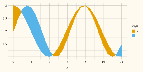
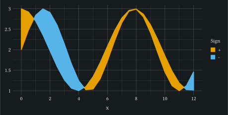
Shade the gap between two series by which one is on top.
#let d = range(0, 25).map(i => {
  let x = i * 0.5
  (x: x, a: calc.sin(x) + 2, b: calc.cos(x * 0.8) + 2)
})
#plot(
  data: d,
  mapping: aes(x: "x", ymin: "a", ymax: "b", fill: after-stat("_sign")),
  layers: (geom-ribbon(stat: stat-difference()),),
  width: 12cm,
  height: 6cm,
)
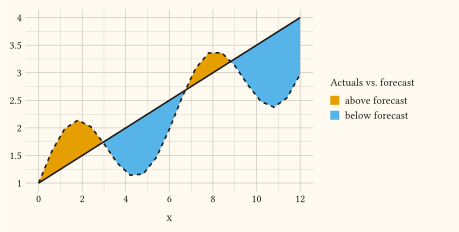
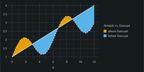
Name the levels and overlay the series themselves.
#let d = range(0, 21).map(i => {
  let x = i * 0.6
  (x: x, forecast: 1 + x * 0.25, actual: 1 + x * 0.2 + calc.sin(x) * 0.8)
})
#plot(
  data: d,
  mapping: aes(x: "x"),
  layers: (
    geom-ribbon(
      mapping: aes(
        ymin: "forecast",
        ymax: "actual",
        fill: after-stat("_sign"),
      ),
      stat: stat-difference(levels: ("above forecast", "below forecast")),
      alpha: 0.6,
    ),
    geom-line(mapping: aes(y: "forecast"), stroke: 1.2pt),
    geom-line(mapping: aes(y: "actual"), stroke: 1.2pt, linetype: "dashed"),
  ),
  labels: labels(fill: "Actuals vs. forecast"),
  width: 12cm,
  height: 6cm,
)